


Whether it’s slogans, logos, or just straightforward celebrations of typeface, we’re always excited by typography T-shirts here at Everpress. So much so that at the start of 2020 we even launched our very own Type In Focus campaign, a tribute to all things type that featured 40 limited edition T-shirts designed by leading designers and foundries from around the world in response to the theme EMOTION.
When it comes to tees with type, we know it’s not always easy knowing a slogan from a logo (and often it comes down to interpretation too!) With that in mind, we’ve put together our own explainer.
Slogan T-shirts
The history of slogan tees could also be the history of fashion-as-protest. Katharine Hamnett’s seminal ‘80s designs, including the “58% Don’t Want Pershing” one that she wore to meet Margaret Thatcher, helped put them on the map, and more recently the ‘Repeal’ T-shirt was instrumental in raising awareness of Ireland’s referendum on abortion. That’s not to say they don’t have a fun side too though; Henry Holland’s tongue-in-cheek takes in the mid-2000s are classics of the genre, with slogans like “Get Your Freak On Giles Deacon,” and “Do Me Daily Christopher Bailey.” Essentially though, slogan tees tend to address social issues through bold, text-based design – making walking billboards of their wearers.
Typography T-shirts
Typography tees, on the other hand, explore and experiment with fonts and type; finding new and interesting ways of communicating with text, numbers and symbols. With a goal of providing striking, cutting visuals, typography can be seen as the science of visual communication through text.
Logo T-shirts
Logo tees especially really come into their own in helping to carve out a visual identity and raise awareness of emerging (or established) brands. They have effectiveness that’s proven by their enduring popularity – they’ve been used for decades by everyone from Supreme to NASA. Plus, because T-shirts are cheaper than almost any other item of clothing, they’re one of the best ways for fashion labels to offer an accessible way of buying into the brand.
Below we’ve prepped a list of examples that showcase a range of what we would classify as typography, logo or slogan tees from across our platform in recent years.
Adam Tickle – What’s Luv Got To Do With It
Now head of content at Sneakersnstuff, graphic designer and art director Adam Tickle cut his teeth branding now-iconic platforms like NTS and Boiler Room. When we caught up with Adam about his Utopia tee, designed for our 50/50 campaign with Amnesty International, he explained the value of typography in grabbing attention. “The campaign was digitally driven so it was important for me to create a design that could be spotted instantly on an Instagram feed,” he said, “It also had to be simple, one word (graphic) to communicate positivity and inclusiveness.” We loved the ‘80s font of his Tina Turner-inspired tee for our Love Is The Message Valentine’s Day campaign.
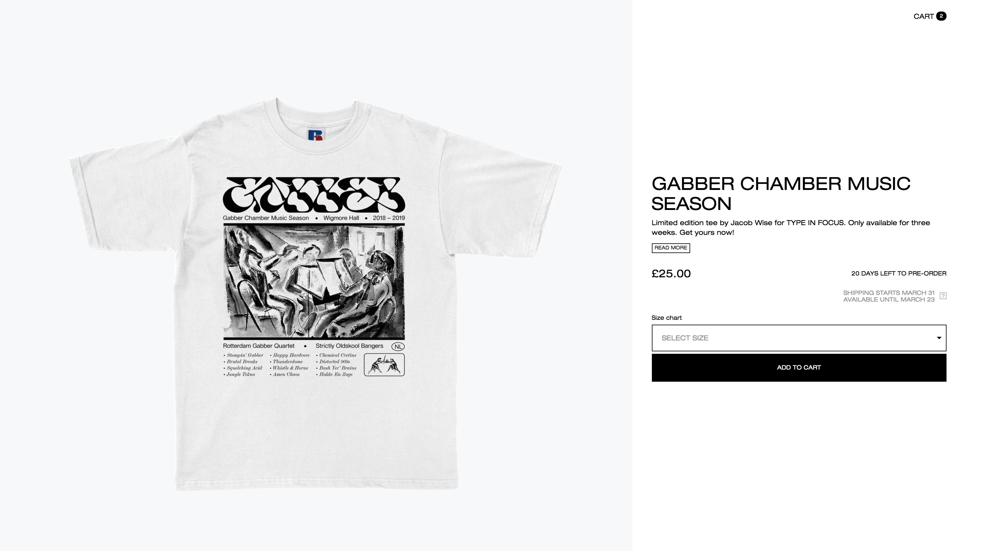
Jacob Wise – Gabber Chamber Music Season
Although he only graduated from Kingston University a couple of years ago, Jacob Wise has quickly gained a cult following. He’s proven himself a master custom type designer, creating fonts like Monarch, Kraft and the lettering for his Gabber Chamber Music Season tees, one of the most-popular T-shirts we’ve had on our site.
Violaine et Jérémy – Love
With an output that spans graphic design, illustration and more, typography is just one of the strings in multidisciplinary creative studio Violaine & Jérémy’s bow. Their ‘Love’ T-shirt, created for our Type In Focus campaign by Jérémy, feels particularly fitting given the due are a couple – they first met working at the advertising agency Konbini back in 2011, and left to start Violaine & Jérémy within the year.
Jackson Green – Human Instrumentality Project
To celebrate the release of his new typeface ZEITMIX, Jackson Green created this Human Instrumentality Project tee. The LA-based designer works across music and film, forging a symbiotic relationship between them. He’s acted as creative director for the band Jesus Piece and art director for the rapper St Louis, and he’s heavily influenced by Hideaki Anno’s anime series Neon Genesis Evangelion; this long sleeve was a tribute to it.
Anthony Burrill – Then Now Always
When we spoke to Anthony Burrill recently, he sang the praises of the T-shirt as a canvas for anyone working with type. “Most of my work is very graphic, I specialise in posters with a focus on typography & short statements,” he said, “it seemed natural to translate that visual language to T-shirts, they almost became visual posters – posters you could wear.” His tee for Great Ormond Street Hospital’s Then. Now. Always campaign was one of our standouts; he used a timeless, clean type to really drive home the message.
The Crystal Beach – THE PURSUIT OF PLEASURE
We’ve been fans of art director Alexander Dueckminor (AKA The Crystal Beach)’s output for a while, both for his collaborations and for his rigorously conceptual type design. His Type In Focus ‘Pursuit of Pleasure’ tee explored the symbiotic relationship between pleasure and pain from a Buddhist perspective, with equally intricate graphic work too.
Ciarán Birch – Concorde Station
Ciarán Birch discovered his love of type design while studying at the University of Brighton, where he recently finished up his graphic design degree. His Concorde Station tee is like a preview of his Instagram and website; with three different typefaces working in aesthetic harmony.
Superimpose – Services Unknown
When we spoke to Superimpose Studio’s Toby Evans about his redesign of the KERRANG! logo, he had a refreshingly anarchic approach to type that’s evident in this Services Unknown tee too. “In terms of the logo itself, I designed it so it could be the foundation for other people to mess around with,” he said. “Kids drawing it on their rucksacks, or stickers or whatever. It would be great to see that user-generated application of the logo.”
Ben Mottershead – Focus
Like most of Ben Mottershead’s work, his Focus tee was born out of his own experiences of living with ADHD. When we caught up with him to talk about his process recently, he explained the motivation behind it, “One of my last directors used to constantly say in daily emails that he “needed me to focus.” This was always quite patronising. As for me, it wasn’t an issue of focus and just made me want to tell him to ‘Fuck Off’.” Ben hasn’t let ADHD get in the way of designing, in fact, he credits it with his development, “I think my love for straight to the point communication design comes off the back of my ADHD.”
Max Löffler – Eternal Musings
Eternal Musings was graphic designer Max Löffler’s first ever attempt at a T-shirt design, proving he’s a natural in the medium. Intended as a contemporary homage to Rodin’s sculptures, the design incorporated the Salvaje Display font, a typeface dreamt up by Coppers and Brasses Type Foundry.
Studio Triple – GLOBAL COLLAPSE
“A message of hope, kind of,” as Studio Triple designer Jérémy Landes put it, this Global Collapse tee, another from the Type In Focus collection, illustrates brilliantly the effect typography can have on the meaning of words themselves. Sure, it’s not the most positive message, but it’s hard to feel gloomy with type that’s so upbeat.
Hendrik Schwab – Times New Romance
We loved multidisciplinary designer Hendrik Schwab’s tongue-in-cheek take on what’s surely the most ubiquitous font of them all. It’s not an easy task making Times New Roman interesting, but his play on the name of the typeface is a smart way of making you look twice at this tee.
Read next: Graphic T-shirts explained.