


You may have noticed the rise of the graphic T-shirt – we certainly have. Distressed graphics and text collaged to build complex visual worlds and communicate ideas with a single glance.
Style and function
Originating from quite functional purposes like university and army branding, the graphic T-shirt has moved and morphed through the decades; from walking billboards for music movements, to iconic foundations for skate sub-cultures, through to collaboration canvas’ for brands. While all of these lives still exist for the graphic tee, we’re also seeing tees flourish among graphic designers. Increasingly, designers are experimenting with layering, symbols and re-purposed graphics within a carefully considered colour palette to create a composition with a message.
Functionally, graphic T-shirts tend to be easier to print than illustrated T-shirts to print because their designs are often ‘cleaner,’ meaning they use less colour and/or are less elaborate (but this is by no means always the case). Below we’ve prepped a list of examples that showcase a range of what we would classify as graphic tees from across our platform in recent years.
Brodie Kaman – Nocturnal Wound
Berlin-based Brodie Kaman works across graphic design, music and merch, forging a symbiotic relationship between the three. True to his distinctive style, the Nocturnal Wound tees, which are part of his label Super Foreign, use distressed, grungey, purple graphics, and text is a prominent feature of the design. You can check out our full interview with Brodie over on The Block, but one of our key takeaways about his process as a graphic designer was the fact he looks to books for inspiration. “I’m obsessed with books,” he said, “I have a healthy mix of printed matter that I turn to when necessary. Reading fiction and poetry can spark ideas too, words are powerful.”
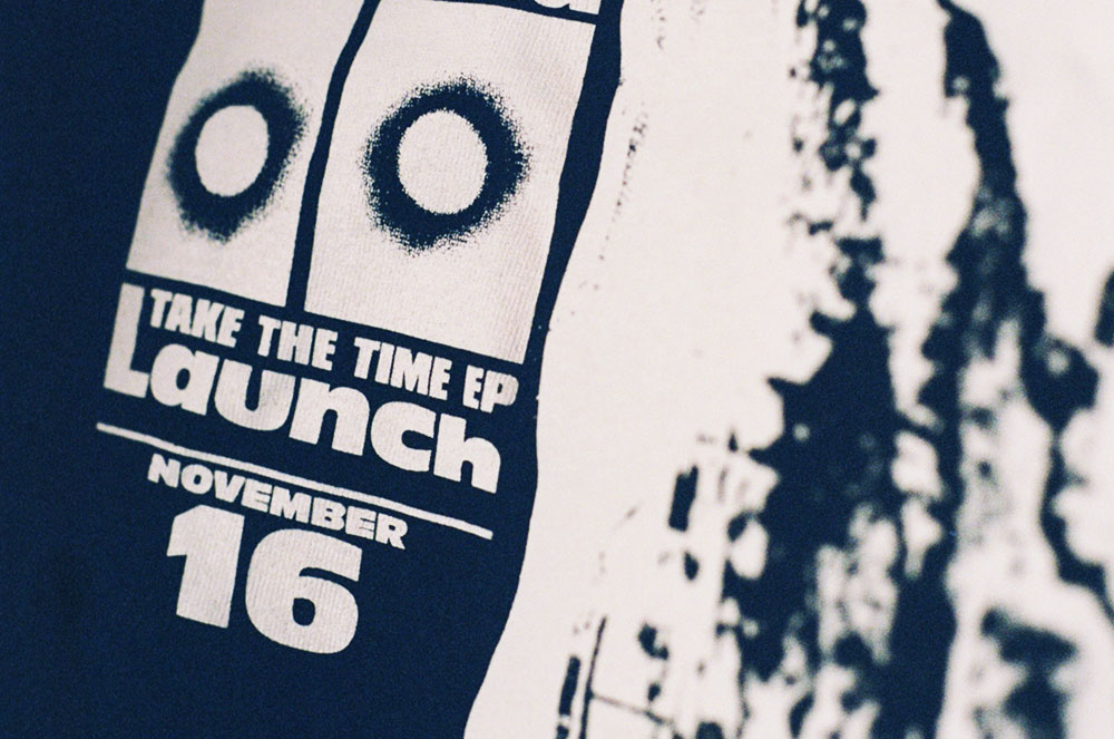
Jawhel – Spirit Lift
Artist Jawhel (or Jake Wheildon as he’s otherwise known) creates graphics, flyers and posters inspired by music, geometry and anime. He’s been adapting his 2D designs for a series of T-shirts with Everpress, and one of our favourites is Spirit Lift. In a dreamy, retro purple, its central image of outstretched palms implies optimism. “It’s all about our spirit and how we choose to utilize it throughout life,” Jawhel told us, “a reminder that we’re capable of reaching higher states of contentment, both mentally and physically.”
Doctryn Apparel
Founded in 2018, Amsterdam brand DΦCTRYN in their own words, “embrace the universal language of occult symbolism, esotericism and horror aesthetics.” For their debut eponymous design, they’ve inverted the typical printed T-shirt, saving an elaborate collection of images for display on the back. The text on the front, literally the dictionary definition of the word doctrine, goes to show how effective typography and positioning can be.
Lucas Hesse – Rundgangsparty
Designer Lucas Hesse created this Rundgangsparty tee for the most recent party at the art academy in Mainz, Germany. Cleverly functioning as a promo flyer for the party, it has details of entry price, opening time and even the full DJ line up, but the masterful use of font and layout keeps it as slick as it is informative. This is one of those tees that really emphasises just how multifaceted good graphic design can be – it’s got all the vital info for the party, but it’ll definitely work as a standalone tee after the event too.
Maria Falbo – Senses
When we chatted to Copson CEO Maria Falbo recently, she gave us her full lowdown on getting a brand off the ground. Printing runs of tees in the early days of her skate/house music blog helped to get Copson started, and now as Maria puts it, “We make tees that are merch: they’re part of something bigger.” Her Sense tee is the first in a series she’ll be releasing with us each month, of graphic designs that she wants to produce as affordably as possible, “Sometimes all you want is a low-cost printed Gildan to wear to death,” she said.
Bill Connors – Physical Medium
Designed as part of Physical Medium, his collaborative project with childhood friends George Joseph Miller, Reid Miller, and Jimmy Steyskal, Chicago-based Bill Connors’s Split T-shirt, landed a place on our favourites of 2018. Connors covered the sleeves, front and back of his tee with the Black Metal-influenced, densely textured graphics that appear on his standout gig flyers, posters and vinyl sleeves.
Jimbo Bones – Desolation
Slightly tame by Jimbo Bones usual standards (his Instagram feed could be a homage to bondage and cartoonish violence), this was still another of our favourites from last year. Keeping the different elements of his design framed inside a square helps keep the mix of fonts and symbols from looking too messy, so it makes one coherent and powerful image.
Keynes Woods – The Future’s Past_ (DUST)
Based between London and Seoul, Angelo Studios’ Eugene Angelo provides creative direction for the emerging hip-hop artist Keynes Woods, including The Futures Past tee that he put out with us last year. The pair wanted to use graphic design to create “merchandise that blurred the line between streetwear and traditional ‘merch’,” as Keynes explains on Instagram, “I didn’t want to just plaster my name across a blank and call it a day.”
WW88 – Sights
WW88, an abbreviation taken from his Instagram handle @wellwishers88, tends to make dense flyers and posters using colourblock images that stand out against their black backgrounds. When it comes to tees though, he pares it down a bit, leaving plenty of white space and letting interestingly placed images and unlikely colour combos grab attention; as with the text that runs along the sleeve of this Sights tee.
Read more: 8 tools and resources for great T-shirt design.