That’s my personal memory of KERRANG!. Bands like Limp Bizkit, System of a Down, KoRn, Slipknot, Alien Ant Farm, Blink-182 and so on, were all introduced to me, more or less, by KERRANG!. The first CD I ever bought, Limp Bizkit’s Chocolate Starfish and the Hot Dog Flavored Water, happened as a result of seeing the video for My Way in the living room of a family friend, during one of those grown-ups’ parties where all the kids are ushered into a room together and willed into being friends by sheer parental desire for the glass of wine that’s waiting back in the kitchen.
It wouldn’t be until a few years later that I would discover KERRANG! magazine, ironically the heart of the business. As a card-carrying nu-metal addicted pubescent boy, KERRANG! was essential regular reading in my social groups. It was around the year 2000, when mainstream media outlets like print magazines, newspapers and radio still by-and-large dictated the breadth of your musical knowledge, and I was a little too young to be climbing down the rabbit hole of applications like KaZaA or BearShare on my own journey of discovery. As a result, KERRANG!, faithfully present every week, tailored to my tastes and eager to please, was a lifeline for me.
Now that I’m an adult, it’s a bit easier for me to fathom how huge KERRANG! actually is – that it has a history beyond my subjective experience. Since the early ‘80s, KERRANG! has been documenting and reporting on the metal scene in its many diverse and varied forms. In fact, with its roots in the very genesis of heavy metal itself, KERRANG! arguably helped to define, fundamentally, what the genre was and would later be.
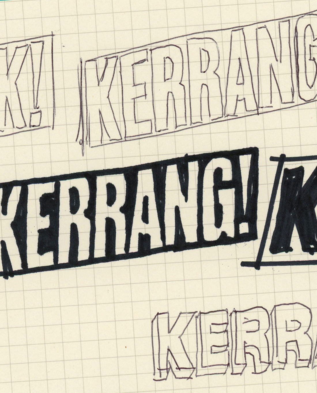
Now, KERRANG! has over three decades in the game, and like many of the older publications, it’s spent some time finding its place in the new digital landscape, shifting, morphing, and redefining itself. Part of that, naturally, is a new logo, and after over fifteen years of KERRANG!’s reassuringly rebellious “smashed glass and neo-industrial barcode” logo, it appears they’ve decided to take a step back.
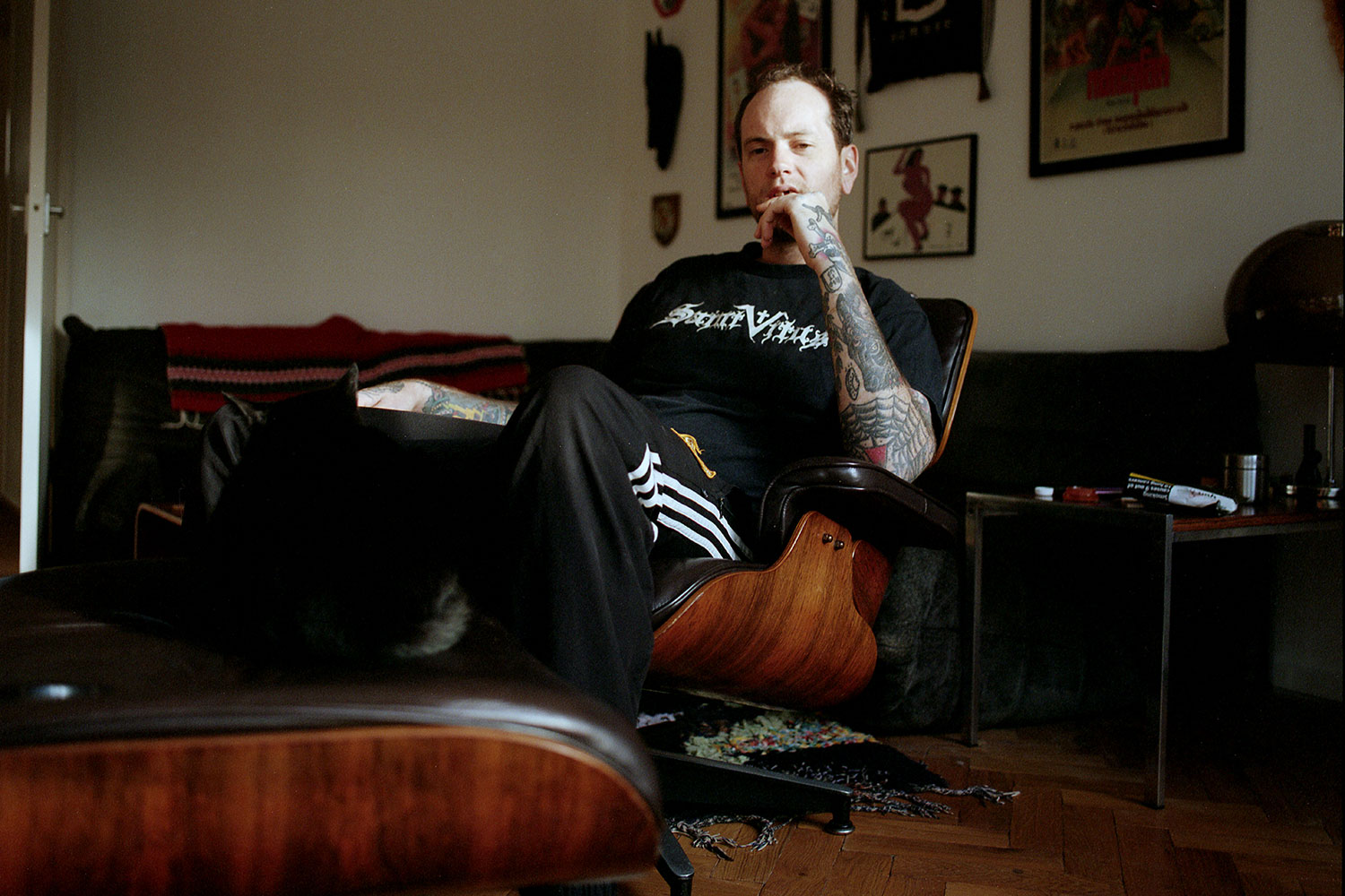
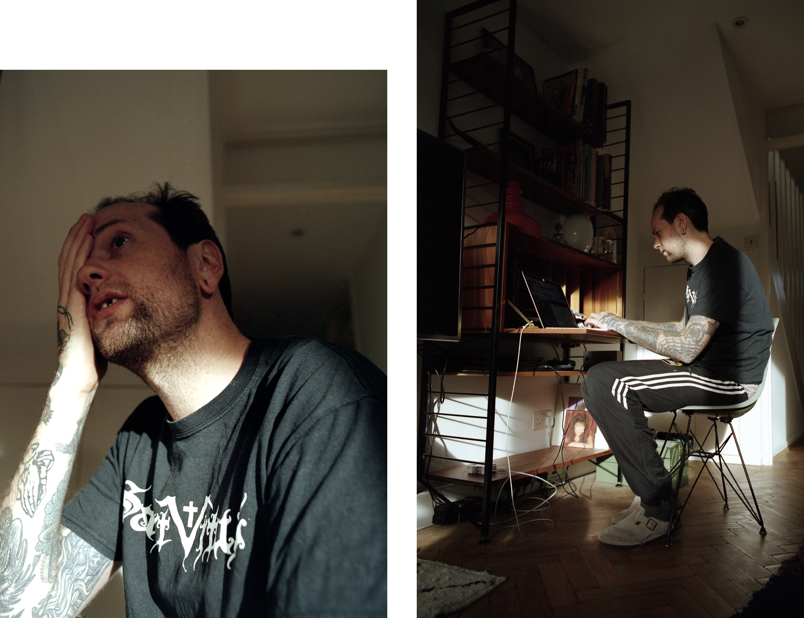
That step back comes courtesy of Toby Evans, a London-based graphic designer who has worked with numerous streetwear and fashion brands such as Palace Skateboards, as well as running his own creative agency, Superimpose Studio, in East London. When I first met Toby he had waist-length hair and was engaged in a bidding war for a vintage EYEHATEGOD t-shirt on eBay, so it seemed clear to me that KERRANG! had picked the right guy for the job. I met up with Toby and had a conversation about what it was like redesigning, and redefining, a British metal institution.

KERRANG! was a pretty seminal piece of my childhood, both the magazine and the TV channel, and I know you’re into metal yourself. Could you talk about your personal experience of KERRANG!?
KERRANG! is one of those things that’s almost a household name, in a sense. It’s such a part of the collective memory for people my age and a few years either side. I remember when I was a kid it was really cool among the older kids, and as I got older it became a bit more tongue-in-cheek.
Personally, I was one of those types who spent more time listening to music than reading about it
KERRANG! was like the pinnacle of metal magazines, but it never really took itself seriously. Every band you can think of wanted to be in KERRANG!, and they still do. It’s a name that was always around growing up, and it still holds a lot of prestige in that regard. Personally, I was one of those types who spent more time listening to music than reading about it, but if I was round a mate’s house and a copy was lying around, I’d pick it up and read through it.
I’ve actually found myself referring back to old copies these days for design references and so on – the layouts, photography, those old backpage adverts for gigs, ringtones and merch. I guess it’s just come back around for me, being repurposed and reinvented. With this project it’s been a chance to return to KERRANG! and view it with a fresh set of eyes, which is quite refreshing.
I know you’re a metal fan yourself, and I imagine there’s a gap between how you approached this job as a designer and how you might have as a metal fan. Would you have designed the logo differently in that mindset?
Sort of, but the redesign was part of a much larger question of what to do with the magazine – frustrations internally about what it had become. There was a big yearning to strip things back to what it was originally about: metal, the artists, the fans, which the magazine provided a weekly commentary alongside. It lost its way a bit, tried to be playful and almost became a bit too young, like a lot of the classic magazines finding their place in the digital world.
So when I was first approached to work on this, of course there was that feeling – what would my 14-year-old self think if I told them I’d be designing the masthead for KERRANG!? It’s daunting, such a large part of so many people’s youth. But that’s the other side of the discussion. Any magazine, or any thing in general that people have grown up with, they’re gonna bring their own ideas, feelings and nostalgia to the table. But it’s important to remember that it’s still being read by kids who are the age we were when it was important to us.
So when it came to thinking about this project as a designer, I almost had to remove my perspective from that discussion and approach it in a much simpler way. I wanted to create something simple and stripped back, which could be fucked with from issue to issue, repurposed, twisted, put on merch, presented in different colours and so on.
It’s ironic actually. A few years back I was doing some fashion design work for one of Ashley Williams’ collections, and I did a design that flipped one of the old KERRANG! logos – I even told them about it, and they didn’t seem too happy about it! But it’s interesting to think about an old logo becoming fashionable, at the same time as you’re trying to create a more fashionable new logo.
KERRANG! has had a few logos over the years. This one feels like a real return to their original logo from 1982. Was this a conscious decision?
Definitely. It just didn’t make much sense trying to redesign something that, in my eyes, they had all along. It was much more a case of taking what KERRANG! was back then, and turning it into a framework which the art director could then take and put their own spin on, and take ownership of every week. Whether you’re talking about a band, a genre, a movement, or an anniversary of an iconic album, you’ve got a logo that speaks to what KERRANG! is and what it represents, but doesn’t impose any of its own ideology.

Also, it was important not to stray too far down one path; not to create a logo that’s overtly doom, or thrash, or death metal, or hardcore, or nu-metal, you know? It’s almost generic, and that was a conscious decision. When I started the project, there were a lot of iterations that were heavily-stylised to the point that they felt like they’d come from a different era. After going through that process, I realised that the right decision was to create a logo that’s much more malleable. I’m hoping this is something they’ll be able to use for years to come and really roll out in a number of ways.
It occurred to me while you were saying that – the KERRANG! name does a lot of the heavy lifting when it comes to communicating what’s inside the magazine.
Exactly, and this was something I brought up early on. The name is like something from a Lichtenstein piece, almost cartoon-esque. When you’ve got a bold, onomatopoeic title like that, you really shouldn’t have to labour yourself with trying to create too much visual stimulation. In a way, I feel like the more I talk about it the more I make it sound like an easy job, but the challenge was bringing people’s eyes back into focus and making them see something that was in front of them all along, right?

It’s funny that you use the word “cartoon-esque”, because I was looking at the old KERRANG! logos from the ‘80s and ‘90s with that shredded, distorted look, and it’s exactly that. It’s almost as if, even in the ‘80s, heavy metal itself didn’t quite know how to take itself seriously.
I think when those magazines were coming out, there wasn’t so much noise around; there wasn’t this endless list of genres and subgenres that we have now. It was heavy metal. And it probably needed more of that visual character, not only to define the magazine, but almost to help define the industry and the genre. So now everyone knows what KERRANG! is, they know what metal is, it’s more mainstream, or at least widely accepted. So when it comes to communicating that edge, all you really need is the word KERRANG!.
Across the board right now, graphic design seems very led by minimalism and understated, modern design. The metal scene is pretty much diametrically opposed to this in sound, aesthetic and, obviously, logos. Was this in your mind when designing the logo?
Not really. I was trying to push this fundamental idea of stripping things back. The covers had become so noisy, covered in taglines, stickers, callouts, trying to tell you everything that was inside the magazine – almost a clickbait approach, trying to get you to look in the magazine by calling out stuff that isn’t even really in there.

The overall objective was to take that away, and focus on great photography and great writing. They’re going through a big transition as a publication, and there’s a lot going on internally to achieve that – rethinking the design of the magazine has been a big part of that process.
In terms of what you’re talking about, modernist design and so on, one of the objectives was definitely to create something that the older reader might be able to take more seriously. People who are into music will pick up The Fader, or Clash, or Fact, whereas KERRANG! has, at times, had more of a throwaway, tabloid feel. Fundamentally, I’d been brought in to design a logo, but that then led to creating magazine layouts; seeing how the logo interacts with the images and text, and how it works in different colours. As you’re going through that process, it becomes clear that some degree of modernising is needed, but you have to do it in a way that’s true to the original source.
Over the past few years, the death metal aesthetic has come back into vogue, with celebrities wearing band t-shirts and a number of mainstream artists modelling their merchandise on death metal logos and artwork. Were you ever tempted to leverage this by creating a more typical metal-inspired identity?
No, because I think the core metal fans, across the generations, are into metal. There will always be trends, flavours of the month, things that come and go. Fashion is faster and more fickle than it has ever been, so I never thought to try and talk to the trend-followers or window-shoppers, because what would it achieve?
Keeping it core, focusing on the fans and the people who’ve kept the genre alive all these years, that’s the important part. They’re the people listening to the bands, going to the gigs, reading the magazine, right? If anything, this was a chance to make something that an older-generation metal fan might buy for their kid, but if they see it lying around the house, there’ll be something in there for them as well.
In terms of the logo itself, I designed it so it could be the foundation for other people to mess around with, kids drawing it on their rucksacks, or stickers or whatever. It would be great to see that user-generated application of the logo… if kids still do that stuff. I hope they do.

I suppose you could compare it to something we’ve started to see with grime over the past few years, where now that the ‘master genre’ is established, it’s started to branch out and diversify, creating new twists and subgenres. In the early days, grime had a very distinct aesthetic, from the mixtape covers to the YouTube channels. And in the early days, metal probably had to do the same, working very hard to define itself to a broader audience. I guess once you’ve achieved that, you’re free to create something more fluid that people can attach their own meanings to.
I think that’s a good way to put it – it’s definitely what I’d like to see. Not everything has to scream its identity from the rooftops. Sometimes it’s nice to let people come to you.
It’s a big departure from the jagged title cards with the barcode which you used to see on the TV channel.
That last logo was perfect for its time – for bands like Slipknot and KoRn. I mean, Slipknot had their own barcode logo as well, right? It all had this very new-industrial look. But after that, things moved towards pop-punk, new emo, screamo, scene and so on. In a sense everything got a bit ‘boy band’, and it’s hard to square that with that very raw, industrial logo.
And all the old logos had some element of that – distortion, broken glass and barcodes. It’s ironic that nu-metal was arguably the most polished, mediated and packaged form of metal ever at that point, but its presentation was so centred around being rough and edgy. In some ways it feels like metal doesn’t really need to prove itself anymore.
Exactly. It’s done years of the shouting, the attitude, the shock and horror. There are so many genres and different forms of metal, but it’s still defined, at its core, by that, ‘Live fast, die young, drink, drink, drink’ mantra. You don’t need to spoonfeed people anymore.
I even remember reading, on more than one occasion, about scientific studies suggesting people who listen to metal are often more intelligent.

Same. I think it had something to do with the complexity of the songwriting; tempo changes, time signatures, melodies and harmonies. There’s also a pretty strong correlation between fans of metal and classical music, which is strange because, when you look at a lot of product aimed at metal fans, it’s almost patronising.
Massively. Look at any other genre of music, and they push it so hard in terms of creative, graphic talent, crafting a whole brand. You could craft an entire aesthetic around a band playing metal, but when it comes to the promo shots it’ll still be that same photo, shot from below, everyone standing there with their arms crossed looking awkward. That’s the formula. And I guess it has its appeal, in a way, but it feels like it hasn’t caught up at all.
Which is one of the most endearing things; that metal has been defined by outsidership, refusing to change or conform. But I know people who shoot for magazines like that, and the 15-year-olds starting metal bands today are getting the exact same photos taken as my mates were 10 years ago. Do you think the metal scene would ever embrace a new approach, or is it always going to be stuck in that endearing timewarp?
It’s a funny one. There are a lot of people I know who work in photographic and creative fields who only listen to metal, and I know people with lots of eclectic tastes where it’s one part of their identity, but they only really interact with the metal scene when they go to gigs or maybe play an instrument, right?
You don’t need these big, shiny, overproduced and, yes, patronising shots where every photo has four filters on top and looks like a teen horror film poster.
My old housemate did an amazing photo-book called “God Listens to Slayer”, where she travelled around Europe for 10 years taking photos of kids at Slayer gigs, and it’s amazing. It’s like every kid you ever used to know in your town, or that you’d see at the bus stop, or at shows in London. It is quite endearing, absolutely, but it’s how it’s documented.You don’t need these big, shiny, overproduced and, yes, patronising shots where every photo has four filters on top and looks like a teen horror film poster. You’ve got amazing photographers and documentarians out there who could come at it with a more ‘shot from the hip’, intimate approach as opposed to these super-staged photos which, to me, just aren’t really engaging.
I live opposite a big venue in Berlin that puts on a lot of metal shows, and it’s the same as in London. When you’re out in town day-to-day, you rarely see metalheads out and about, but if you’re walking past the Electric Ballroom in Camden at 7 o’clock on a Friday night, they’re all there. These people clearly still exist, but when you walk out into your daily life as a creative person in London, you wonder where they’ve all gone. It’s like metal has gone into hiding.
Yeah, which is quite nice in itself; you don’t have to wear it on your sleeve. I remember I went to a gig a few years back and there were a few guys that showed up in suits, with their hair in ponytails, and they’re fucking into it. But then, daily job, they can’t let that side out, right? And that’s the case for a lot of people in a lot of jobs, but here we are in the creative industry, where you can supposedly dress and act however you want, but people do hide it, or at least don’t talk about it as much. It’s like a ‘need-to-know basis’.
So last question, if I were working on a task like this I feel like I’d want to listen to a lot of metal for inspiration. What have you been listening to lately?
There’s a couple classics that I always go back to. “Crippled Lucifer” by Burning Witch, Eyehategod…
I forgot you were a total doom head.
Haha, yeah. What else? Neurosis, sometimes Today Is The Day, but that’s a little bit hectic, Bong… ah, yeah! Electric Wizard! Always!