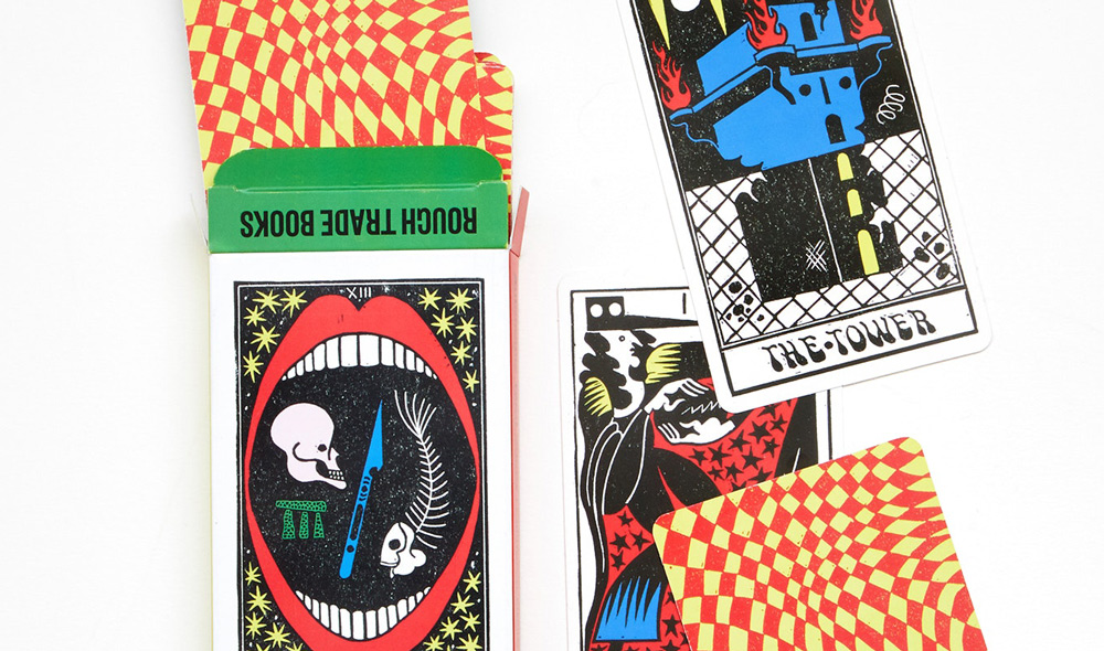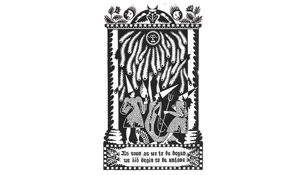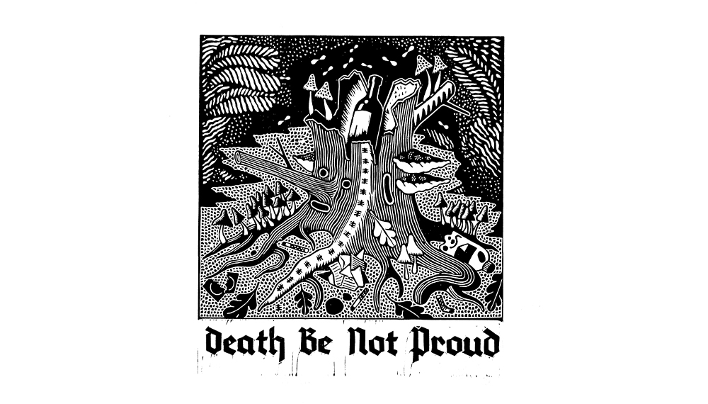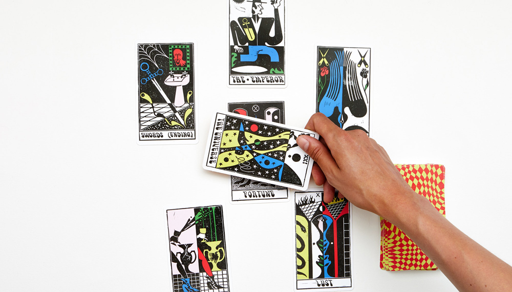
Camberwell alumni Sophy Hollington started out studying illustration, but it was discovering lino in her final year that proved pivotal to her work. An introduction that came via borrowing her flatmates’ tools (“thank you Martha Smith – amazing tattooist now”), she found the limitations of lino suited her. “I’m an awful perfectionist and the rigid parameters lino offers meant I could focus on composing an image instead of dressing it up,” she explains.
Fast forward nearly a decade, and her signature lino prints have graced the pages of The New Yorker, The New York Times, The Wall Street Journal, and Migrant Journal, as well as a good number of our favourite T-shirt campaigns of the last year. Spurred on by the success of each campaign (and the messages she’d get from fans gutted they’d missed out on their chance to buy a shirt) Sophy’s trajectory is a study in learning and adapting across campaigns. “I felt the momentum building with each campaign which was really satisfying,” she says. “It’s been such a pleasure to see my work on people’s backs in the streets.”
Why T-shirt Campaigns?
In her work, Sophy tries to maintain a healthy balance between self-directed projects and commercial work. “I like to balance my time with as much personal work as I possibly can,” she says. “This means I can keep refocusing the creative direction I’m going in and it’s not completely in the hands of my clients, which can happen when working non-stop commercially for a long time.”
She likes the synchronicity of running T-shirt campaigns that in turn help make personal projects more commercially viable: “T-shirt campaigns are an excellent way to finance personal projects using the artwork itself.” There are many reasons to start selling T-shirts, commercial and otherwise, and one is that they’re an undeniably great way of helping fund your practice. Plus there’s a nice circularity in using T-shirts printed with your work, to help subsidise it.
Design With T-shirts In Mind
For Sophy, running multiple campaigns has really brought home the importance of good design. Because her typical medium is lino cutting, with most of her commercial work taking the form of relief printing, she gives special consideration when translating her designs to T-shirts, so that they keep their impact. “As physical objects all have their own properties and textures, I take out the paper texture that I leave in for online pieces,” she says. “I also have to bump up the levels and contrast for the screen printing process to be able to best represent the character of a linocut print.”
It pays to be inventive when it comes to designing your T-shirts too – develop a new design if none of your existing work is quite right. “It’s also good to come up with designs with the T-shirt in mind rather than using work that’s already been made,” says Sophy. “Although this works well too if the piece really lends itself to a shirt.”

And finally, her approach extends to thinking about the effect the print method will have. “Create work with the T-shirt and the screen printing process in mind,” she says. “Spot colours are generally always more vivid and exciting than anything digital, and they last longer too.” Designing with the screen printing process in mind can provide constraints that will help steer your design process too, like keeping to three colours or less, or avoiding very intricate details. (We offer both DTG and screen printing. For a quick explainer on the differences between DTG and Sophy’s (and our) favourite method, screenprinting, head here.)
Wearability
So what makes for a great T-shirt design? There’s no exact science to creating a hit T-shirt, but a tactic that Sophy swears by is designing with herself in mind. “Make a T-shirt you would want to own,” she says. “I try to design things that I’d like to wear myself.” The logic of this is sound. Firstly, it’ll be easiest to confidently promote your T-shirt if you really love it yourself; it’s hard to make a case for something that you wouldn’t wear, or don’t appreciate. And secondly – and this one is especially true if you’ve already got an established audience for your work – if your community likes the aesthetic of your work, there’s a good chance they’ll share your taste when it comes to clothes too.

Be Adaptable
Probably the biggest key to improving across campaigns is to be dynamic and adapt to feedback as you get it. Features that work well for some designers won’t for others, but the important thing is paying attention to what works, and what doesn’t, and working out how to use this to your advantage in your design process. In Sophy’s case, her audience seems to tend to favour more complex designs. “Simpler designs of mine have tended to not perform as well as the more complex ones, but this is perhaps specific to me and my way of working,” she says.

It’s Not Just About Design
The beauty of running successive campaigns is that you can take the lessons from your previous one into the next, and if you notice a big jump in sales between campaigns it’s worth paying attention to why this might be. Design will always be a big part of why a campaign proves popular, but there are other factors that are important too. Length of campaign, when it starts and ends, and how effectively you promo will all have their role to play; so it’s worth changing these up if you’re a little disappointed.
Sophy makes an interesting point too about her long sleeves, which have proven more popular than T-shirts thus far: “I’ve also found long sleeves to be a lot more popular but maybe this is seasonal!” There can be reasons aside from aesthetics that a certain design will do particularly well, weather being one of them, so it’s worth keeping this in mind when it comes to thinking about how a campaign went.
Don’t Be Afraid To Experiment
Sophy credits her success across campaigns, at least in part, to her willingness to try new things. Changing things up helps keep your audience interested in your tees, and prevents them getting samey. And if you’re after tips on how to do this, we’re always happy to give our input. “Everpress were really helpful with info about what could work best in terms of design,” says Sophy. “I seem to remember that it was an Everpress suggestion to make one of my designs a back print, which is what I’ve ended up doing for most of my campaigns from then on. It allows the design to be a bit larger and maybe bolder too.”


