Like their close cousin the graphic tee, illustrated T-shirts have really taken off in recent years; from intricate fine line drawings to bold Keith Haring-inspired prints, some of our favourite recent Everpress designs have been the work of illustrators.
Style and function
With closer links to fine art, illustrated tees tend to have a less explicit meaning than their graphic counterparts. They do crop up as music merch and other forms of promo, but more often they’re an adaptation of an existing print, a way of sharing a much-loved work on a new medium.
When it comes to production, illustrated T-shirts can be more costly to print than graphic T-shirts because their images are often more elaborate, using finer detailing and more colours than a graphic design, but this is not always the case by any means. To get an idea of the scope of illustrated tees, check out our run through of some of the best on our platform below:
Sophy Hollington – Darkness
Appearing as posters, book covers, and a new 30 card tarot deck created in collaboration with David Keenan (and a series of tees that featured the resulting cards), Brighton-based illustrator Sophy Hollington’s lino-cut relief prints are multifaceted. Her Darkness tee started life as an illustration for Migrant Journal, but the silver on black print was too good not to extend to another medium.
No Bad Days – SUSHI SOIRÉE TEE
The record label, party and radio show No Bad Days put out a T-shirt version of the posters for their Sushi Soirée nights at London’s Brilliant Corners. We loved the clean Keith Haring-esque colours of this one, plus its meta – a literal illustration of one of their nights.
Kyle Platts – RSI
Over the past year illustrator Kyle PlatTs has proven himself as a T-shirt designer; his bi-monthly T-shirt drops have become some of the most hotly anticipated on our platform. When we caught up with Kyle he explained why T-shirts are such a vital medium for him, “A T-shirt is a good platform for an artist because people take clothing really seriously. It’s an accolade if someone wants to wear something you’ve made.”
Jan Buchzik – SOUL BIRD
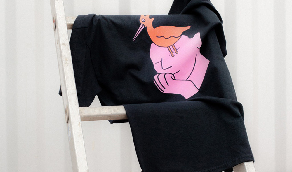
Jan Buchzik’s playful illustrations have graced the pages of The New York Times, The Guardian and The New Yorker, and they’ve even appeared as a Google homepage (to celebrate Otfried Preußler’s birthday). Taking its inspiration from Michael Snunit’s book of the same name, his Soul Bird T-shirt features one of the colourful, direct images that are his signature, and he collaborated with the photographer Gesine Laura Hennig to create some beautiful promo shots of it too.
Bjenny Montero – 50/50
Melbourne-based Bjenny Montero (or “the underground hero of comic strips” as It’s Nice That put it), has gained a cult following over the years, with a portfolio that includes merch for the likes of Mac Demarco and Kurt Vile. His exploration of censorship for our 50/50 campaign with Amnesty International, charted the dismantling of a wall, as he put it, “Censorship is just borders and walls being built.”
Venus Libido
Venus Libido doesn’t shy away from difficult topics. The UK-based illustrator uses her work to confront misogyny and patriarchal values, in her own words: “We must challenge what has been the norm for so long and we must address the things that are taboo.” Part of the lineup for our 2018 50/50 campaign with Amnesty International, she’s since brought out this hoodie with us too, and we can’t think of a better visual summary of Venus’ style.
Joey Yu – Midnight Walk
Colour is a big part of Joey Yu’s work and she played true to form with her Midnight Walk design, opting for a vibrant red long sleeve top instead of a plain white tee. She really turned the whole garment into her canvas; as well as including an originally 2D illustration, she added contrast blue writing down each sleeve.
Claire Barrow – Smoking Cloud
When we spoke to Claire Barrow about last year’s Archive Revisited campaign, she traced an interest in illustrating clothes as far back as school; “I started drawing on jeans and clothes at school, even making them for my friends for 5 quid.” Taken from her 2015 Autumn/Winter collection, High Flyers was based on the relationship between freedom and the commercial world, “I was imagining a woman working in a skyscraper flying out the window to escape the misogyny and sexism that brought her down to earth.” And she chose to fundraise for a cause close to her heart too, donating a portion of the proceeds to the London charity NIA, which offers hands-on services to women and girls suffering any form of male abuse.
Ruohan Wang – Brave Women On The Way
For our International Womxn’s Day campaign, Berlin-based illustrator, painter and visual artist Ruohan Wang decided to update her own logo. “On my original design there are 8 genderless legs,” she explained, “I added high heel shoes. Brave and together with love, we are on the way to a better world.”
Isabell Altmaier
Originally created for the exhibition wall at Illustratoren Festival, Isabel Altmaier’s linocut and riso printed piece looks as good on a T-shirt as it did on a display wall. An exploration of the word ‘Kiss’, Isabel’s illustration tackles ideas of paradise and sin, with a snake and apple nodding to its Edenic origins. The primary colour scheme means it’s remarkably uncluttered and clean looking, despite all the references it contains.
Read our break down of 8 tools and resources for great T-shirt designs here.


