Photo courtesy of Repeater Books
It was only a matter of time before the ever-growing merch market and the world of literary status items (eg.: The New Yorker tote bag) found a mutually beneficial arrangement. So, it is no surprise that literary merch is having a moment: from the infamous bucket hat that accompanied the release of Sally Rooney’s Beautiful World, Where Are You, to The Paris Review’s tees, shorts and sweatshirts – and our very own collabs with the likes of Repeater Books, Slanted Publishing and Peninsula Press. But just how easy is it to make merch as an independent publisher? We caught up with Repeater Books’ Christiana Spens to discuss their design process, bringing their authors’ vision to life (and potential legal pitfalls).
Why did you decide to create your own ‘merch’?
My colleague Katie King and I started at Repeater around the same time – March 2022 – and since we both come from artistic backgrounds, we immediately saw an opportunity to take some of the brilliant titles that Repeater was publishing, and find visual ways to connect them to new people. Our first project was a T-shirt celebrating DEEP SNIFF by Adam Zmith — I did the illustration and then Katie adapted it using Illustrator for the T-shirt design. We discussed ideas with each other throughout, so it was a really fun and organic process. From the beginning, we wanted to have merch that could coincide with the summer events and festivals we were also organising for the authors, so that was a key factor in what we designed and the general spirit of the process.
It seems like there’s an increased trend in the world of publishing to accompany book releases with a physical keepsake (see: Sally Rooney bucket hat). Why do you think this is? Where does the demand come from?
I found the bucket hat thing funny at the time – kind of audacious – but I could see that people were enjoying the hype. Faber also have a great reputation for their cover designs so it made sense they would amp up their merch in that way, and I really like how they’ve celebrated their designers and illustrators since then as well, with a range of prints and so on. Design has always been an important part of book publishing and I think the demand for a bit more focus on that side of it comes from people in the industry wanting to highlight all that great work that is going on, but also from the readers wanting to savour a favourite book with art and limited editions, as a way of celebrating the book beyond reading and remembering it.

What was the design process like?
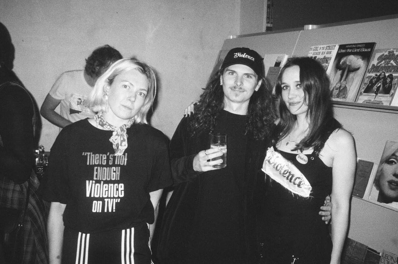
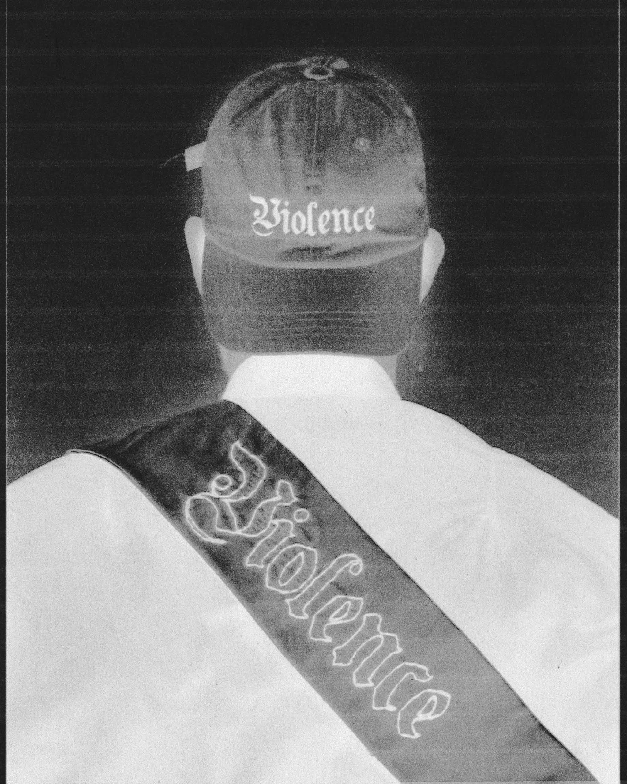
For the DEEP SNIFF tee, Katie and I worked together independently, and then Katie liaised with the Everpress team for production and everything else. We also worked with the editorial team to choose an excerpt from the book, which we shared online when the campaign was ready. For our second project, the VIOLENCE cap to celebrate the publication of Philippa Snow’s WHICH AS YOU KNOW MEANS VIOLENCE, we were actually just chatting with Philippa in Tate Modern and quite flippantly suggested a cap (Katie and I had talked about it prior). Philippa suggested the font and then Katie found one similar to it and amended it. It was the font she originally wanted for her cover but the team went with another design, so it was a nice opportunity to bring back her original vibe. And then I suggested the baby pink colour… and we took it from there. So again, it was very spontaneous and organic. We all loved the hat, and ended up designing a version in black because there was demand for it as well. It was really fun to see lots of people turn up to events at Claire de Rouen and Reference Point wearing their Violence caps, it felt like a real moment.
What advice would you give to other independent publishers wanting to do the same?
It depends on your publicity and marketing teams, and the design backgrounds that people have. There are various ways you could go about designing a T-shirt or other product, and it’ll depend on who you’re working with. Personally, we wanted to go beyond using just the covers themselves, as we could have done that quickly in-house, and also you can run into legal issues with that sometimes (if you only want to use some of the cover, for instance). Basically, the more creative you are, the better, because then you’ll make the most of the process and its opportunities. I found that Katie and I working together has really helped make the process fun and dynamic, so if you’re lucky enough to have a good synergy and team then that’s the best scenario. Currently, we’re designing another campaign for RED ENLIGHTENMENT so watch this space…

What appealed to you about working with Everpress?
Repeater shares a lot with Everpress in terms of its radical, creative and subversive vision, so we were ver excited to work together. I already had a few pieces so I was a fan myself, and it was just a dream to bring our ideas to fruition and make the publicity process a bit more creative and inventive. We also loved the editorial side, and that we could use these designs to actually bring the books and authors to a new audience who would most likely align with their ideas and work. And as creatives ourselves, we were impressed with Everpress’ commitment to supporting other artists, of course.
Explore our Creator Toolkit to learn more about designing tour merch, running a grassroots fundraising campaign and more, and read more of our collaboration with Repeater Books on The Block.


