Building a wholly beautiful and optimised campaign should be your goal, and product description are a key part of doing this. Though it might seem secondary, just a few clear sentences will fill in any details about you and your design that aren’t obvious at first glance, and it’ll really help get your message across to anyone arriving at your page.
The easiest way of approaching this is to think about the info you’d look for if you were browsing a similar campaign. Ideally, you should include:
- Brief info on you or your organisation
- Design inspiration
- Summary of your cause if you’re raising money and awareness for one
Whether you’re an individual seller or a charity, organisation or collective, we’ve outlined how to make sure you’re covering these in just a few sentences with examples below:
Product descriptions and your campaign page
If your campaign page isn’t already telling your story through imagery and links to your social media profiles, we suggest you do that straight away. See our guide on making your campaign page look pro for more info.
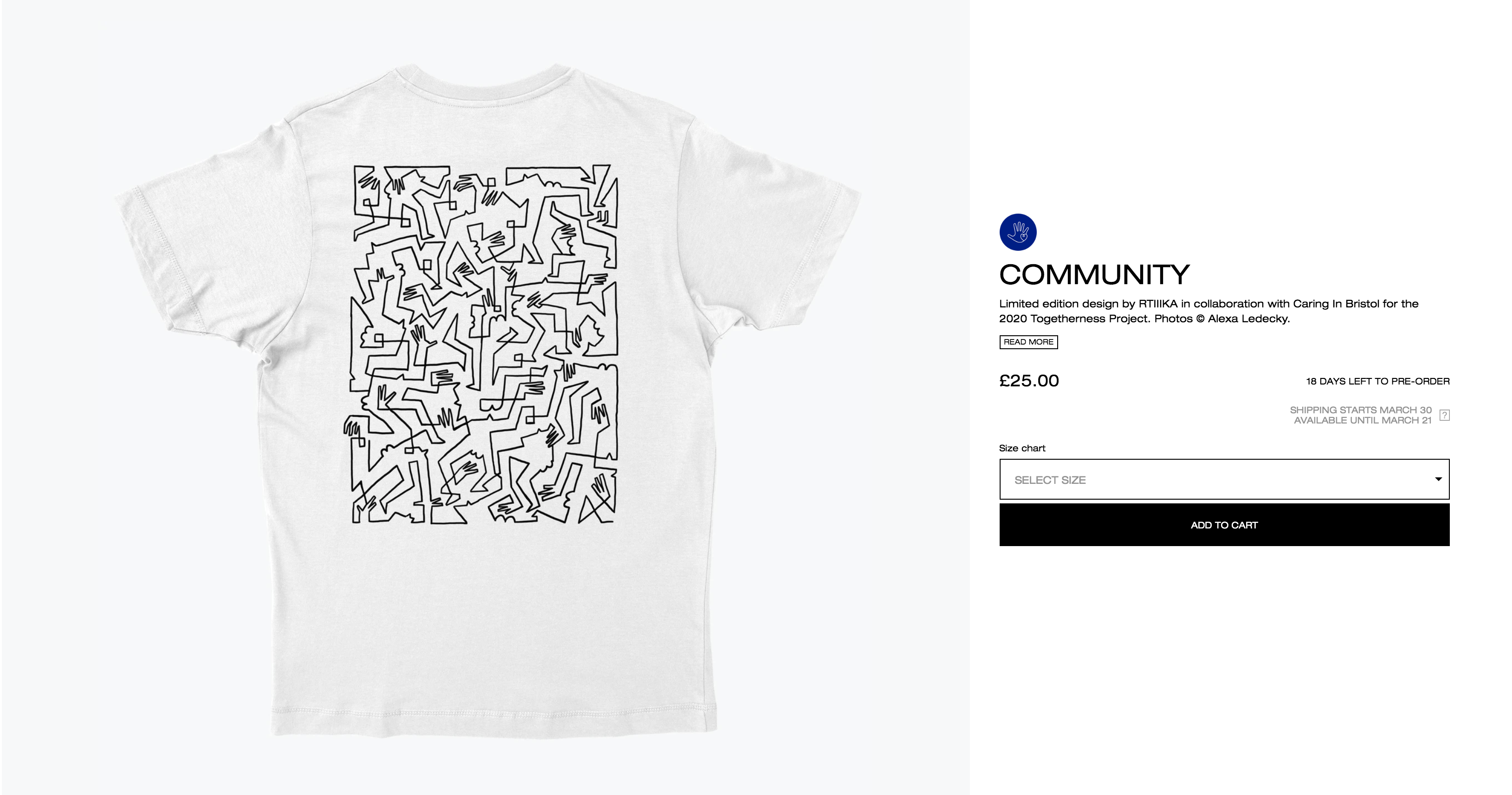
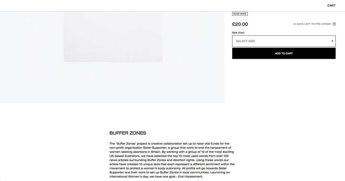
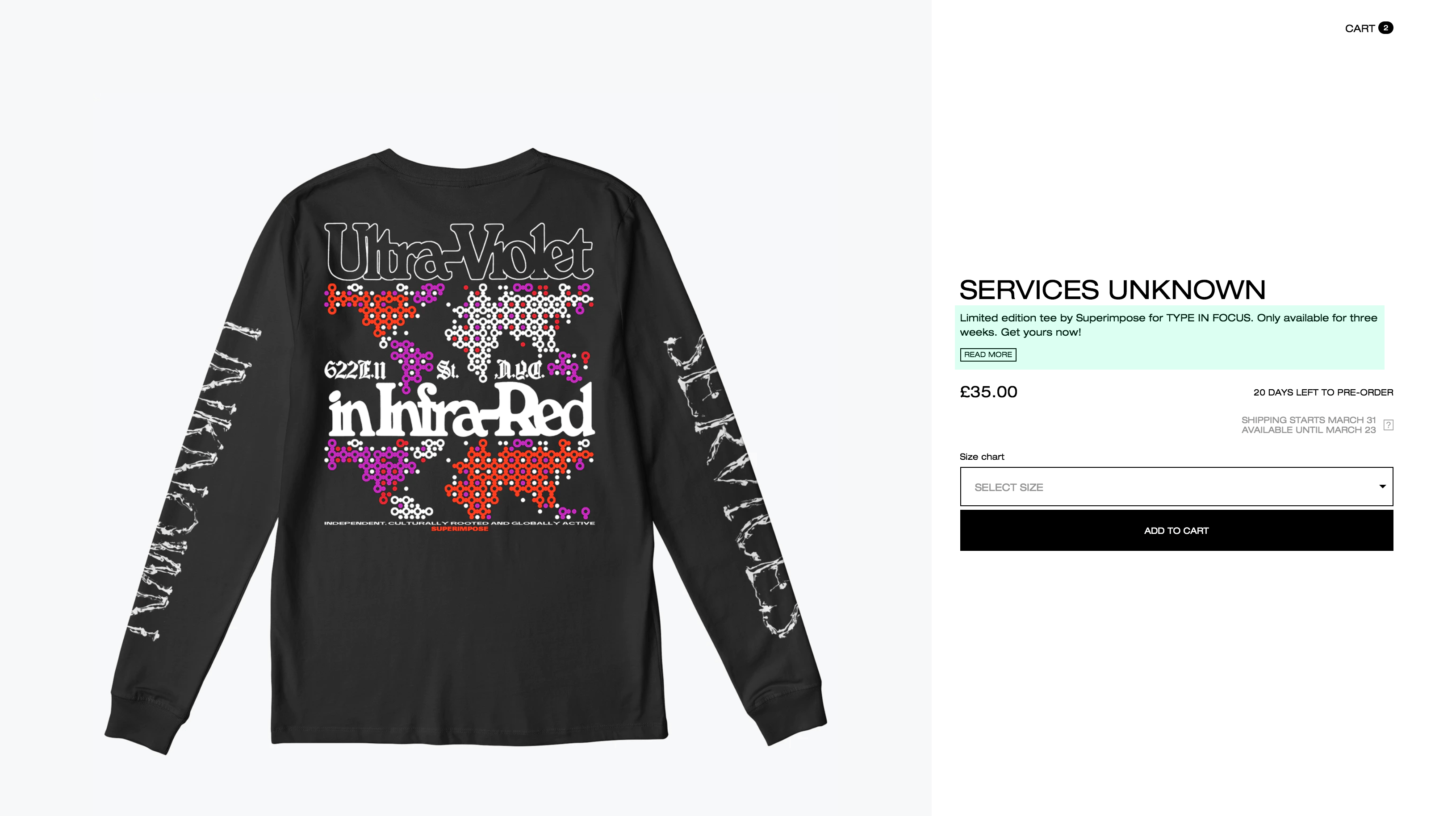
The text field directly to the right of your displayed T-shirt mockup allows for 150 characters worth of text. We suggest you compress the key elements from following the guide below into this section and use the full description in the additional ‘add text’ sections below.
Tip: The ‘read more’ button will direct buyers directly to your additional text and content fields below the product mockup.
Keep It Simple
The description doesn’t need to be formal, stick with the language you’re comfortable using on your channels already and remember it should be straightforward and informative rather than overly descriptive. If you’re struggling to write it from your own point of view a trick is to use third person, just like you would with an artist bio: “John is a London-based illustrator…”
The Basic Outline:
These are the key points most product descriptions should follow, but definitely play around with their order depending on the purpose of your campaign. If you’re fundraising for a cause, say, you might want to lead by talking about it, whereas if you’re selling your own merchandise then opening with an explanation of your design can work well.
Sentence 1 – The Design
A little insight into your inspiration can help get your audience excited about your work; think of this as a way for them to understand the process and context behind your design. You can mention what led you to your design, or any references or precedents. And remember, simplicity is key, this can be as obvious as “Inspired by ‘80s club culture…”
If it’s a limited edition run(never to be launched via a campaign again) or a design based on one of your most popular graphics or illustrations then it’s definitely worth flagging this here.
Example:
- “Inspired by ‘80s club culture…”
- “as Inspired by her racing car driver dad’s”
- “The campaign saw 20 designers and artists interpret the theme of ‘sanctuary’”

Sentence 2 – About You
Don’t assume that everyone who lands on your campaign page will already be familiar with you and your work. If a friend or one of your followers links to your work, sending new people in their networks to your page, you want them to get up to speed as quickly as possible. How? By giving context.
This bit really doesn’t need to be lengthy, just a quick summary of what you’re about will cover it:
If you’re an individual:
- “Ava is a model and artist whose illustrations have featured in It’s Nice That, AnOther and others”
- “Jack is a skateboarder and graphic designer who’s recently branched into making T-shirts”
If you’re a charity, collective or other organisation:
- “Amnesty International has been supporting human rights defenders for over 60 years.”
- “Extra is a collective of female and non-binary artists who work across illustration, fashion and film.”
- “PINK is a design studio, who work across architecture, graphics and branding”
Sentence 3 – About Your Cause
You’ll only need this if you’re running a T-shirt fundraiser, and if it overlaps with your bio that’s no problem. If you’re partnering with a charity or raising money on their behalf, you’ll want to include their name and a brief insight into what they do:
“SODA and Everpress have curated a selection of T-Shirts designed by some of London’s finest creatives. All profits go directly to The Childhood Trust, who help some of the 37% of children in London who are affected by issues surrounding poverty.”

Or, if you’re a charity working on a specific project, then flesh this out a bit:
“REBELLION is a creative act of solidarity between women and non-binary artists, and women human rights defenders around the world. Nine women and non-binary artists have produced nine feminist T-shirts, with 50% profit going to the artists, and 50% profit to Amnesty International.”
For more info on making your campaign page look pro, head to our detailed guide here.


