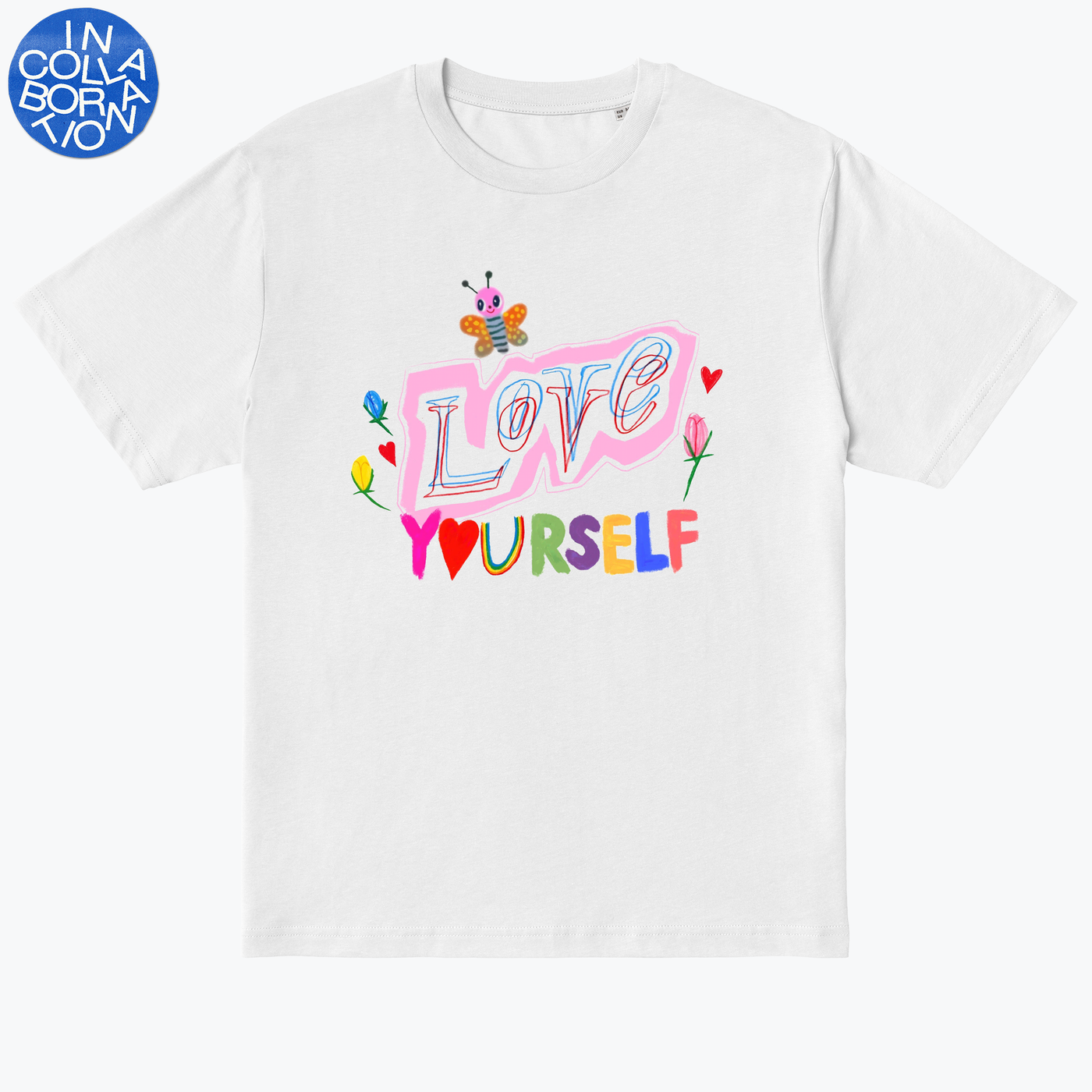
Humberto Cruz and Scott Csoke – Love Yourself
Brooklyn-based artist Scott Csoke first met San Diego-based illustrator Humberto Cruz over Instagram. They bonded over their mutual admiration for each other’s work and have been talking ever since. Their Love Yourself T-shirt was all about maximising what each of the pair do best; Scott flower motif alongside Humberto’s use of text and colour. Scott shares his thoughts on their process.
How did you begin your Love Yourself design? And how did the process go from there?
I think we both really connected on Humberto’s recent work about anxiety and loving yourself and giving yourself patience. I think this sentiment is always true, but there are times when you need to remind yourself of it more frequently, or in a more convincing way.
From there we decided to make drawings that emoted those feelings and that felt authentic to ourselves and to anyone who would see it. We both work very quickly; Humberto is very prolific and makes numerous works a week, and I work in a similar fashion, so I wanted us to have options. I sent him a couple of drawings and he told me he would add his own elements to it. I really loved the final product.
You said you wanted to “incorporate what we do best” for the design. What do you feel Humberto brought to the collaboration?
I know that Humberto makes exquisite and complicated drawings, which is something I can do too, but he definitely does it better. I often work in a more straightforward way. l knew that whatever we presented to each other, we would be inspired by it and able to work off it easily, because we both love each other’s work so much. We love incorporating text so we knew that would be important, so I had text on all the drawings I sent him, and he made it into a more digestible design for a T-shirt.
Instagram is a great tool for collaboration
You first met over Instagram. How important are platforms like this for facilitating collaboration between like-minded artists?
Especially right now, platforms like Instagram are very important. We are on opposite sides of the country so this would have been basically impossible to do without technology. I think Instagram is a great tool for collaboration, especially when it brings about a true marriage of ideas and not something that is forced or contractual. I would love to continue to work with Humberto in the future with any project, he’s a great collaborator.
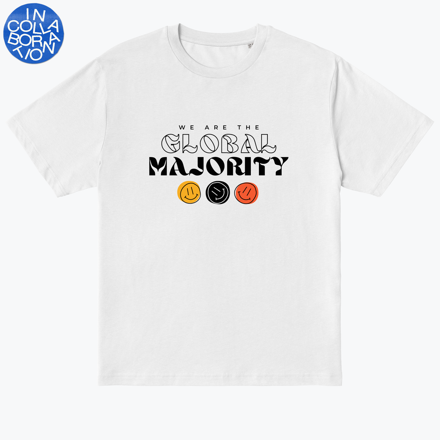
Riot Soup – We Are The Global Majority
A collective of Black and Brown women artists based in London, Riot Soup’s members span painters, illustrators, photographers and more. Together their work includes running socials, curating exhibitions and hosting workshops too. The whole collective was involved in creating their We Are The Global Majority T-shirt, and they even let their audience weigh in on which final design to select too.
You went through a process of several designers coming up with different designs, how did this play out?
At first we had a big group briefing and everyone went away and came back with initial designs. We initially narrowed those down but then realised that we all had way too many ideas, and that working in such a large group was not going to be efficient.
So we rewrote our brief and split into smaller groups: a copy group and design group. The smaller groups would then feedback to each other before presenting their work to the wider group for opinions and discussion. It took several rounds of this and lots of trial and error before we narrowed our options down to four complete designs to take to Instagram polls!
How did the process of designing a T-shirt differ from the other work, like the exhibitions and workshops, that you do as a collective?
It was actually the most collaborative we have been to date as a group. Previous collaborations haven’t demanded as much creative focus from us and this particular project required us to merge ten voices into one. It was a real challenge but eventually we got there!
We wanted to add an extra step to the collaboration process
I loved that your ‘end result’ was several finished designs that you then polled among friends of RIOT SOUP. In a way you made your final design into a wider collaborative decision too. How do you feel this went?
We wanted to add an extra step to the collaboration process by inviting our friends and online followers to have the final say on which design to take to print. We had a fantastic response, much better than we actually expected! There was a clear winner, which is the design we see before us today!
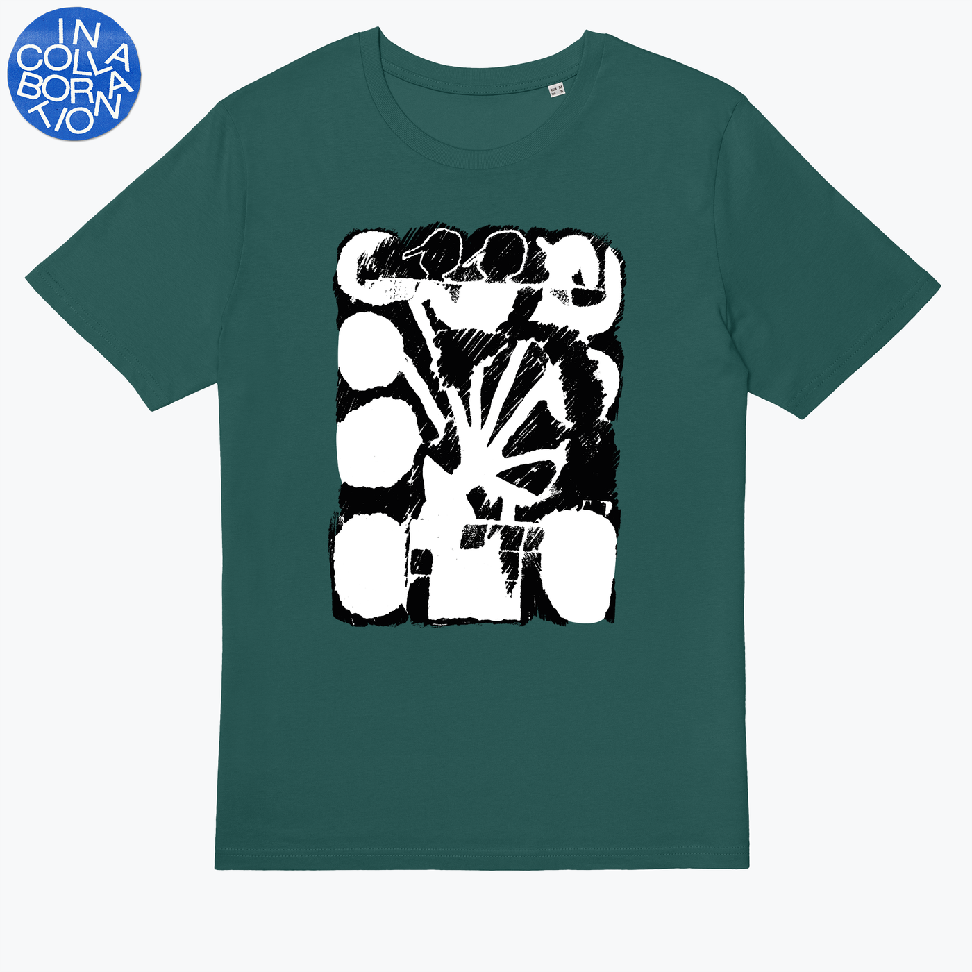
Eric Reh and Jim Klok – Acetone College Paintings
Eric Reh is a graphic designer who works out of Amsterdam, and Jim Klok is an artist and illustrator based in Berlin. A fan of Eric’s since he discovered his work on Instagram a few years back, Jim reached out to see whether Eric would be up for collaborating. Their Acetone Collage Paintings tee came about through a process of reworking. Eric sent over some photos of his work, Jim started making prints of the photos, and it snowballed from there. Jim and Eric shares their insights on their collaboration.
You worked through a process of Eric sending over photos of his work and Jim beginning to work out how to make acetone prints with his bigger drawings. Was it difficult to work with and adapt another artist you admire’s work? And how did this flow?
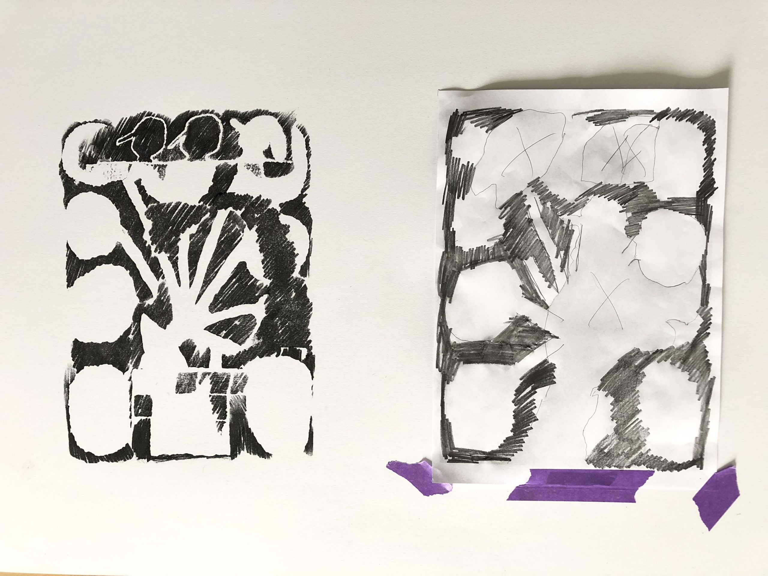
Jim Klok: It took a little time to find a sweet spot in which our work could have an even balance in the final design. I selected a few of Eric’s paintings that I thought would work well as an acetone collage and then started meshing stuff together. After a couple of trials, I realised I should just keep it simple and process Eric’s work in a more direct way. I printed three of his paintings on a Xerox and started making black and white acetone collages with those.
In terms of difficulty with being a fan of his work, it didn’t feel difficult to touch the work at all. I guess the plan was to have both of our styles shine through, so I didn’t feel like I was compromising anything. Eric was happy with the process stuff I showed him, so we quickly came to a final result.
We wanted both our styles to shine through
Why do you want to collaborate with Eric in the first place Jim? And why did you feel your different practices would mesh well together?
JK: After the idea was pitched to me by you guys, I didn’t hesitate for very long! Eric has been an influence on my work for a good few years now, so it felt right that we’d do something together.
I guess we are both just really into drawing. Even with the acetone stuff that I tend to do more of now, I’m still ‘drawing’ those images onto paper, because that’s the nature of acetone printing. You sort of ‘press’ an already printed image that’s soaked in acetone onto another piece of paper with a pencil. This gives the images a scratchy, sort of crude aesthetic, which matches well with Eric’s hand style and signature.
What did you both learn about your own practice through this collaboration? And will it change the way you make work going forward?
JK: The idea of collaborating in this way is something I’d never considered. The way in which my practice can serve as a tool or some sort of filter makes it exciting to take other people’s work and adapt it to combine in this way. I’m thankful Eric gave me so much freedom and trust to mix his work together!
Eric Reh: It felt totally new for me to give away a piece of my work, which I considered to be ‘finished’ to someone I don’t really know in person but only from Instagram and the internet. But I did actually work on a zine last year with my partner Anna Beil, and I realised there were some similarities in how we made the zine to how I worked with with Jim; I made some black and white drawings and gave them to her and she did the colouring.
One of the most inspiring things about the project with Jim was seeing the technical metamorphosis from a photograph of several of my paintings on linen on quite a huge format to an acetone print/ drawing – mixing up with Jims style – and from there to a shirt design.
I love how both our styles of drawing mixed up in this metamorphosis and became something beyond – a new style, a new visual language. Transforming aspects of my drawings into different media has become a big part of my work recently, I guess this collaboration with Jim just came in the right time. Both these project experiences definitely made me hungry for more new projects like these in the future.
What do you have to keep in mind when designing T-shirts?
JK: The majority of my day-to-day work consists of designing T-shirts so it was familiar terrain for me. In terms of producing something like this, the design is always influenced by practical factors, like limiting your colours in order to use the screen print method, and sizing comes into it too because there is a limit to how big you can print on a shirt.
Another consideration for us was keeping the shirt wearable, if that makes sense. I like artists’ shirts that just present the work clearly and simply, to me these are the ones that withstand the test of time. I feel like if an object like this becomes overly considered, it maybe loses something that’s special about it. So I hope we succeeded in that!
ER: I design shirts on a regular basis, and I’d say the big thing is that the clothes I add my illustrations or drawing to should stay wearable, and I like them being timeless in a way too. On every other medium I could go totally crazy, for instance with colours, in almost every direction – I don’t think of the outcome in a way that it has to fit in somewhere. Jim and I totally agreed on both of these aspects. I hope you like the result.
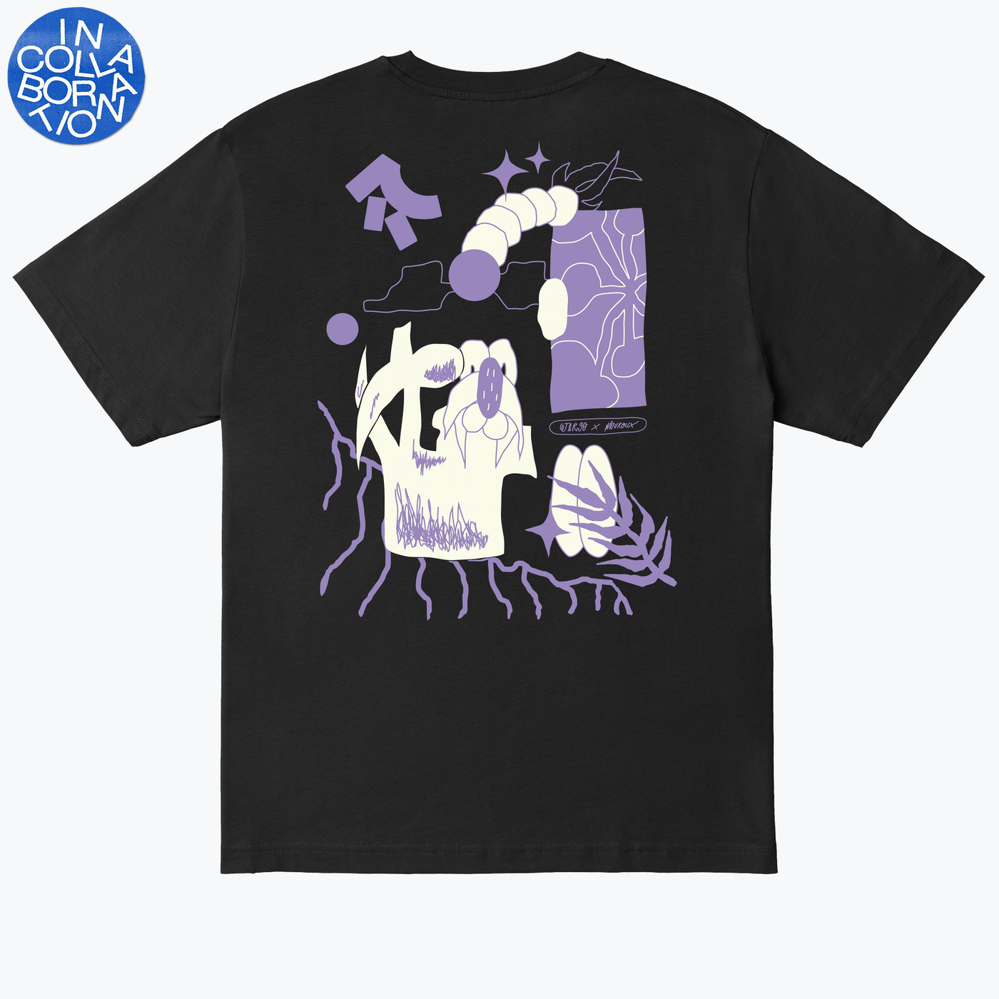
Maxime Mouroux & Jer 90 – Lovely Night
Working at the intersection of art and design, Maxime Mouroux has gained a sizeable following for his tufted wool carpets, made to look like paintings. He paired with Jer 90, whose work spans graffiti, painting, sculpture and publishing. Both based in Brussels, their Lovely Night tee was the result of a back and forth volley of ideas, combined with a final in-person session to hit on the design.
Before this collaboration you already knew each other through friends, but was this the first time you’d worked on a project together? And what made you want to work with each other if so?
Maxime Mouroux: Yes, this was the first time we’ve worked together, but we were already in the habit of speaking about our respective projects anyway. I wanted to work with Jer because I like that his style is simultaneously different from mine, but in certain aspects overlaps with what I do too. I just felt our two styles would sync up.
I felt our styles would sync up
Jer 90: We’ve known each other for a while but not had the occasion to work together yet! But because of our existing relationship I was confident this project would work out.
How did you begin your design? And how did the process go from there?
MM: We spoke together about the different ways we could approach the design and what would be best for us. The way we decided to go about it; we each drew up our own part alone, then combined them. I wasn’t in Bruxelles when we first started working on it, so we worked solo, then when I was back we met up and finalised the design. It felt very natural as a process, and the end design came about quickly.
J: We began by making drawings and sending them to each other, and then we mixed the works solo as Maxime wasn’t in Brussel initially. Then when he was in town we met up to find the best match out of our works. We wanted to make something spontaneously, like the quick initial drawings we made, so the selection of a final version was quite quick.
Though you both work in quite different mediums, there are aesthetic similarities in your work. In terms of skills, what do you feel the other brought to the collaboration and did you learn anything by working with someone who works in a different medium?
MM: There is something similar in our style, but we aren’t drawing in the same way. I draw on paper first, then I move the drawing to Photoshop, and then, I’ll play around with it using my Trackpad. I know this isn’t necessarily the easiest way, but it’s what I’m used to, and I love to draw like this. Jer 90 draws directly in InDesign, which makes a big difference. In terms of the final design, we had a brilliant result by doing things a different way; it’s good to draw with someone else.
J: It’s funny because through this collaboration we both discovered that our aesthetics match quite well, even if we don’t create through the same medium. Both works are composed of a series of different forms and references: Maxime mostly works with natural forms, and my work is more about objects of desire.
We were surprised by how different our practices were
We were actually quite surprised by how different our practices were, when it came to producing a visual, but it was easy to make it work. Maxime works mostly with papers, whereas I never use a pen anymore. I think you can feel this through the differences in our line markings; that was one of the points that made this collaboration interesting.
Read More: Collaborating For A Cause With Conor Clinch