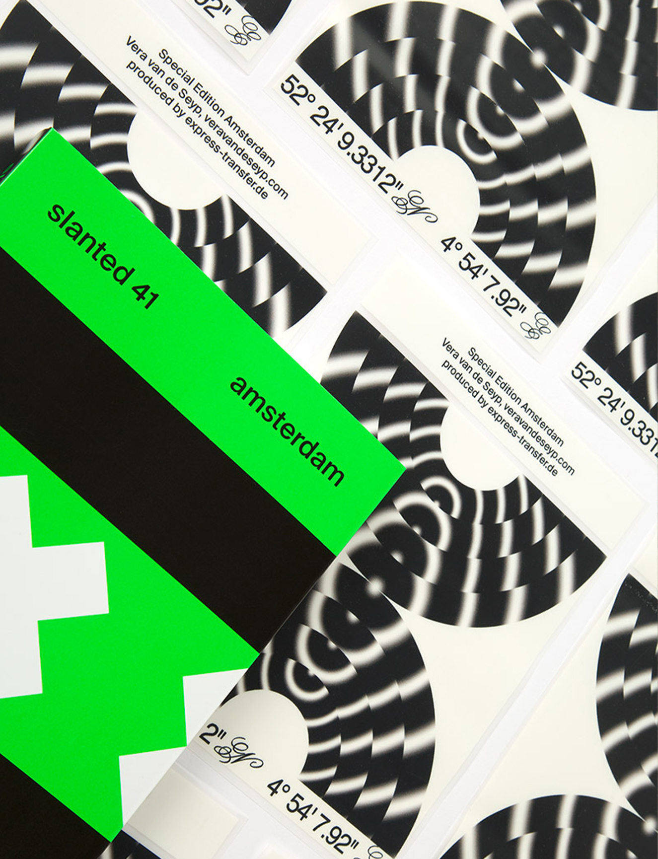
I want to talk a little about the latest issue. Why did it feel like the right time to spotlight Amsterdam? And what feels specific about it as a design city?
Where we go for each issue of the magazine that centers around a city is always a very subjective choice. Every time that we think about the next issue of the magazine, we are trying overall to have a mix of cities that are both well known for their design scene, and others that are either up and coming or that are facing big changes.
At the same time, there are personal relationships that we might have with people living in these cities. The mix of these things; thinking about where to go, whether it’s time to visit a region that we might not have spotlighted, plus our own personal relationships, tends to bring about the decisions on where we should go. With Amsterdam, we had contacts, and we wanted to go to a city that is well known for its graphic design this time, and we haven’t been disappointed.

With a place like Amsterdam that has a really strong design reputation, is there an aspect where you’ll try to show a different side of it, or confound preconceived ideas?
We knew that the designs in Amsterdam would be mind blowing, but there are always discoveries that are very surprising for us. What is so special about Amsterdam, and about the Netherlands, is that colour and form play a very important role, not only in graphic design, but also in everyday life.
Colour and form play a very important role
Design is ubiquitous, from bike paths to police cars; everywhere you look, you see design. One example: the traditional brown cafes, or bruin cafés, which play an important role in Dutch life. We fell in love with them because they were super cosy, and they look very traditional against this highly designed city. We really liked that these differences are possible.
Past issues of Slanted have focused on Stockholm, Prague, and other design capitals. What are some considerations when representing a city in a magazine?
Every time we go for a trip to a city we do a lot of research, as well as having tips from people we know in those cities. We always try to catch some of the ‘old master’, figures who have years of expertise and are at the top of their careers, and at a similar stage in their lives. They will also have a lot to say, and an interesting perspective on a city, when you have interviews with them. Equally, we’re also looking for young people; those who have just graduated or are just starting out in their industry but are still making super interesting stuff. You don’t always find those kinds of people on the internet so it can be a case of on-the-ground seeking out.

In terms of Amsterdam, we were really lucky to meet the seminal graphic designer Karel Martens for example. We were only able to meet him because we met the wife of his son for an interview, and then he put us in contact with Martens who doesn’t give many interviews anymore. On the other side, there are also people who are included in the magazine who are probably not as well known.
It’s very interesting to us to be able to catch a designer’s personality in the wider interviews, not only how they work, but to really talk to them and to get an idea of their attitude and their minds. We had a super interesting interview with De Designpolitie, who have a great project called “What Design Can Do”. It ended up probably being one of the longest interviews we had, and it was not so much about design, it was much more about questions like: how do we respond to climate change? How do we deal with all the big problems that we are facing in our times? It’s these unexpected moments which make it very special for us to explore a city.
I think you make a good point about the value of going and being physically in a place, where in journalism now there can be a tendency to use the internet as the only primary resource.
I mean I don’t want to say that we are not doing that as well. When we have finished a trip, and we haven’t had the time to meet somebody, we will still try to get in touch afterwards, and try to include some of their works in the magazine. We also have a written interview section in the magazine called “10 X 10”, where we send 10 questions to 10 creative people who we didn’t meet in person, but still want to include. For us it’s a mix of both; getting the vibe of a city when being there and finding unexpected aspects, which then help us to compile the whole magazine afterwards.
These unexpected moments make it very special
Each year you publish two issues of the magazine; one on a city, and another on a broader theme in design. How does this other kind of issue come together?
In terms of the topic or theme, this is something where we want the community, our community or the design community in general, to be active and to participate. We’ve had themes like colours, experimental type, or the next theme is books, and we currently have an open call for submissions where people can submit their work. For the last call for submissions we had more than 1,500 entries, so there is a big interest in collaborating from our readers as well. We think that this is very interesting; to see what is happening out there, not only with the research we are doing in house here, but also to get information from the outside, and to discover or show work that hasn’t yet been presented.
For a publication that’s centred around design, why do you think having a printed, physical magazine, rather than a digital issue, is important?
We started digitally with the blog in 2004, and then just one year later we published the first issue of Slanted Magazine, so this was a very considered decision actually. A digital presence is still something that is vital for us; it meant we could grow a very big network, and I think that is only possible if you have online channels which give information you wouldn’t get in a printed magazine.
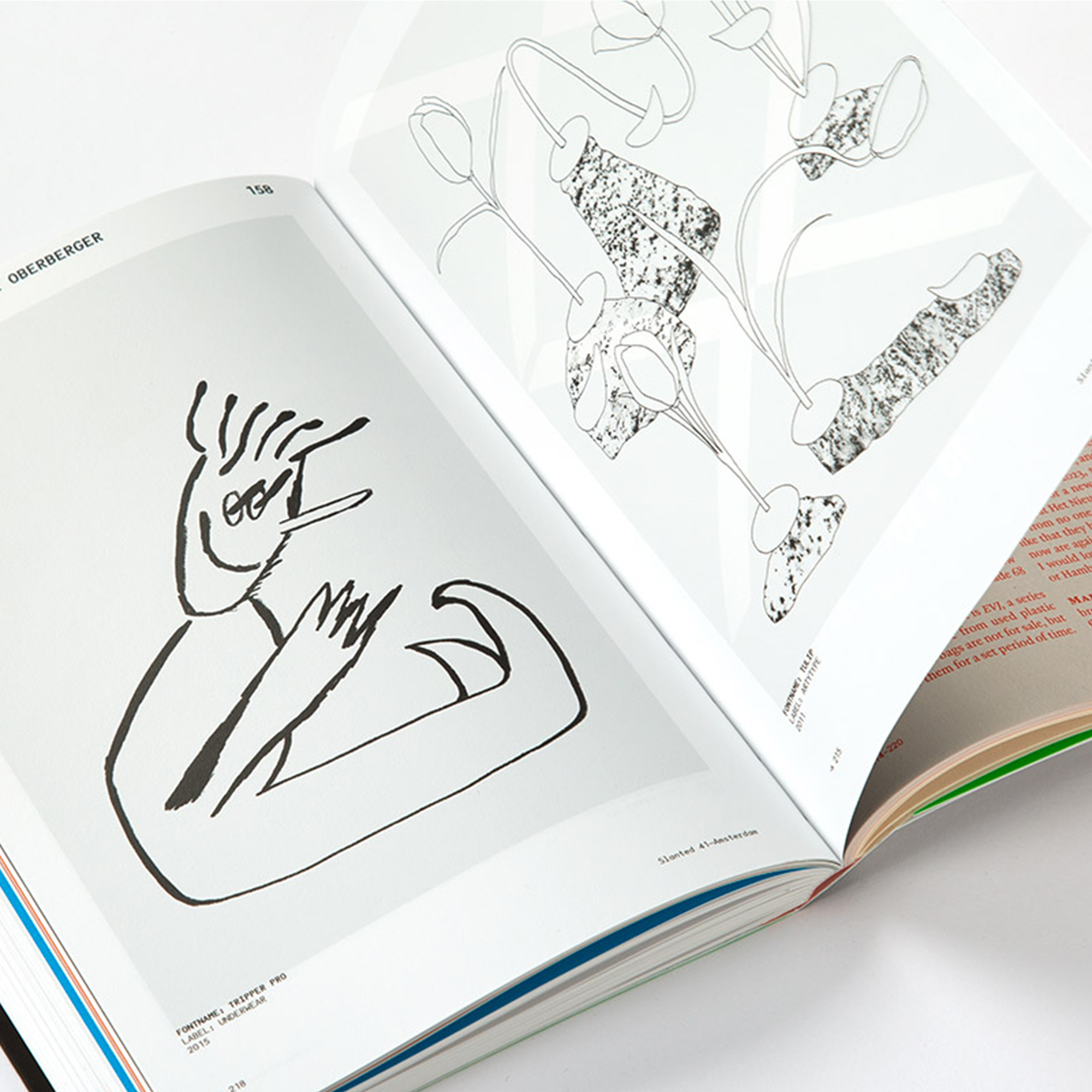
The reason we have both the magazine and the online platforms (including our social media channels) is that, in my opinion, the online channels are very useful for daily news and for things that should be accessible very quickly. The magazine is something completely different. You have that printed value, it’s produced very nicely, we have thread stitching, we have special colours and these aren’t things you can experience when you only have an online version of it. A magazine, unlike a laptop or tablet, is something you can throw in a beach bag and take to the lake with you, but it’s also something that people keep on their shelves, to last for a long time.
How has Slanted grown since its inception in 2004? And what do you think has stayed the same?
To keep the long story short, we started with a blog, and then one year later, we decided we wanted to slow down. In a very short time the platform had become very famous, we had a lot of visitors and a big network that grew over a very short time.
So the first magazine was about us wanting to slow down and go deeper into different topics, because you don’t necessarily want to read long texts on the internet, do you? The first issues we published maybe once or twice a year, we didn’t have a fixed schedule because the magazine was something we made on top of the daily graphic design work in the studio.
The magazine was about slowing down
We built up the magazine, tried to have it published twice a year, started with subscriptions, started with distributions. At first we printed digitally with only 300 copies per issue, then in 2008 we moved to offset printing which was a big step. Eventually, we also started to edit and publish side projects like the Yearbook of Type, which is a book about typefaces. In 2014 we split the company and created Slanted Publishers, an independent publishing and media house, so it was not part of the design studio anymore.
Next year we’ll celebrate our ten year anniversary. In the past few years we have also grown so that now we are not only publishing our own books and magazines, but also a lot of other great designers, photographers and authors in the creative field. At the moment we’re on about one or two publications per month, which is quite a lot!

In terms of creative work that you spotlight, what do you look for in work that interests you? Are there common themes in the work that you like?
It’s pretty varied, actually. Our main focus is definitely on graphic design and typography, and those fields are what we have our biggest readership for. But we are also very interested in photography, for example, as well. We know that a book about graphic design or typography sells better than one about photography, but we want to publish both, because we think that it is important to not only publish books because they sell well, but also to cover your interests. We did have a book, for example, about architecture and skateboarding, called Ar/KATE. It has nothing to do with graphic design or typography, but it is very nicely designed.


