Tré Seals, Vocal Type Co.
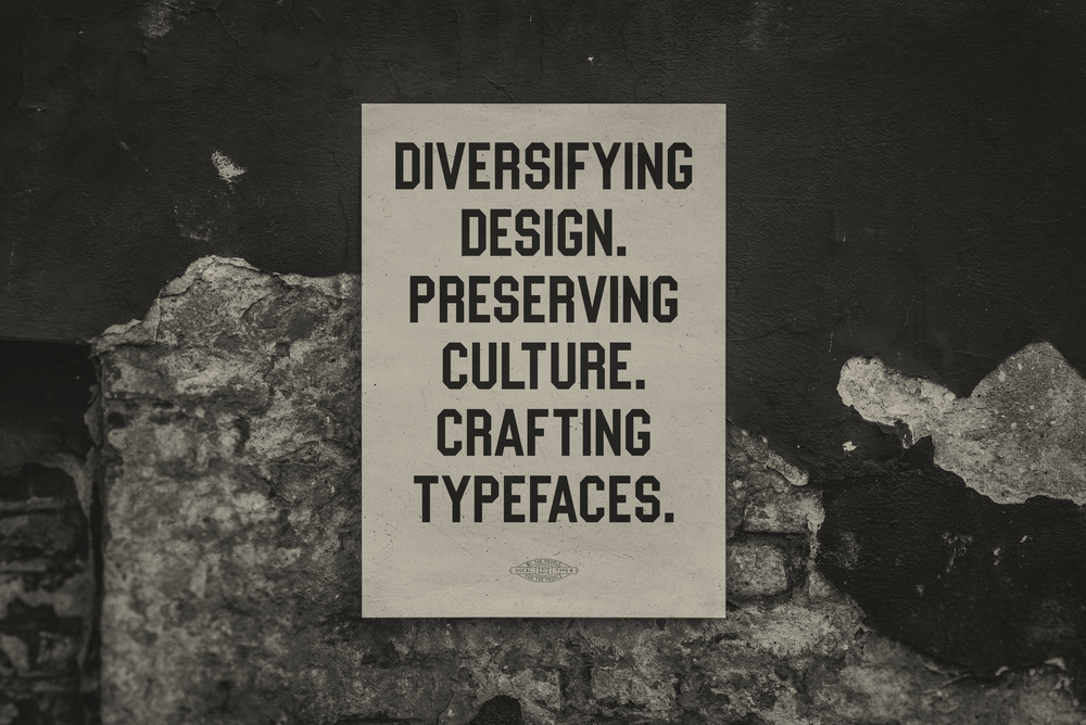
“I decided to find a way to increase diversity and empathy in the design industry. I knew I couldn’t just change the demographics or the education system. So I tried to figure out a way to introduce a non-stereotypical piece of minority culture into the design itself, starting with the basis of any good design — typography.” So reads the mission statement of Tré Seals’ foundry Vocal Type Co, an independent initiative running since 2016 which seeks to diversify design innovatively.
As you see it, why is type design so important in the world?
Type is strange. On the one hand, it’s subliminal to most people. However, it’s also the most direct form of visual communication. Type says a lot about a person, a brand, or whatever the text you might be reading is about, before you even begin to read it.
Different typefaces, like people, have different personalities. For example, type is how you can tell the difference between an antique store and a tech company or a historic university and a sports team. Type guides us through every street: it’s how we tell time, it’s the reason we have books, text messages, websites, food labels, and almost everything in our lives.
What is your guiding ethos when it comes to your own practice? What kind of things do you find important to keep in mind when designing type?
I’m a firm believer that everything happens for a reason. And in line with that, that every design decision should also have a reason behind it. So at the end, by the time you’ve compiled all of these design decisions, all of these reasons, you have a story. And stories are what connect us. Stories and histories are what make Vocal, Vocal.
So for me, when I’m designing type, I always have to ask myself, “Will this decision help or harm the story?”
Different typefaces have different personalities
RACHEL DENTI
Originally from Brazil but now based in Portland, Oregon, via a stint in New York, Rachel Denti is a graphic designer with a remarkably versatile body of work under her belt. Scan the Instagram of Denti, who is now a designer at Nike, and you’ll see posters for club nights alongside relatable slogans like ‘being alone is hard/not being alone is hard’ and ruminations on her industry too.
As you see it, why is type design so important in the world?
I think type is capable of expressing feelings, emotions and even informational cues beyond what words themselves mean. The exact same text can have a completely different interpretation depending on what typeface is used.
By looking at someone’s handwriting most of the time you can tell if they were in a hurry, or if they were feeling angry or sad at the moment of writing. Typography has a similar power, as it contains a range of subtleties that add a lot more depth to whatever message that word or text is aiming to convey.
I’m a designer first, type explorer second, so I tend to think more about impactful type usage than type design itself. Typefaces on their own can definitely hint at certain meanings or feelings, but I believe it’s their design in addition to how and where they’re applied that dictates their true significance and interpretation.
Is there one example of type design that you think really captures and illustrates this?
I have always had a fascination with ‘mundane’ type work: signage, flyers for businesses, parties and service providers, informative text, packaging, graffiti, whatever. For me, all of these are a very interesting study of how non-traditional designers think and use type.
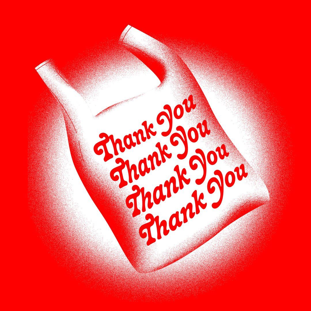
Take the “Thank you” script-type bags you see in New York; they convey a certain kind of post-capitalist melancholia like nothing else, and the trainline caution sign that reads “Stop, Look, Listen” in bold has a condescending, provoking tone that makes me strangely uncomfortable.
The first time I remember feeling like this towards type was reading the instructions on the microwave popcorn bag as a kid. I can recall being literally terrified of the sudden bold, large-sized, all-caps line: “STOP MICROWAVE IMMEDIATELY WHEN POPPING SLOWS DOWN TO EVERY 2 SECONDS.” It caught my attention so much, over any other part of the instructions too, that I honestly thought the microwave would explode and set my house on fire if I didn’t stop the microwave at that precise moment. Needless to say, I am to this day a very good microwave popcorn maker.
What is your guiding ethos when it comes to your own practice? What kind of things do you find important to keep in mind when designing type?
In our field, I think it’s really easy to get lost in certain design indulgences or pure design porn when the work doesn’t really ask for it. As a lover of design for the pure sake of design, I myself am definitely guilty of that.
With that in mind, I’d say that purpose is certainly the defining aspect of how a typographic work will take form, and practicing humbleness and thinking about what role the type will play in that context is the foundation of a solid work. In some cases, type is merely a support for the assimilation of its content and thus should be almost unnoticeable; whereas now and again readability may come after aesthetics, which always makes for an exciting opportunity to push the boundaries within type design.
BLAZE TYPE
A type design & art direction agency based in Lyon, France, Blaze Type are powered by their egalitarian ethos. At the heart of what they do is the belief that their work should be as accessible as possible; each of their fonts will always cost the same price, and they ensure usability across all kinds of formats is as flexible as possible.
As you see it, why is type design so important in the world?
It’s less about type design as a practice, and more about type in general. So much of the way we communicate and share information is through the lens of type, so in that sense it’s as relevant as any other means that we use to communicate with each other.
Now, type design and its relevance in the world leads to another big question: is it still necessary to design and produce new glyphs, new type families and new fonts today? We believe that everyone wants to have a voice in this too-loud world. And as such, designing new fonts and new glyphs to translate what one wishes to say to the world is super important.
Is there one example of type design that you think really captures and illustrates this?
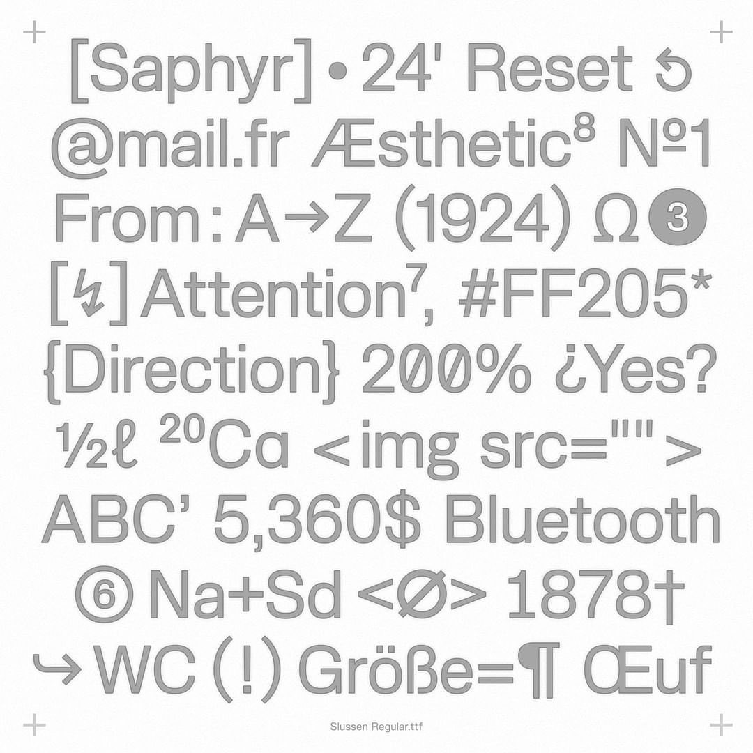
One thing that drives us to bring new fonts into the world is the knowledge that they’ll be used not just by designers, but by people with little to no knowledge of what fonts and type design are.
It’s an incredible success when your font is used by someone who simply wants to use it without overthinking it. Every font that’s put into use by our users is a reward. So there’s not really one example per say; there are thousands.
Every font that’s put into use by our users is a reward
What is your guiding ethos when it comes to your own practice? What kind of things do you find important to keep in mind when designing type?
We try to keep in mind that we are not designing type for ourselves, but mostly for others. In the end it’s our users who are at the very center of our practice.
Nowadays there are so many new fonts being released everyday, it drives us to be innovative in every project we work on. Whether that’s on the aesthetic side of it or the technical one. We try to care as much as we possibly can about the fonts we design and produce because we want to deliver beautiful tools for people to have a good time when using them.
CIHAN TAMTI
Born in Bochum, Germany, where he’s still based today, Cihan Tamti’s route to design started with a teenage love of graffiti, via a stint as a design technical assistant through to a degree at Dortmund University of Applied Sciences. With custom projects for the likes of Adobe and Calvin Klein already under his belt, he started this year publishing his first book Breakout-100 Posters Book with Slanted.
As you see it, why is type design so important in the world?
Typography is always in the background, it accompanies us like instrumental music through our lives. We should consider that a word is an image, and that fonts convey information in different hierarchies and volumes. At long and short distances, writing can or should work in different ways.
Type design itself is especially important in its functionality in the ever-changing media landscape. While everything is becoming simplified and more factual, type designs are needed that surprise, arouse curiosity and attract attention. A lot is quickly forgotten and easily overlooked these days, especially in digital media and in social networks that are so important nowadays. Type can also lead to entertainment, even if it wasn’t the point in the past.
Is there one example of type design that you think really captures and illustrates this?
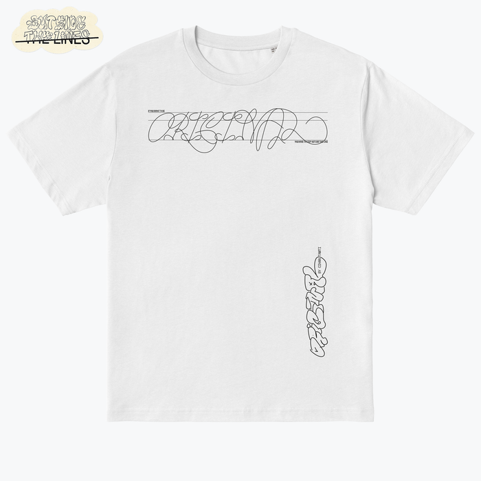
I’m a huge fan of Benoit Bodhuin. With his typefaces BallPill and Gikit, he has managed to create typography with personality in his own style. You should also take a look at his specimens, because they showcare exactly how he handles it himself and how the fonts are presented in a novel way.
Typography is always in the background
What is your guiding ethos when it comes to your own practice? What kind of things do you find important to keep in mind when designing type?
I mainly make headline typefaces that are experimental, so I am not directly concerned with legibility. It’s always more about attention, that it attracts someone and makes them read all the details.
I like to mix styles and I look for contrasts and points that normally don’t belong together, like non-existent ligatures or ligatures between two different fonts, but between all the mess, there are design laws at play. Care has to be taken that there are repeating elements, so that it doesn’t become too chaotic. In addition, the stroke weight plays a big role in the font mixes, so that everything is adjusted.
Most importantly, if you work experimentally on the one hand, you have to work as strictly and cleanly as possible on the other hand to keep the balance. Only one or the other is not possible. Either it is a chaotic salad or a toast bread without communication and sense.
RICARDO FERRARO
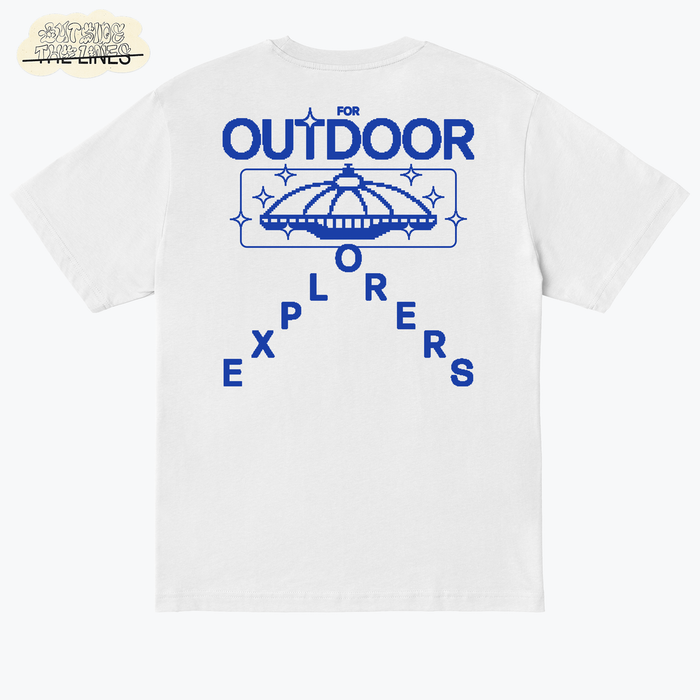
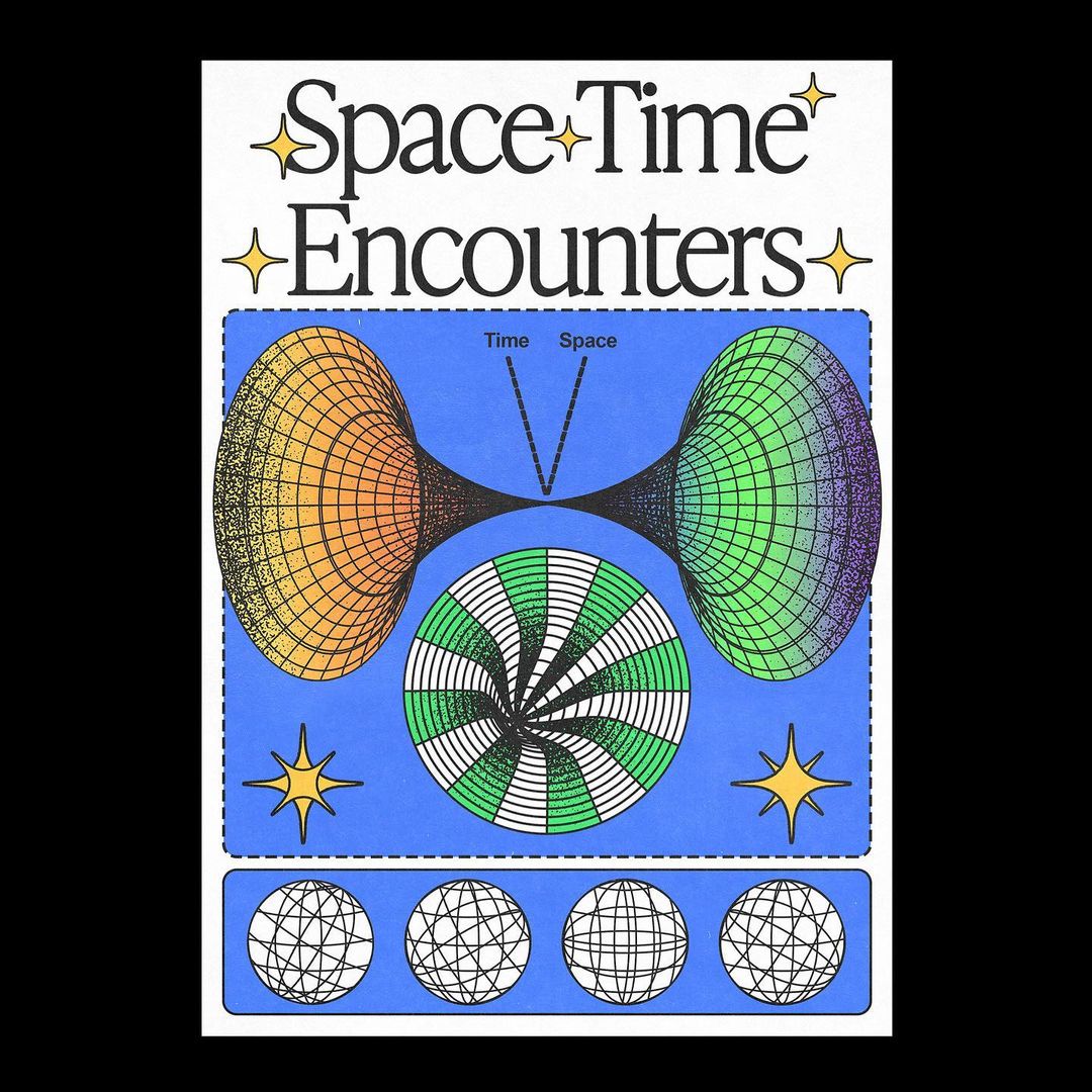
Working out of São Paulo, Brazil, Ricardo Ferraro is a graphic artist whose practice draws heavily on sci-fi aesthetics, resulting in designs that are simultaneously retro and forward-looking. Drawing inspiration from sources as wide-ranging as music, TV shows, album covers, festival posters and old magazines, Ricardo has already got a hit T-shirt with us under his belt.
As you see it, why is type design so important in the world?
With type you can set the mood for the entire project. If you want to convey a sense of comfort, tranquility, anger, love or any other feeling, it all comes down to the type you choose. Type is one of the bridges between the message and the people, and will help guide the emotions and feelings of a project. A single type choice can communicate everything you want to show and say.
Is there one example of type design that you think really captures and illustrates this?
Sure. You know exactly when you are reading a scientific text and when you are reading a comic book, just by seeing the type used in the title of the book. Even if you don’t have images and colours, just a white sheet of paper with text, seeing the type usage throughout the text, you can get a unique sense of what you’re reading.
What is your guiding ethos when it comes to your own practice? What kind of things do you find important to keep in mind when designing type?
Choose or create a type that follows the project flow, using and placing specific features for each type and then take advantage of these characteristics by incorporating them into the piece, making your project unique!
Swiss Typefaces
Started in 2006, Swiss Typefaces was born out of its founders’ shared backgrounds, as designers growing up surrounded by the Swiss (International) Style. Since its inception, they’ve balanced this with their vision of the new generation of design, closely tied to international scenes too. Headquartered in Vevey, Switzerland, they have a second office in Berlin.
What is your guiding ethos when it comes to your own practice? What kind of things do you find important to keep in mind when designing type?
We always took a holistic approach to type culture, and therefore, type design. Designing type can be a complex chain where often the end user or customer is not the client.
Designing type can be a complex chain
Whether you are any person reading, a graphic designer, a corporation or a type designer, you traditionally often work in double or triple-blind. We decided to break this cycle by addressing the whole chain to the best of our knowledge. Each part of the chain has a certain agenda and needs which they are the only ones able to enforce, while other parts are completely unaware of those. From the outset we decided to do the opposite, taking advantage of the multidisciplinary activities that complement our work at Swiss Typefaces. Our vision and structure express it daily and we continue to grow our ecosystem accordingly.
Read More: 14 Visual Artists To Watch in 2021


