DEVELOP YOUR OWN STYLE
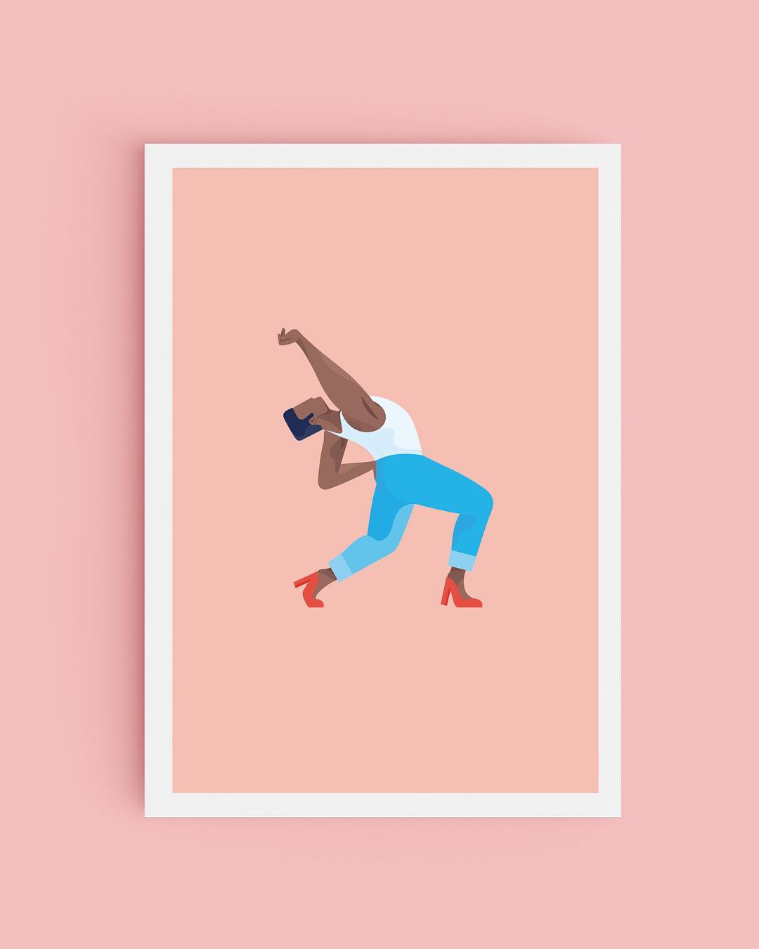
When we spoke to illustrator Kyle Platts and artist Aistė Stancikaitė for their insights into getting your first commission, they both felt there was a value in developing a signature style and consistent body of work. As Stancikaitė put it: “It’s good to stick to what you’re good at and push that further, instead of thinking about how your work should be and comparing yourself with other people.”
Baker too echoed this sentiment when considering what he looks for in an artist as an art director. “The first thing I look at is the overall aesthetic of an artist’s work. I can’t help it, and it’s usually what draws me in,” he said. “Having a set style makes it easier for an art director to go to an artist and their specific style, because you know exactly what to expect and that’s safe when you’re facing tight deadlines.” But, as Baker added, it’s still important to grow and develop your practice too, and good art directors will be aware of this, especially over longer projects. “This can be a bad practice over time, because if you only call on illustrators to do exactly what they’re comfortable doing your work and theirs won’t evolve,” he said.
BUT IT’S GOOD TO BE ADAPTABLE TOO
That’s not to say, though, that flexibility and adaptability are bad things. While a signature style will help an art director visualise how the final project will come together with you on board, as Baker explained, a variety of different commercial, editorial and personally-initiated work will help show what you are capable of. “I think it’s helpful to include conceptual and editorial work in your portfolio, to show range,” he said. “Making really sick 3D renders or beautiful paintings is great, but when I work with an artist who doesn’t have experience with editorial it usually requires more time and active art direction.”
But don’t panic if you haven’t got much editorial experience under your belt; as Baker points out, there are other ways of demonstrating these skills. “If an artist doesn’t have past examples of editorial work, what I look for is an ability to distill complex ideas, or to communicate through image-making,” he said. And thorough art directors will be aware of the importance of finding new talent, too. “I recognise the value of pushing myself as an art director to look for artists who are outside of the big-publication-illustration world and giving them an opportunity to shine,” said Baker. “So I try to do that whenever possible.”
It shouldn’t be hard to get in touch
MAKE IT EASY
It might sound obvious, but one of the best things you can do is to make it as easy for your prospective art director as possible, and this involves taking a couple of different factors into account. Your social media following isn’t everything, but having a curated profile, or a website with a good selection of your work, will make it that bit quicker for an art director to see what you’re about. As Baker summarised (with the help of his coworkers Renald Louissaint and Dora Godfrey) – “Be really clear about the type of work you’re interested in doing, and show some of that work on your site or Instagram.” And secondly: be contactable. Something as simple as including your email address in your Instagram bio can mean the difference between someone being able to get in touch with potential work, or not. “Make it clear how to contact you, or whether or not you’re accepting commissions,” said Baker. “It shouldn’t be hard to get in touch!”

DON’T BE AFRAID TO REACH OUT
Something we hear again and again from our community is the importance of being proactive. It’s a truism, but so often career ‘success’ tends to come down to a combination of luck, talent and being in the right place at the right time, so getting your work in front of prospective clients can mean you’re halfway there. “Send cold emails!” as Baker put it. “If your work is well-suited for the art director/publication you’re emailing, chances are they could do with another talented image-maker on their roster.” And don’t be put off if an initial email doesn’t lead to work immediately; as Baker adds, even if they don’t need you right away, “they’ll at least keep you in mind when something comes up.”
Send cold emails!

SET BOUNDARIES AT THE BEGINNING
When we looked at how to handle creative compromise, something both Jor Ros and Merijn Hos highlighted about working with clients was the importance of making your terms clear at the outset, and not being afraid to push back and have your own opinion. As Hos put it, “I think it’s super good to have all that stuff (budgets or rounds of revisions and deliverables) clear up-front before you start a project.” This rang true of Baker’s advice for working with art directors too – don’t be afraid to discuss the conditions of the project with an art director, and make sure you’re really clear about what you’re undertaking. “The more transparency the better,” said Baker (with input from the team’s art director Tessa Modi). “If you can only do one or two rounds of edits, set your boundaries from the beginning. Ask. Questions.”
REMEMBER WHAT’S IN YOUR CONTROL
In terms of working with clients, Baker had some insights to share from his own freelance work too, chief among them the role the artist has in managing the design process. “Only show work to your client that you’d be satisfied with if they chose it,” he said. “I think as I work for more varied clients in my own practice I’m realizing that’s one of the things that’s always in my control—what I show. I think I used to err on the side of oversharing, and it made for a messy process.” It’s good to bear in mind just how much of the process is under your control, and Baker applies this approach when it comes to getting feedback too. “If your client wants to see a change, it’s up to you how exactly to interpret that visually, that’s still in your control,” he said. “If they’re truly splitting hairs in their feedback (ie. “change that hair highlight colour to pink”) you either have to trust their vision or, more likely, push back with reason and intention.”

AND FINALLY…
Some of the best projects happen through improvisation, working in response to what you’ve got, and taking a lighter approach. To really understand Baker’s process we asked him to select his favourite projects so far as an art director, and he chose two.
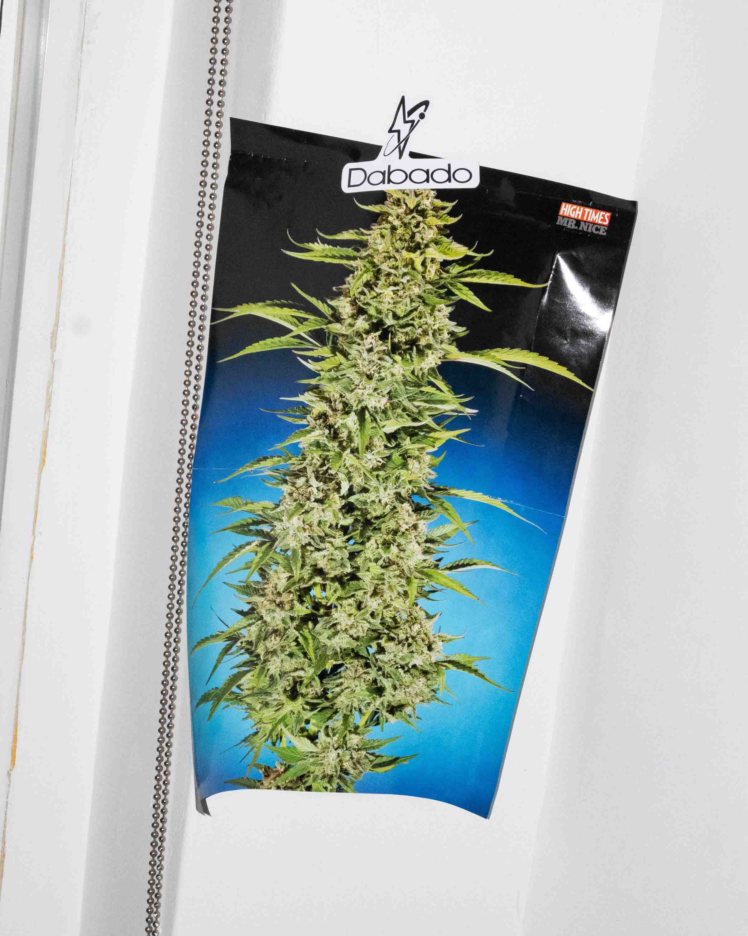
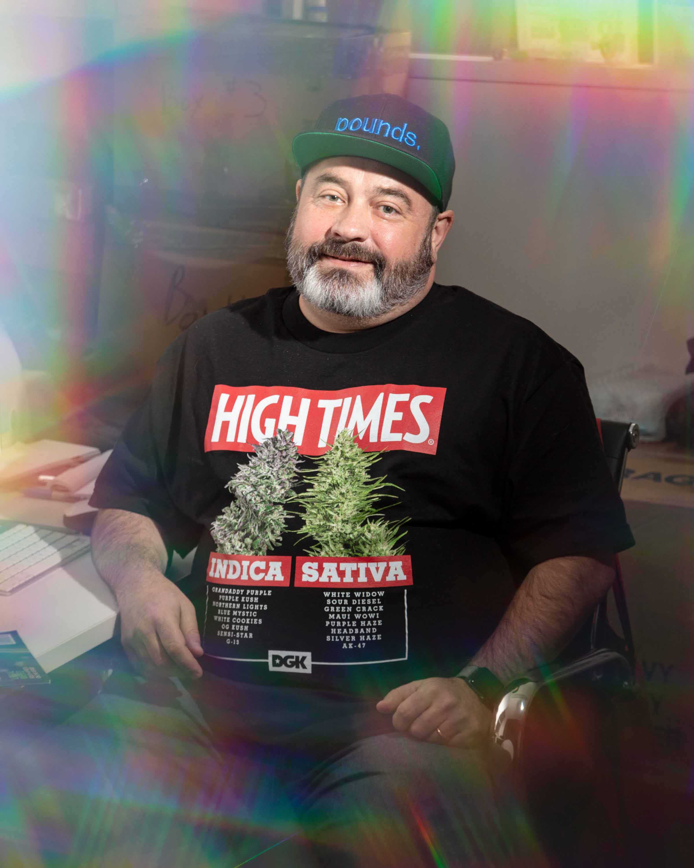
The first was this one about High Times magazine, for Medium’s tech and future publication OneZero. In Baker’s words: “It was really fun because it was my first time art directing a photoshoot and it was with one of my favorite photographers, Chris Maggio. There was a fair amount of planning between myself, the editor and another art director about how we wanted to approach it, or how we could tie in illustration with the photography, who we wanted to use for that, what kind of photos we needed. Ultimately, I went into the High Times office with Chris and it quickly became clear that we had to improvise a bit due to some constraints. We used the smoking paraphernalia they had in the office to make some trippy still-lives and embraced the cold, sterile feel of the office for some shots. Because of the nature of the subject matter, we didn’t have to take ourselves too seriously, and I think that led to a more interesting set of images.”
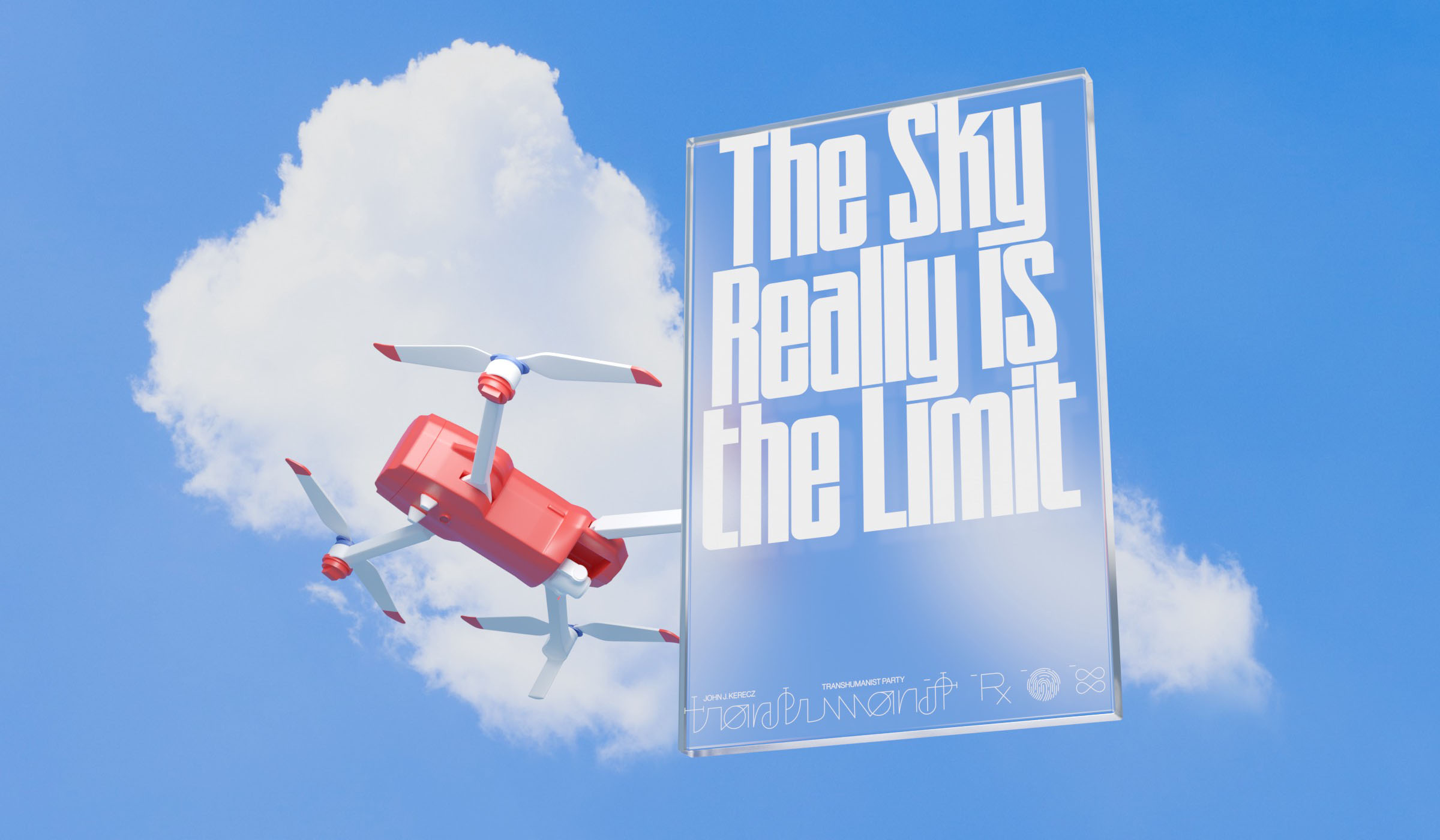
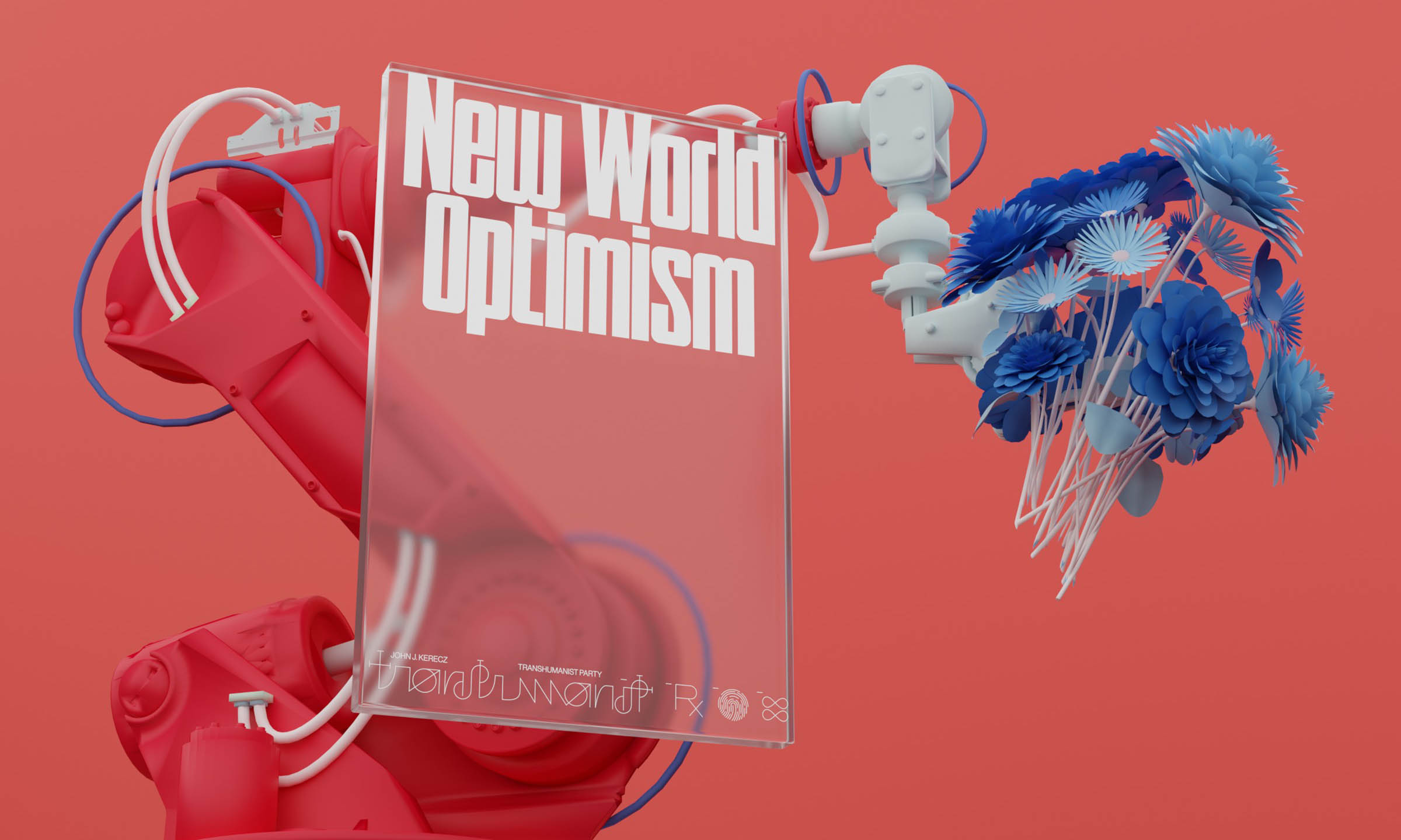
And the second was a collaboration with Seth Thompson for a GEN piece on the Transhumanism Primary. As he explained: “The concept from the beginning was to riff on the idea of political posters, and to try and reimagine them specifically for the Transhumanist party, a group of radical futurists. I thought it could be interesting to design the posters myself, and have an artist render them in realistic but unfamiliar, futuristic settings. I’d worked with Seth before and thought he’d be perfect for this. Over a couple days, we talked back and forth and mocked up ideas as we went. We eventually settled on the posters being ‘printed’ on glass, something that felt like an appropriately cliche vision of the future, and Seth devised a series of objects that complemented each poster’s slogan. The process was much more collaborative for me than usual and we were really satisfied with how it came out.”
Read More: Brand Tips With Stain Shade’s James Brackenbury.


