“Many of the designers in the book told me they hardly ever had a brief,” says Banks. “It’s a bit like designing record sleeves, you could create a piece of art. Also the turnaround designing flyers is insane. In its heyday The Haçienda had a club night nearly every day of the week. That’s a lot of design.”
Clubbed is a reminder of the wilder side of graphic design, much of it created pre-internet and with a sense of freedom that’s hard to imagine today. Here, Banks tells the story behind eight of his favourite examples.

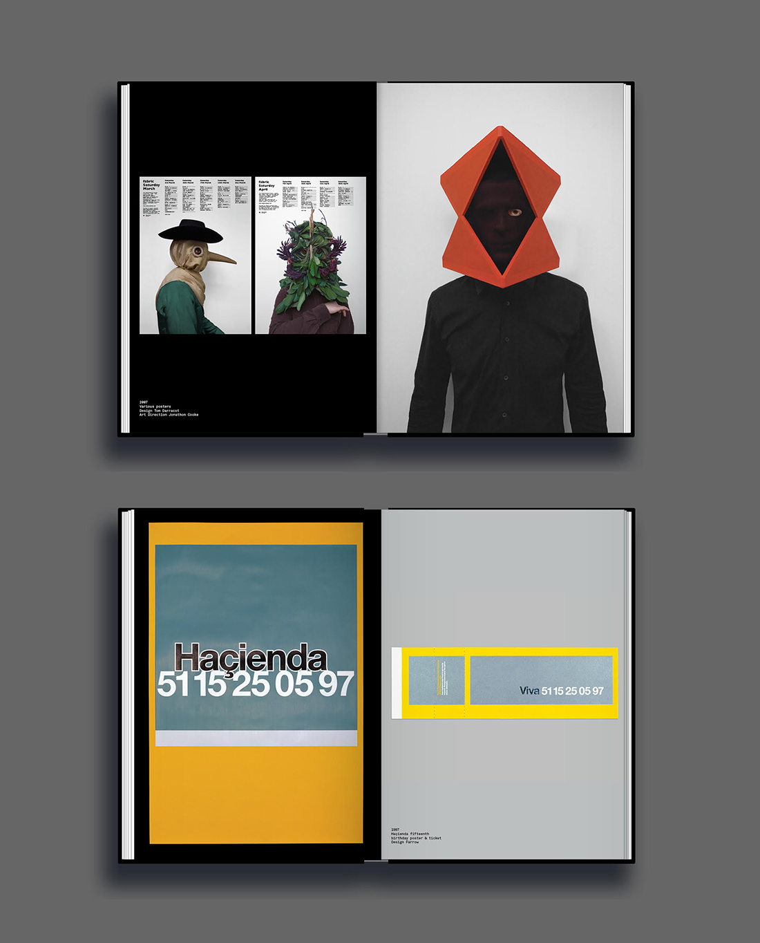
1. The Haçienda fifteenth birthday poster
Farrow’s fluorescent poster design for The Haçienda’s fifteenth birthday is my favourite design in the book; so much so it’s the first thing you see when you enter my house. The modernist minimalism, subtlety and craft inspired me hugely as a young designer and influenced my own work.
The code 51 15 25 05 97 (FAC 51 is 15 on 25 05 97) was printed in a reflective ink onto a grey background, which rendered it almost invisible in daylight. The poster only came to life at night under the glare of car headlights – the reasoning being that the message was only important to people who were out after dark.

2. Renaissance photography
As a teenager, I vividly remember seeing this photographic campaign by Toby McFarlane Pond; art directed by Phil Sims at the now defunct Dolphin agency. I was amazed by the stunning abstraction. It went against the very graphic nature of some of the design at the time. The typography and hierarchy were always wonderfully set and made me appreciate grids as a young designer. There was an elegant beauty about the whole campaign.

3. Cream logo
This is my favourite logo in the book and one of my favourites of all time. I actually wanted to shave the Cream logo into my head as a teenager…. Embarrassing looking back, but that’s how strong the logo is. It’s timeless.

4. Fabric surreal posters
Fabric’s initial designs were very graphic, like a lot of the clubs at the time. However, they quickly abandoned this in favour of a photographic approach. Over time, under the direction of Jonathon Cooke and Roberto Rosolin, Fabric have created their own, unique surreal world which is instantly recognisable — they don’t even need to use the logo on their posters.

5. NYSushi
I love the wackiness of tDR’s designs for NYSushi. Named after one of the founders, these rare flyers have become a collectors item.

6. MoS copy posters
Only Ministry of Sound can get away with using swear words in their tone of voice. For their 18th birthday, Studio Output created this series of posters, selecting transgressive quotations from famous 18-rated films to create a brash, tongue-in-cheek campaign.

7. Gatecrasher brand world
I liked everything about tDR’s holistic approach for Gatecrasher — the bespoke font, the tiny details, the lairy colours, intricate illustration and distinct tone of voice. It was one of my first experiences of a ‘brand world’.

8. Printworks logo
Printworks’ fluid identity by design studio Only takes inspiration from the venue’s former purpose as the largest printing facility in Europe. The wordmark was created by wrapping the Printworks’ name around a cylinder, to mimic the huge rollers of the printing press. The marque uses a silhouette of the printing rollers in profile.
Liked this? You may also want to read our list of the 10 most wanted J Dilla collectibles.