Studio
I do all my designing at a pretty minimal desk space. I’ve never really been concerned with creating a space that felt super personal. I just open up my sketchbook and laptop and get at it. To be honest even that is actually an upgrade for me. Up until a couple weeks ago I did all my freelance designing on my couch.
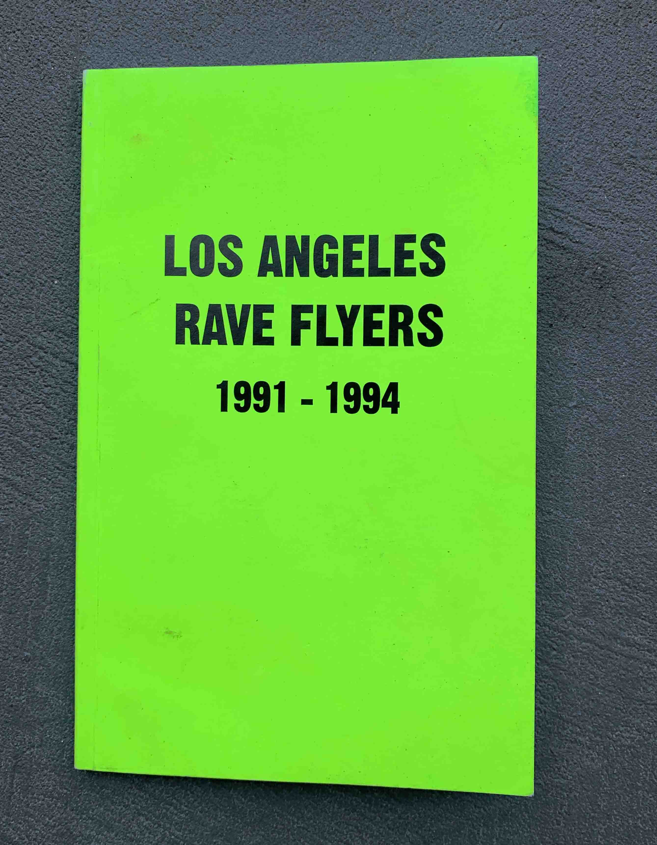
LA Rave Flyers
This is one of a three part series, and I wish I had the other two books – San Francisco and New York City – too. I chose to get this LA version though, since L.A. is where I call home. There’s a certain level of purity and love that’s been put into these flyers that is just so tangible as you flip through the pages. The designs might be rudimentary, for the most part, but that’s what makes them so endearing.
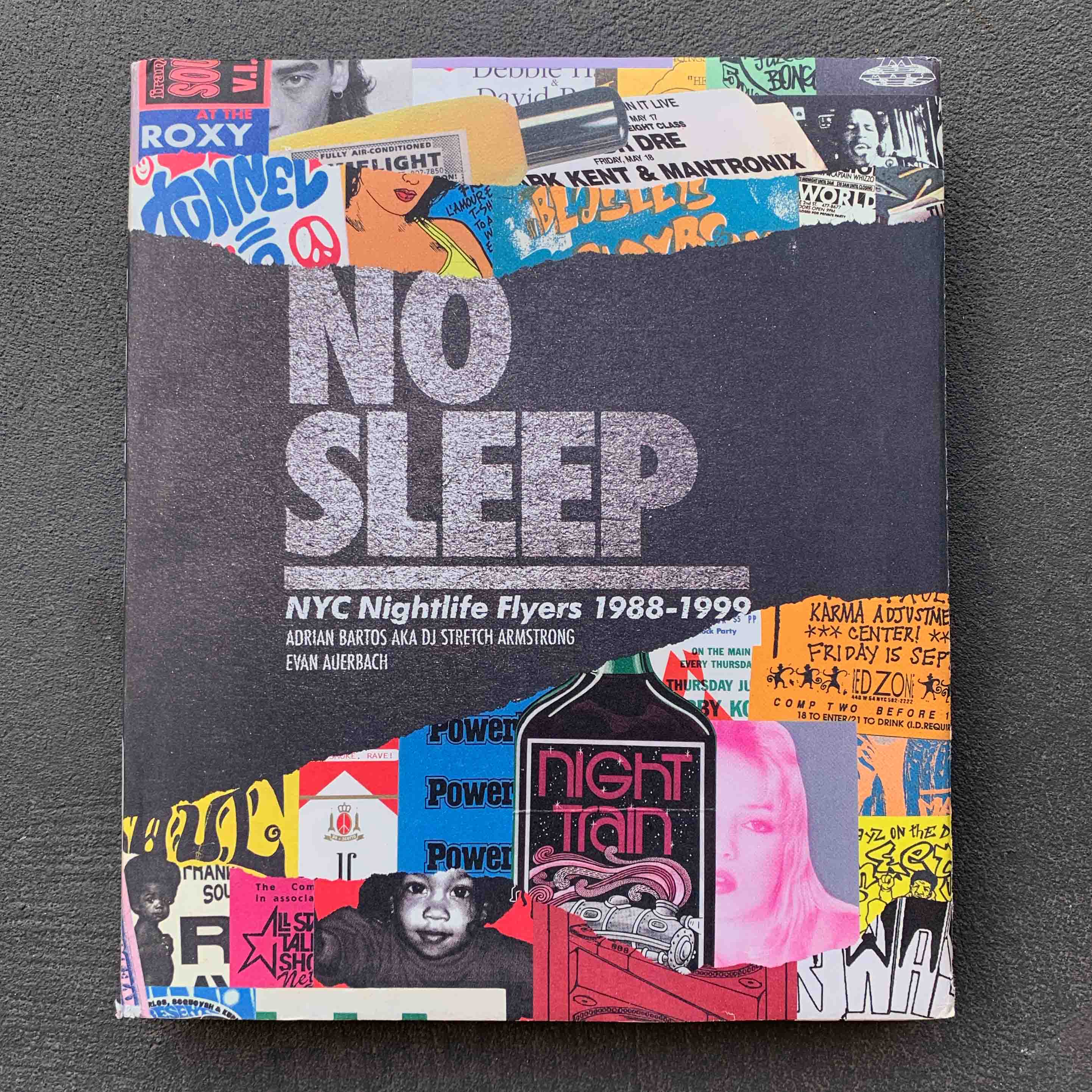
No Sleep
This book is the mecca of flyer design. Damn, every page is just eye candy. Shout out to Evan Auerbach and everyone else involved who thought people might enjoy looking at these flyers decades later.
This book is the mecca of flyer design
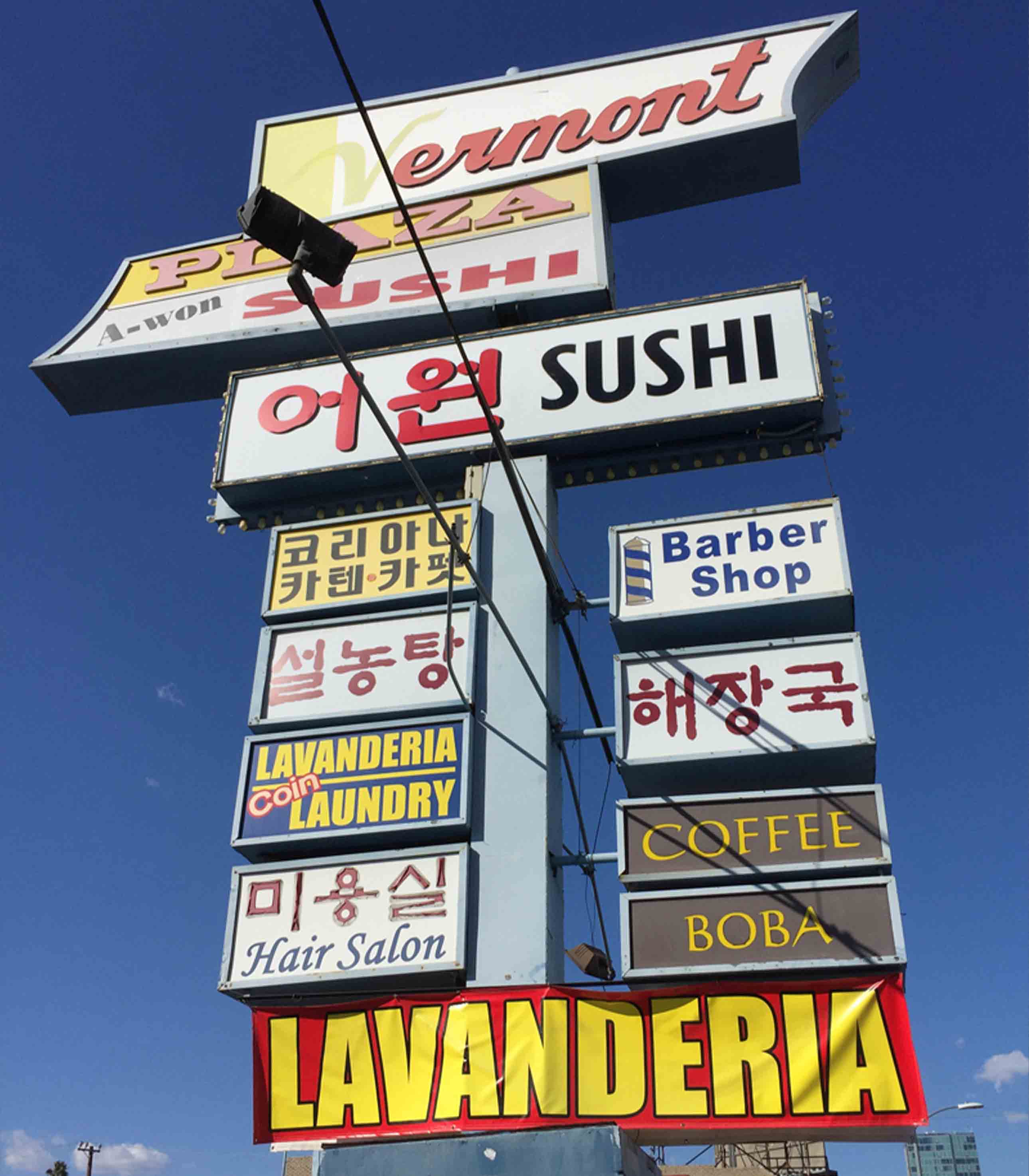
Type in the Wild
LA is a huge city with strip malls and ads everywhere. The visual overload can be crazy but it creates this sense of natural maximalism that I really enjoy. The unpretentious design choices are part of what makes it so appealing to me.
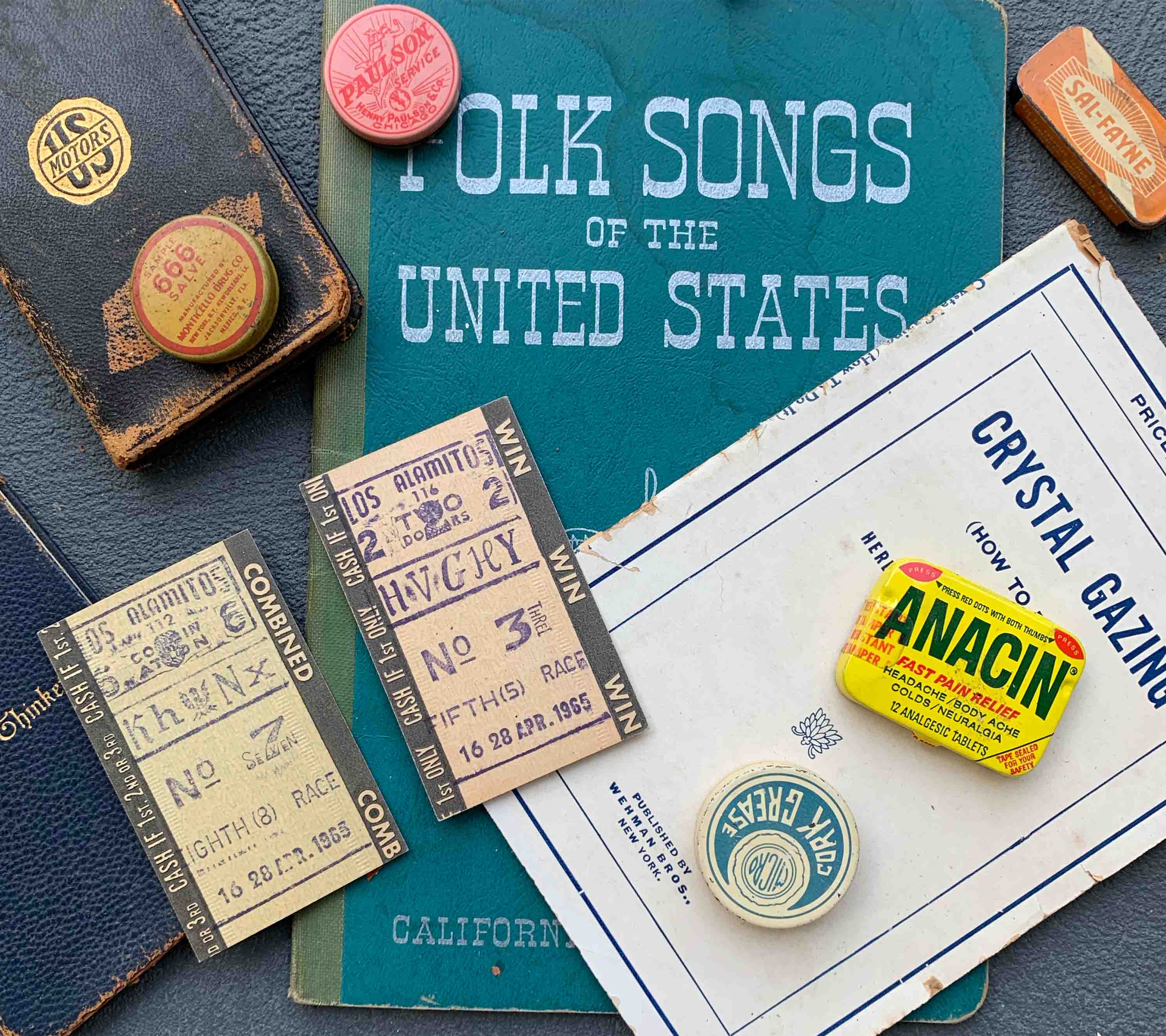
Old Ephemera
I have a big box full of old stuff I have collected over the years. Maybe it has some cool type on it or an interesting layout. There’s some value in keeping it around.
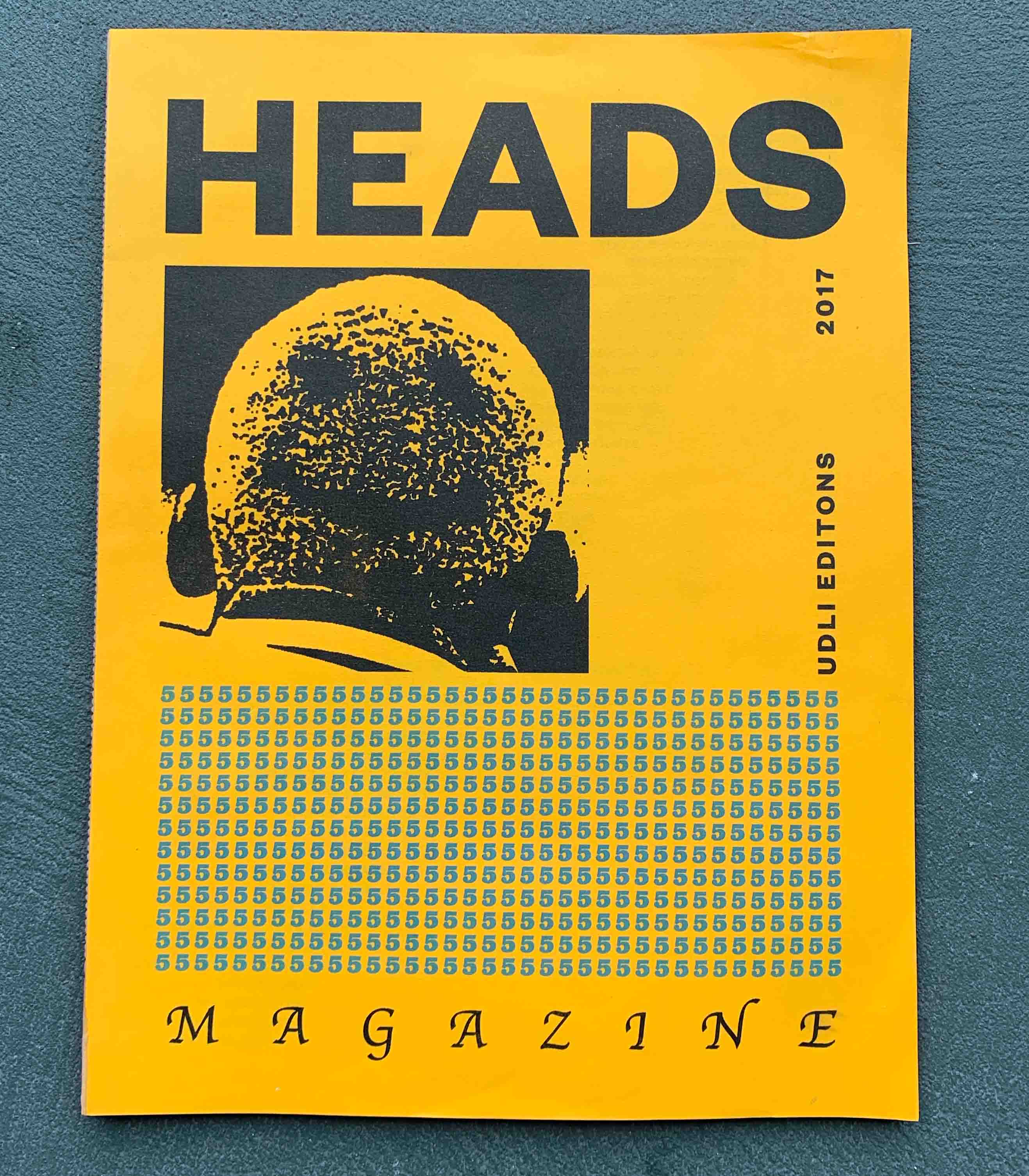
Heads Magazine
I found this magazine at an art book fair in LA a couple of years back. Since then I’ve been a huge fan of Jason S. Wright and U.D.L.I Editions. His style is so visceral and raw.
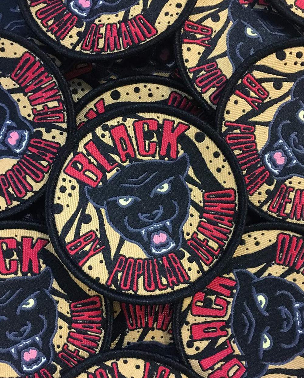
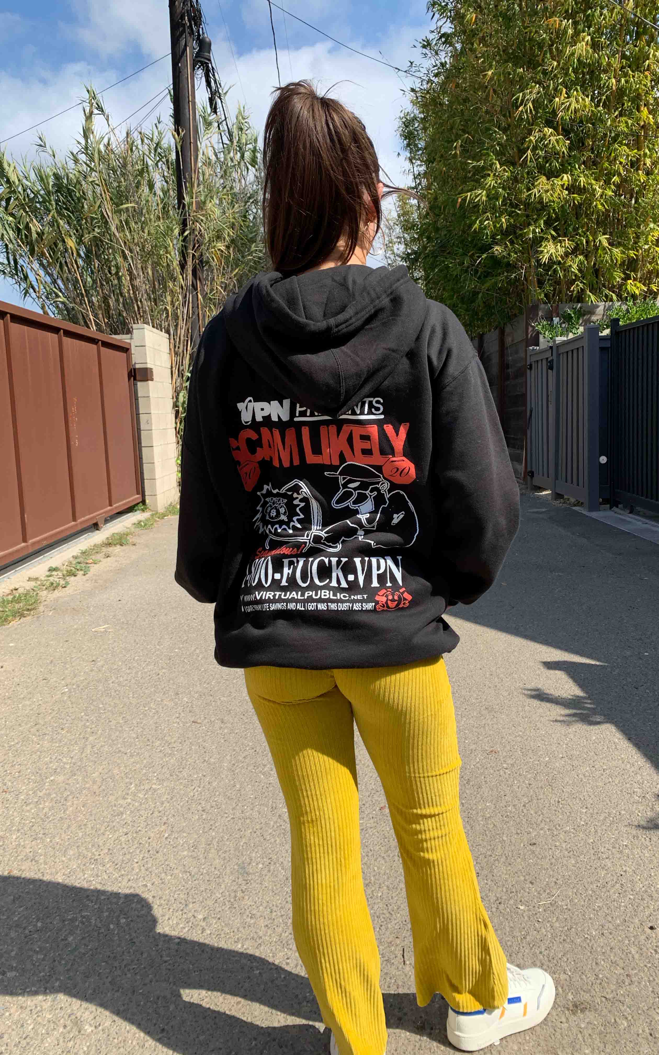
VPN Presents: Scam Likely 2020 Hoodie
I’ve been doing a lot of projects recently with my friends at VPN radio here in LA, and this is a hoodie I made for a party they threw recently. The layout, type choices, and overall imagery embody the kind of un-designed, maximalist aesthetic that’s all around me here in LA. The less polish the better, especially for a party called “Scam Likely.”
Read More: Process: Jay Daniel Wright