Studio
I wouldn’t say I have a conventional ‘Studio’ space. I work pretty much everywhere. On the move, in my flat, at coffee shops, on the bus, or tube. I’ve never really found I need a single location to work on projects. I just need the right mindset which, if I’m being honest, is a hard thing to get into when you suffer from ADHD. That being said, the below items/objects are things that I find help me to get to the point where I am able to finally begin.
Signs
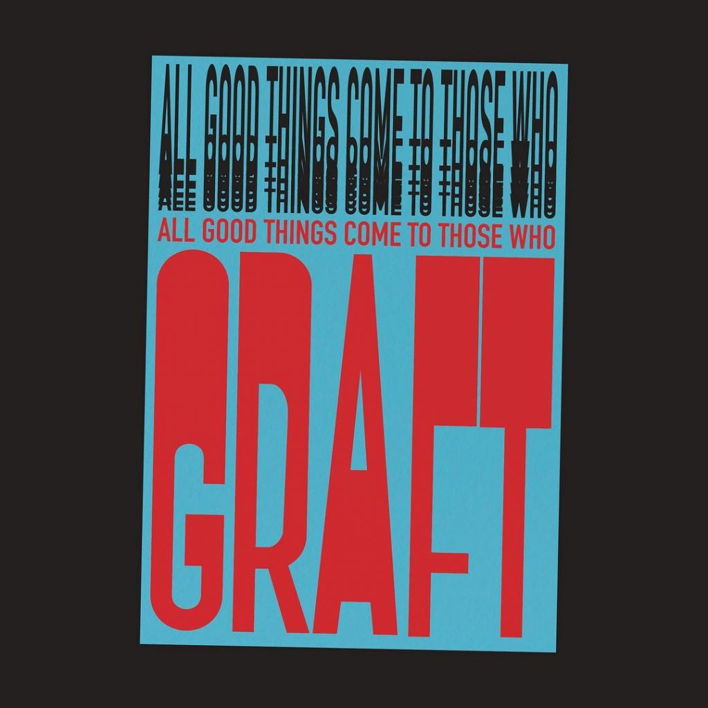
No, not the film starring Mel Gibson. Street Signs, or the ones you find above shops, giving you directions, or what location you’re in. I’ve always liked seeing a design which gets straight to the point. One you can understand and consume immediately.
A couple of examples of this would be the London Underground typeface and signage by Edward Johnston. It was commissioned because the Commercial Director of the London Underground wanted to update their look so it wasn’t mistaken for advertisement. Quite literally cutting through the noise of the environments they were placed in. Another is the artist ‘Bob and Roberta Smith’, who I discovered in my first year of university and who’s has had a large impact on how I work today.
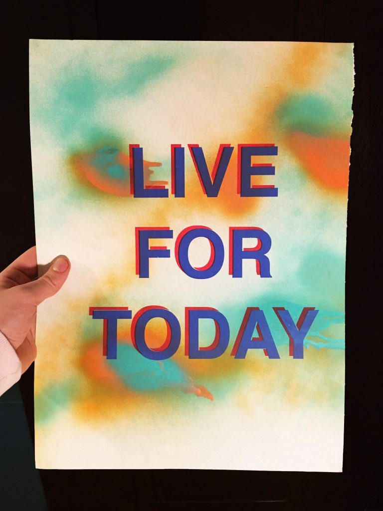
I think my love for straight to the point communication design comes off the back of my ADHD. It means having a million thoughts going through my head at any given time. Not having to read between the lines of some skewed meaning, or ‘wanky’ message is super helpful.
Finding simplicity amongst the chaos is something I’m always trying to translate within my own work.
ADHD
I’ve mentioned this already and it doesn’t appear on my desk, but it does play a huge part in my inspiration as a designer. I’ve had to learn to live with it, accept it and make it part of my everyday process. The world is pretty chaotic and it often feels even more chaotic in my own head. However, the plus points of this are I’m always full of energy and constantly thinking of ideas which I write down everywhere. It’s the one thing I feel has probably shaped my current style of working the most. I’m always trying to simplify my thoughts to make sense of them.
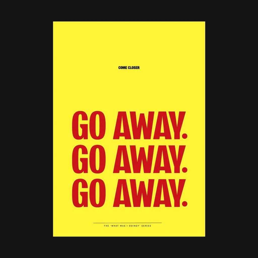
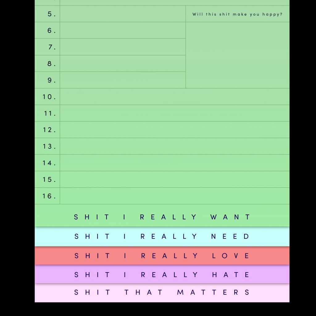
This never-ending journey of attempting to find simplicity amongst the chaos is something I’m always trying to translate within my own work. Currently, I’m doing a small poster series on my experiences with the disorder. I intend on making them free to download to raise awareness for the condition.
With books, you get to read about the project and learn about the process.
Books
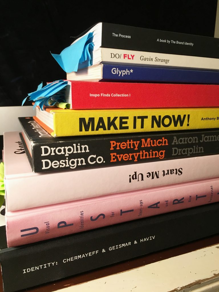
Screw the internet! If you currently only use the internet to do your research then you should cut back. That may sound outdated but for me, there’s a reason trends reappear within design every few years. It’s mainly because of sites like Pinterest & Instagram. Something will crop up from the past, get featured on big channels and everyone will start doing it again. With books, you get to read about the project and learn about the process. Someone’s actually spent money on paper and glue to publish it. With that comes a level of curation, connection and care that I feel get’s a little lost online at times. There are too many to count so I’ve taken a photo of my favourites.
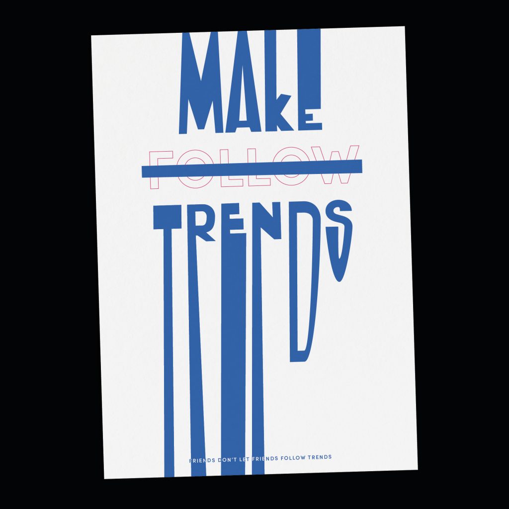
There’s also a reason a lot of renowned creatives often don’t list sites on the internet when it comes to talking about their process. It’s not because they want to appear deep and brooding.
I don’t want to make things that just look nice on a wall
Comedy
Aside from my client facing ‘serious’ projects, a lot of my own personal work, especially posters, involves humour. From animation to print, I’ve found it to be a really effective way of connecting with people. That’s how you create an emphatic response. I grew up on a diet of ’70s and ’80s British sitcoms such as Porridge, Blackadder, Only Fools and Horses etc. They’re very observational in terms of its delivery. They also had confidence that the audience would understand what was being communicated.
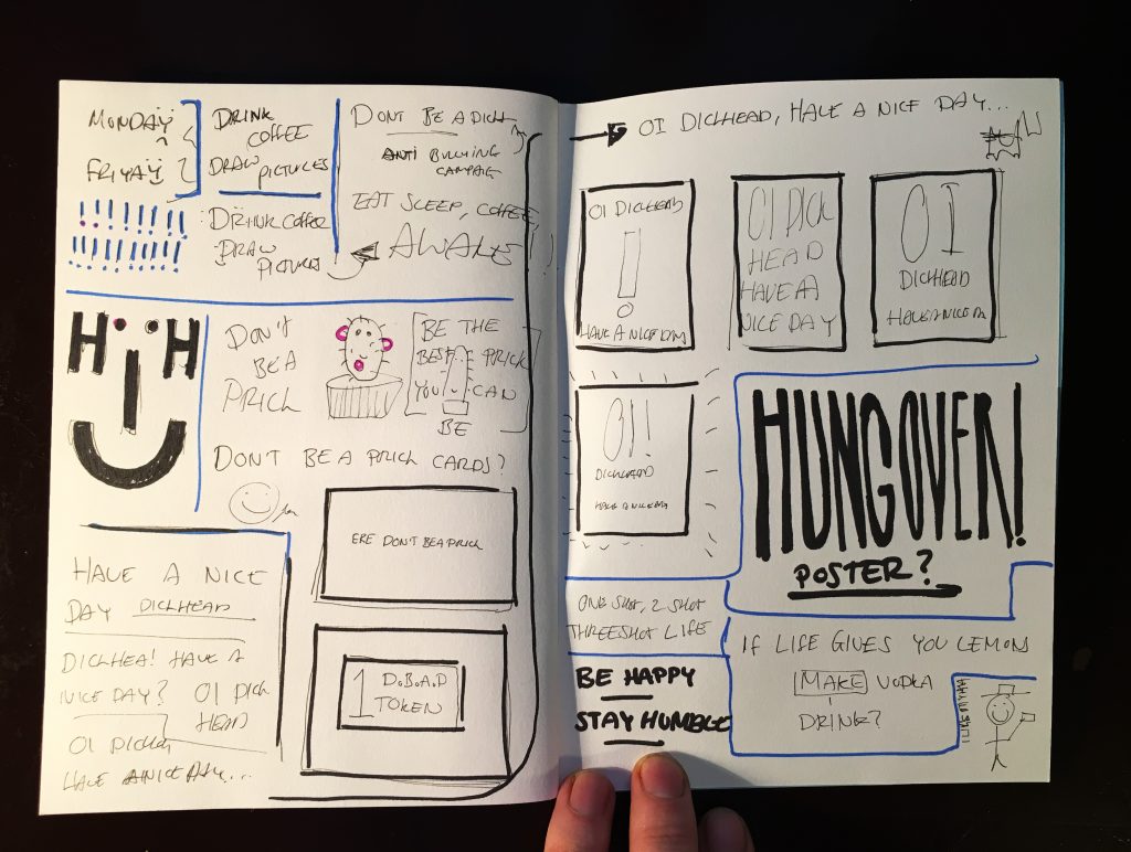
This era of television had and still has a big impact on my own sense of humour. It’s quite tongue in cheek and riddled in sarcasm (finger snap). The point of my work isn’t to offend anyone, but create more of an ‘oh I can relate to that’ kind of reaction. I don’t want to just make things that just look nice on a wall. However, I don’t want to spell things out to people as it’s boring being spoon fed. I like to think the people who see my work get a laugh out of it. The ones that don’t probably wouldn’t like me in person.
Everyone has a unique view of the world and what’s in it
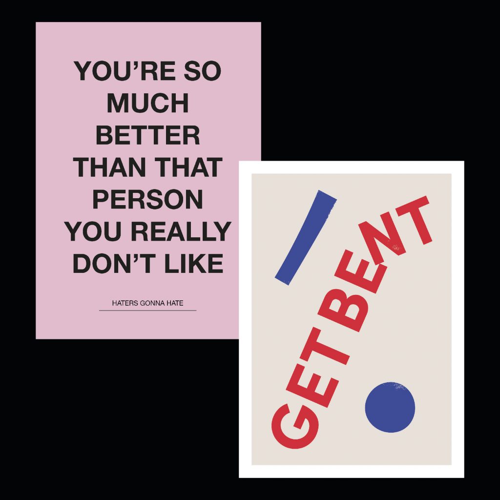
#1
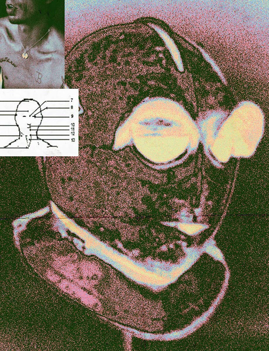
The first is from my recent series around ADHD, mentioned earlier. Despite it having a big impact on my life I’ve never openly put it into my work. Instead, I’ve almost avoided it altogether. I decided to change this and took a series of occasions within my own life where I’ve regularly had battles. Whether it’s with directors, colleagues and friends who see it as controllable and just a matter of a lack of focus. One of my last directors used to constantly say in daily emails that he “needed me to focus”. This was always quite patronising. As for me, it wasn’t an issue of focus and just made me want to tell him to ‘Fuck Off’.
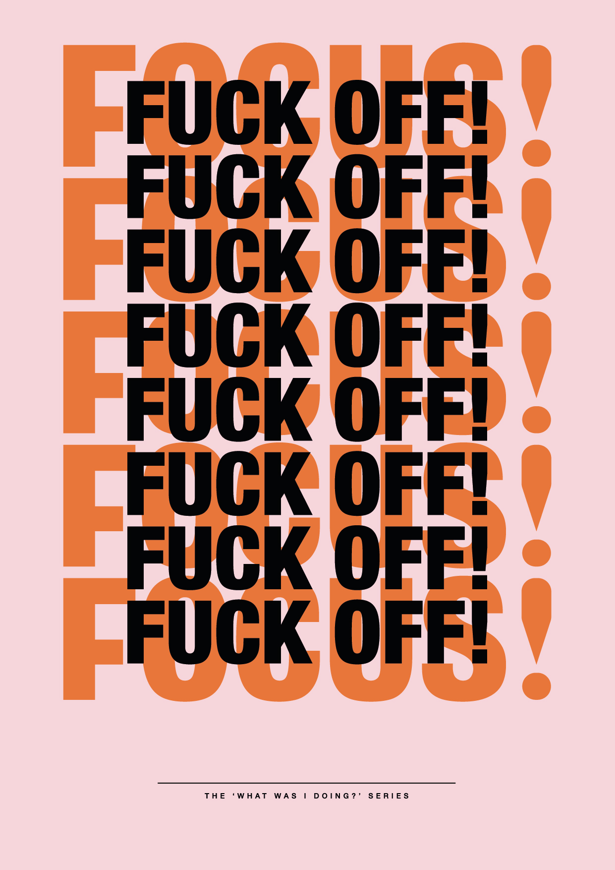
In the end, it was almost like a form of therapy; design has the ability to communicate many things. I’ve always thought the most interesting and unique work surfaces when the person puts their own life experiences into the design. I don’t believe in the statement ‘nothing can be original’, because everyone has a unique view of the world and what’s in it. If you let that unique view become a part of your work then it doesn’t matter if what you produce kind of looks like something else in the world, because what it communicates will be totally different and individual. At least that’s what I feel.
#2
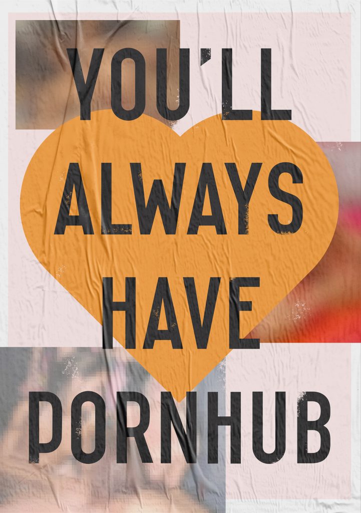
This is a piece I created for Valentines Day which again was based on everyday observations. Both myself and my girlfriend have never really seen much point in Valentine’s Day, it’s always felt like a constructed holiday made to make people feel sad. Or to spend money on each other which usually ends in a low bank balance and additional sadness.
So, I was seeing the endless waves of Facebook posts about meals, gifts, the store signage, the advertisements and despite being in a relationship for five years it made me feel incredibly apathetic to the entire ‘holiday’. As a result, I wanted to create something which was a bit stupid, relatable and almost a protests to what valentines day is to me… a corporate money making occasion and instead decided to focus the attention onto something which people do all have and is for the better part completely free…porn!
If I could be remembered for anything I’d rather it was for having a sense of humour and trying to help people out whenever possible.
Ben’s limited edition ADHD awareness T-shirt is available here.


