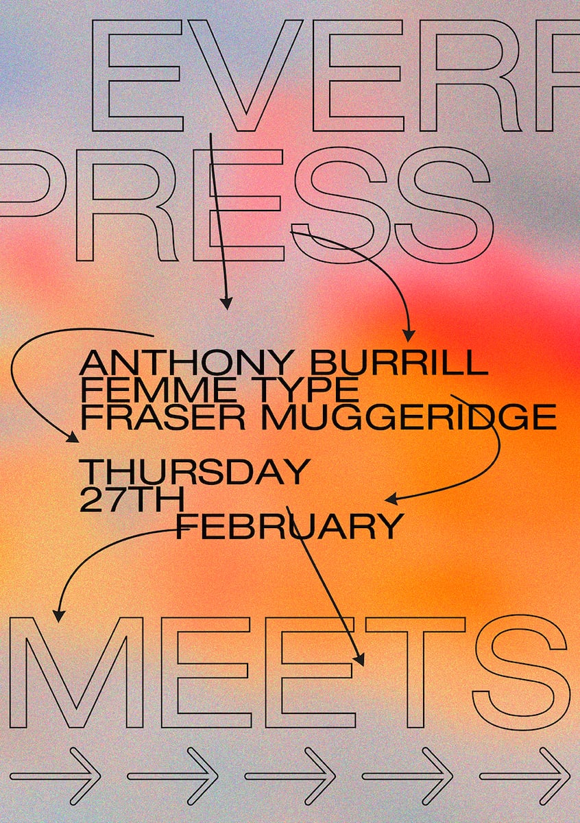
ANTHONY BURRILL
Long-time Everpress favourite Anthony Burrill is driven by type with substance. Speaking on where he gets his inspiration, he reels off a list that includes the Paris Riots of May ‘68, the Civil Rights and Suffragette movements, Sister Corita Kent, the ‘pop art nun,’ and Katharine Hamnett meeting Thatcher in Downing Street. Burrill is one of the most well respected, and distinctive, figures working in type today for good reason. He has a long string of hit prints to his name, including the now-infamous ‘Work Hard and Be Nice to People,’ a message that could double up as his mantra.
“I’ve been working with Extinction Rebellion since last summer. Seeing my stuff used within the protest in Trafalgar Square, as part of this much bigger thing that was going on, felt like it connected with things that I’ve always been concerned with. It was quite a moment.”
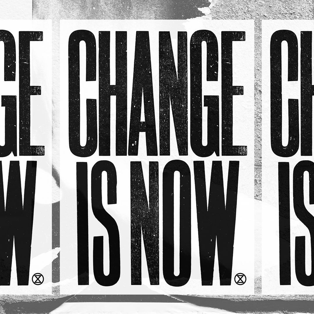
“T-shirts are an amazing kind of walking billboard. My ‘Action Not Words’ T-shirt was about this idea of connecting people who want to actually get involved with things. That’s something I think is really important, that through the kind of work that we make, you connect with things that you feel are important to you.”
T-shirts are an amazing kind of walking billboard
“I’m obsessed with type. When I go on holiday with my family they kind of hate it, because I’ll disappear down some street to take a photograph of a really interesting grid. They’re like, “Dad! What’s wrong with you?” Quite a few times I’ve been challenged by security guards: “Why are you taking photos of that sign?” I show them the camera roll and it’s all bits of type, and they just kind of think I’m mad.”
“There’s a lot of terminology in typography, that is kind of designed to bamboozle people, I think.”
“Stuff that’s been put together wrong is much more interesting to me than stuff by other designers. I don’t really look at other designers too much, I kind of prefer things on the street or just weird stuff really.”
AMBER WEAVER, FEMME TYPE
Launched in April 2016, FEMME TYPE is Amber Weaver’s mission to generate long overdue recognition for women working in the type industry. “This is my baby,” she says. “It started with an Instagram account, and then I decided to publish a book. We managed to raise £10,000 through Kickstarter, and the final book featured the work of over 40 international female designers.” Spurred by the book’s reception, she decided to start a website too, “a digital archive that’s basically a feed of easily accessible content,” to support her aim of platforming female type designers.
“I collaborated with Graham Rounthwaite on a recent issue of Love Magazine. [Love] use all these typefaces that were made by men who died 100 years ago. He said, “I want similar typefaces to this, but I want them all to be from your network.” So I went away and did my research and then helped consult on all the typefaces that they use.
“With Love, we tried to push more for the display typefaces, because they’re quite experimental, they’re not as traditional, and I think it’s a really interesting route that type has taken.”
Type has gotten so much more accessible
“Type has just gotten so much more accessible. I look at Instagram all the time, I’m constantly going and finding new profiles, new type, just any kind of new, different work. I’m obsessed with it.”
“When I was at university my class was maybe 50 girls and ten boys, but then when I actually started working in the creative industry the ratio flipped, and now the percentage of men is huge. What I’m trying to tackle is bridging that gap, and working out what is happening in that bit in between.”
“I think it’s maybe that there’s no one out there showing women that there are other women who are working in type. Women at university might say, “I really want to do type design!” But then only end up doing it as a project in their third year and not taking it any further, because there are no advocates, there’s no one there to inspire women.”
FRASER MUGGERIDGE
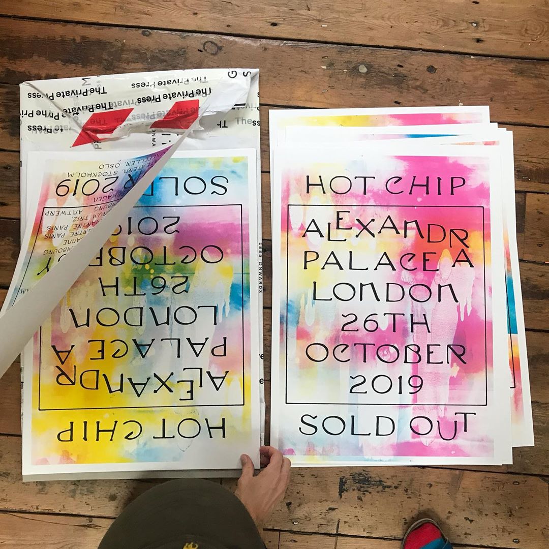
Fraser Muggeridge’s eponymous graphic design studio is, in a word, multifaceted. Their output spans everything from artists’ books to exhibition catalogues, posters and websites, not to mention album covers. One of their latest, for Hot Chip’s A Bath Full of Ecstasy, leant in heavily to an anti-graphic design aesthetic. “I liked the fact that the Hot Chip cover was really boring, I liked the idea that it was almost like they couldn’t afford a decent designer, or even a colour printer,” says Fraser. “This is an example of me as a designer intentionally getting into hot water with the design layouts, and then using a creative word to get out of the hole that I’ve made.”
“The Hot Chip cover took me five minutes to do, but it also took a whole career of manifesting in my head. Why was it done so quickly? Because I’m doing many jobs at the same time, I don’t have time to do options, I don’t have time to analyse. And, I like the idea that it’s quick and fresh.”
“Something I always think about is the workmanship of risk versus the workmanship of certainty. The idea that when you’re making something by hand each one will be different, so it opens it up to risk, failure and variation. As opposed to the workmanship of certainty, that’s precise, made on a map, printed through an industrial process, and produces identical copies.”
“When I was a student in the ’90s I studied typography for four years and people used to just not have a clue what it was. Now everyone knows what it is, everyone’s got an opinion about it, and so many people have got InDesign on their computer and can download a font and do all of that stuff. It’s definitely changed.”
The key thing often, about choosing a font, is the history behind it
“I think it’s quite easy now to be a graphic designer. With InDesign it’s quite automated, some decisions you don’t even have to make because it’s predicting these things for you. To me that means that the standard in design has gone up quite a lot, but it also means that someone that’s spent a lot of time doing that has either got to go super polished, or to react against it, break it, make it a bit ugly.”
“To me the key thing often, about choosing a font, is the history behind it. If you know why certain typefaces came from certain places, then you can kind of justify it to your client. I’m always really trying to build a story and typefaces have this amazing history.”
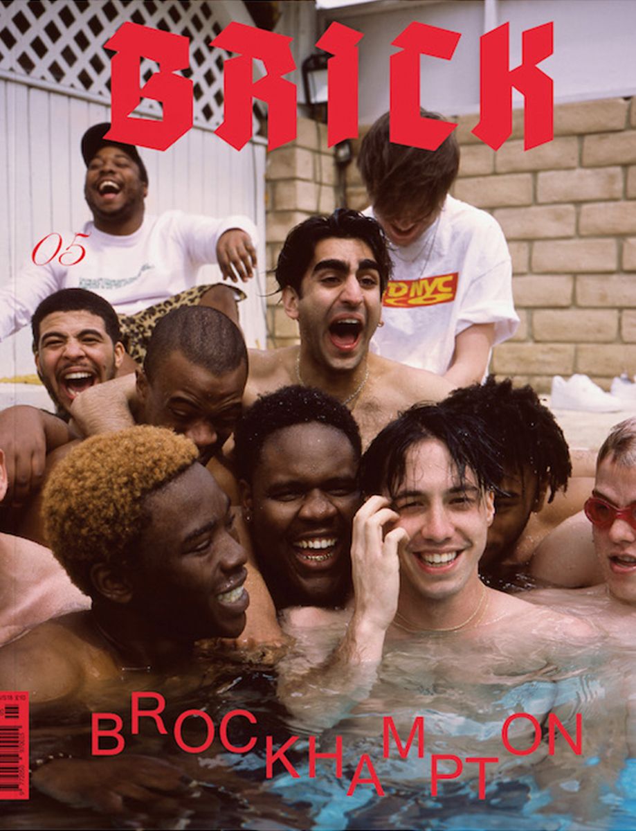
Read More: Everpress Meets: Designing For Music