I have often admired the simplicity of book covers from European publishers: Les Éditions de Minuit in France, Suhrkamp Verlag in Germany, or the vintage editions of La Nuova Italia. For classic texts of literature, politics, or philosophy each favour simplicity, spacing, and decent typography. The ink lives on these covers, saturating between the white space, stressing the lively matter of words. This kind of design is more like a wrapper: it stresses something is contained inside that you need to grasp out of it.
One of my favourite books from this year, the Canadian poet Lisa Robertson’s Anemones (released on the Dutch small press If I Can’t Dance, I Don’t Want To Be Part Of Your Revolution) has a beautiful cover that pays homage to typographical classicism. The book itself contains seven short texts, mostly focused on translating Simone Weil, and ruminates on the relationship between stoicism and beauty: “Whoever spends six years sewing white anemones cannot be distracted by anything,” if only more publishers didn’t spend more than six minutes designing their book covers.
This kind of design is more like a wrapper

Financial concerns in a saturated market mean that many books try simultaneously to be for everyone while reaching out for that special someone and falling short of both. Luckily, in the lively resurgence of small press publishing, there are people still taking time to gift books beautiful covers. This year, Peninsula Press published Lynn Tillmann’s Weird Fucks in the UK – a book with an exquisite title and sharp cover to match. Imagine someone catches your eye on the tube. They’re reading a book with that emblazoned on the title in hot cerise. You’d want it to be them, wouldn’t you?
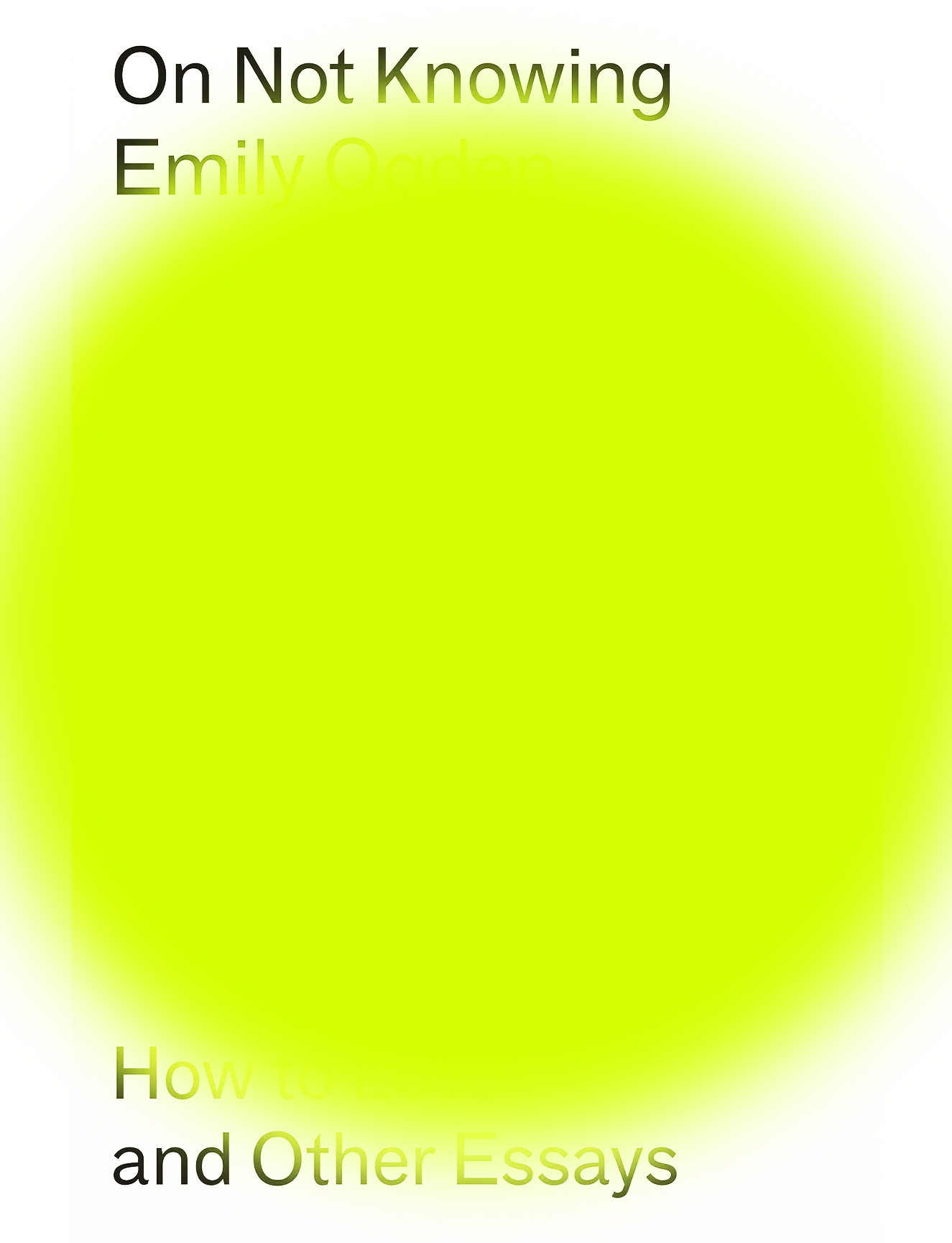
Peninsula Press also published a phenomenal collection of essays this year by the writer Emily Ogden. The cover, designed by Tom Etherington, features a sharp nozzle-spray of lime green obscuration to the font. It makes me want to know what the book is not going to tell me – where it will leave me. In design, as in writing, there’s a confidence in leaving room for interpretation. The gaps and spaces in between can be what makes a work compelling. If the design were overburdened with anything more, it’d break this spell.
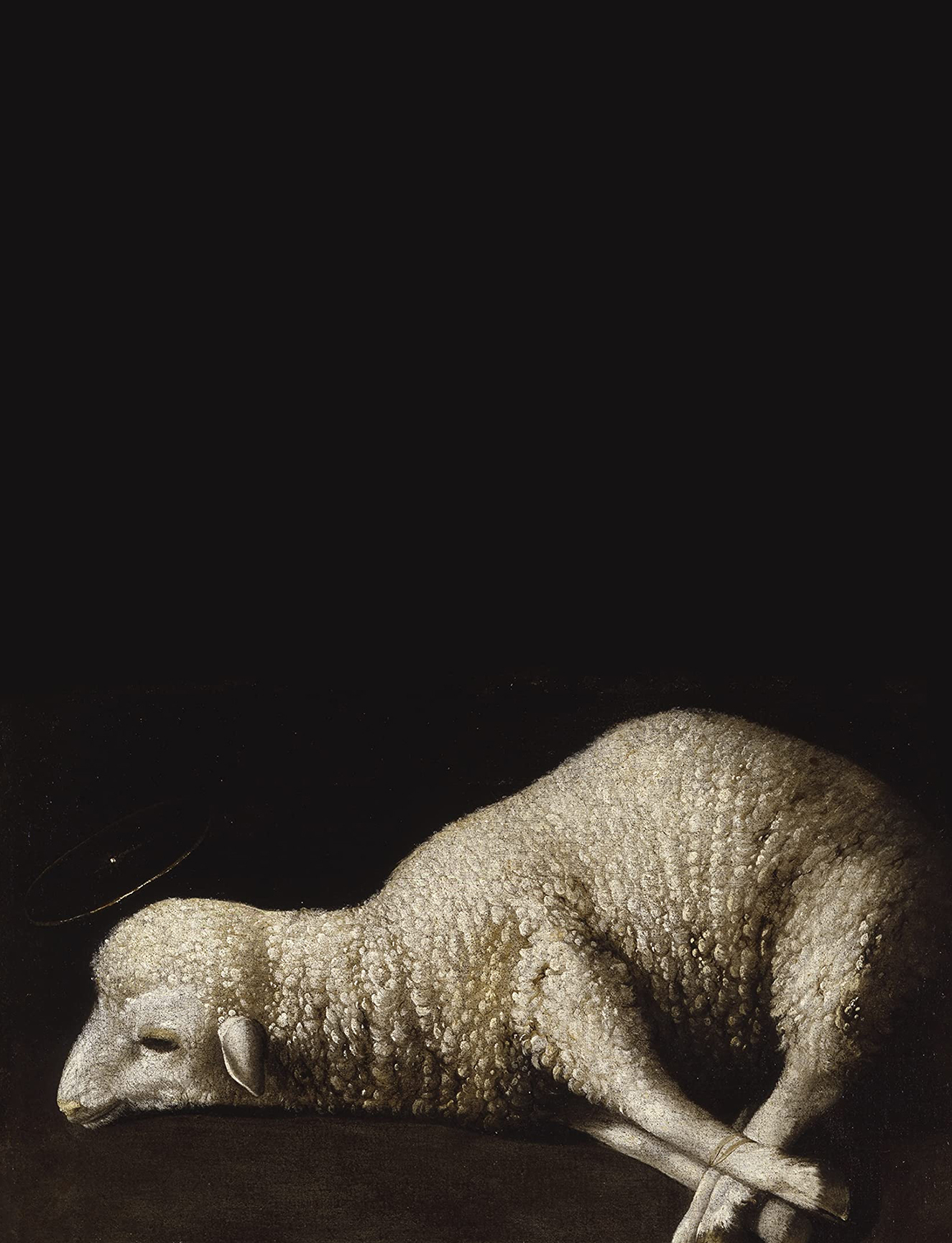
This year also saw another new novel by literary fiction’s favourite young celebrator of abjection, Otessa Moshfegh. The cover of Lapvona, a lamb collapsed on its foreshanks gives a foreboding sense of the grotesque while also not giving too much of it away. The story is a carnivalesque fantasy of human cruelty, in which Marek, a motherless shepherd’s son and a useless cripple, eventually finds himself the unwitting ruler of a collapsing fiefdom. The image of the young animal awaiting slaughter is taken from the Baroque artist Francisco de Zurbarán’s painting ‘Agnus Dei’, an oil painting finished sometime between 1635 and 1640. While in The Bible it is the lamb of God who will take away the sin of the world, there is no such salvation in Moshfegh’s novel, just a steady descent into famine and violence.
The gaps can be what makes a work compelling
Other books that I enjoyed this year also deployed brutish, painterly figuration on their covers – where the visual conceals as much as it reveals. The Doloriad, the debut novel by Missouri Williams, released on Dead Ink Books, has a cover by Luke Bird: a cross-section of a cherub’s chubby, blushed cheek, with none of the features of the face recognisable. It reminds me of the investigation of gesture in the Neo-Baroque paintings of Jennifer Carvalho. This painterly address of the human form speaks to the novel’s own study – its addressing of the difficult and unspeakable centrality of human cruelty and family relations.
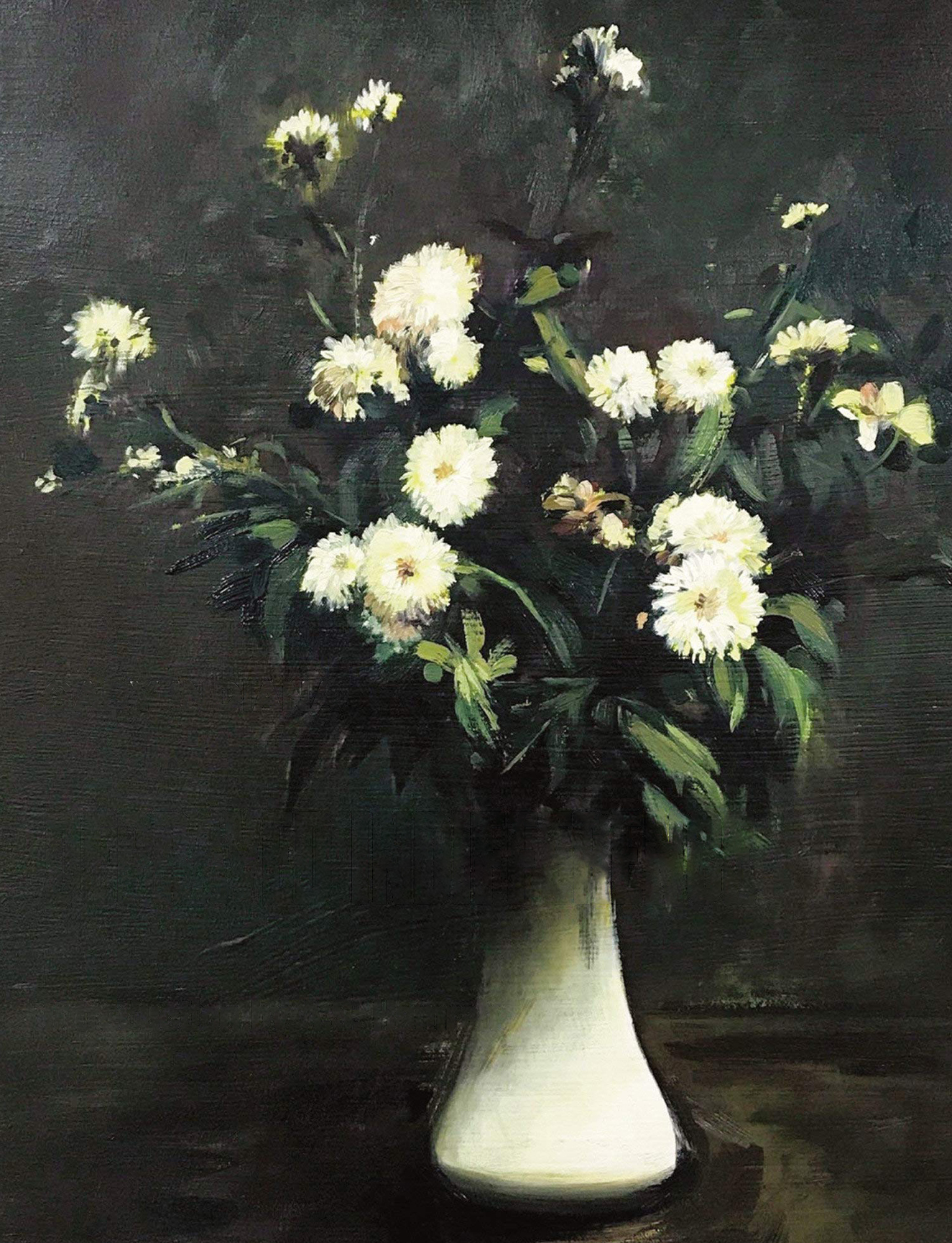
The recent rise in interest of the work of Gary Indiana has led to reissues of his books of his prose and criticism, many using paintings by his friend, the artist Sam McKinnis, for their cover art. Indiana has described McKinnis’s work as producing a “fuzziness between fiction and documentary reality,” an equally apt description for Indiana’s writing. McKinnis’s Crysanthemums, after Fantin-Latour (2017), is used on the Semiotext(e) reissue of Indiana’s Depraved Indifference. A still life of flowers in a vase, it gestures at time, ephemerality and death.
This year Semiotext(e) also republished the first three novels by notorious French writer Guillame Dustan as The Works of Guillame Dustan, Volume 1 (2022). These novels are works of highly compelling pornography, where male bodies, drugs, and alcohol are endlessly consumed, and the prose is both exhausting and exhilarating. Good job, then, that Semiotext(e) have celebrated the seediness of this work and its republication with a design befitting of VHS box smut.
The funny contradiction about books as decorative objects is that even if they have beautiful covers, the book will spend most of its life with its cover obscured, pressed against the behind of another book, kissing the blurb. It is spines that are the cover in reality. If we think of books as erotic objects; they intrigue us through what we don’t know but hope to experience.
The best book covers flirt. They do a lot with a little, using the coquetry of manners, selection and restraint to pique our intrigue, before we lick our fingers, ruffle the pages and begin.
Read More: Which As You Know Means Violence