PATRICK SAVILE
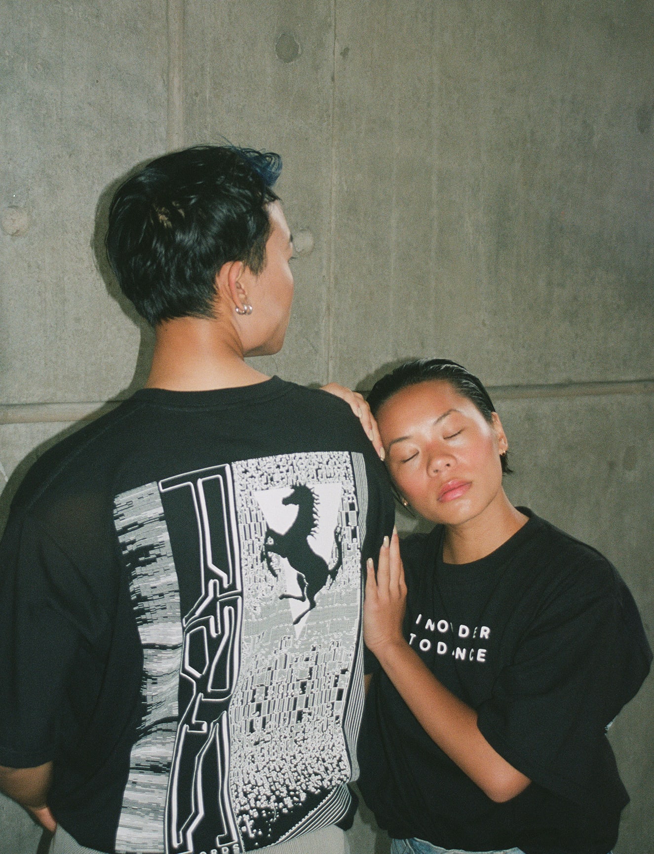
Graphic designer and illustrator Patrick Savile’s work has graced countless record sleeves, posters and tees (including his effort for HIGHPASS, which landed a spot on our best tees of the 2019 roundup.) Heavy on esoteric and sci-fi symbolism, his distinct retro-futurist aesthetic has earned him a client list that spans Warp Records, Tate, Pop Magazine, Sony/RCA Records and Vice.
What was your route into what you do now?
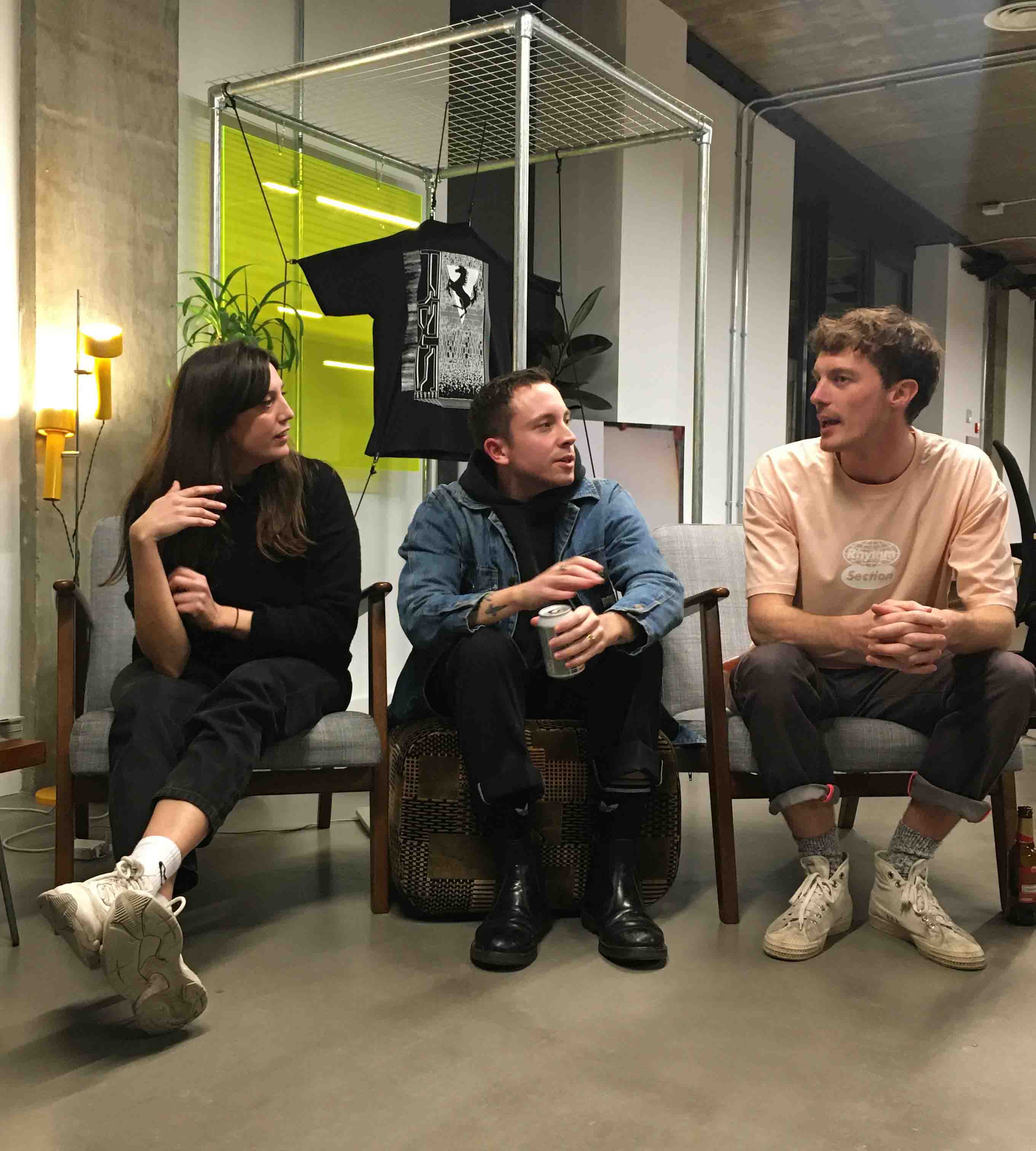
It was through doing a radio show years ago on Resonance FM called The Gravy, with my buddy Will. We had guests on regularly, and for a little while tried an online video broadcast thing (which I embarrassingly presented sometimes.) I met loads of people through that, and started to do designs for sleeves for a few artists, but it wasn’t quite viable as a job at that point. So it started quite sporadically, and then I came back to it fully about three years ago, when I started working with Miles at Bokeh Versions.
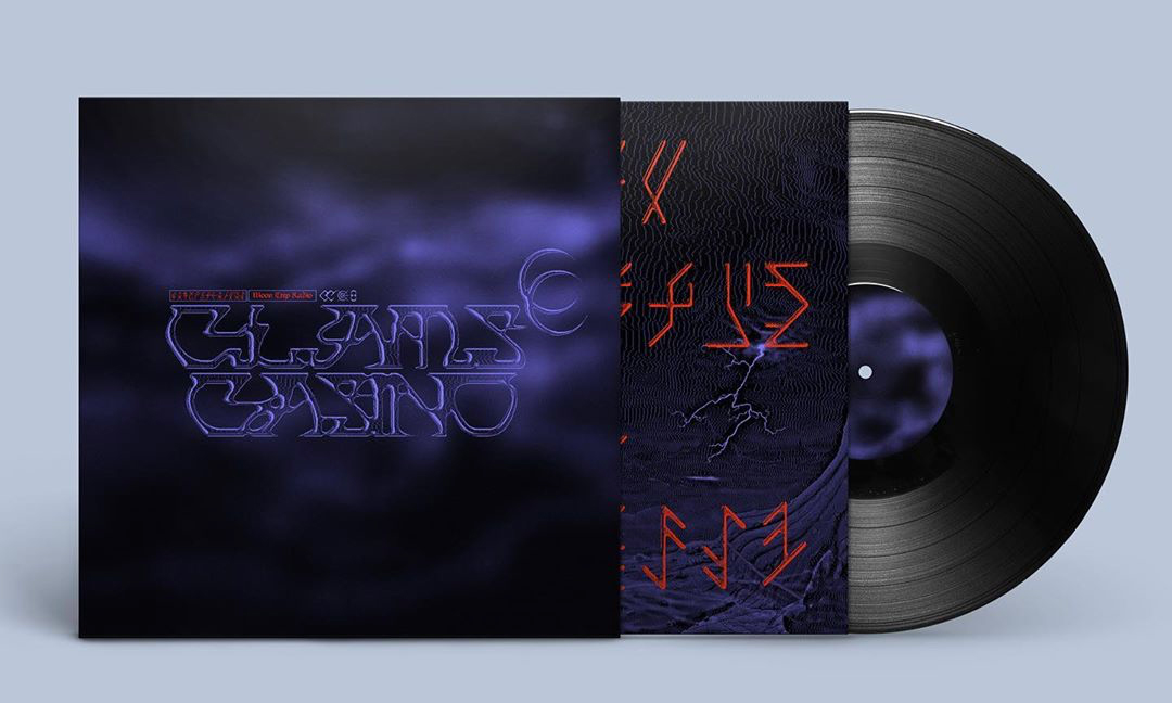
How does designing for physical formats like T-shirts and record sleeves/labels differ from digital?
That’s a pretty broad question, but digital-only has to be much simpler I reckon – just being able to work in the ocean of jpgs.
In terms of physical, I like to make sure the cover fits with the ecosystem of the rest of the design on the packaging, that means never just having an image on the front and featuring other stuff on the back too. I suppose the scaling of the type etc can be considered differently for vinyl due to its size, but usually I try and imagine something that will work on all sizes.
I use a different style when I’m working on tees, it’s a lot more illustrative
As for tees, that’s a completely different world! It has to be much more graphic. I only like T-shirts that have been screen printed, so that means creating a design that works within the limitations of the screen printing method. The imagery has to be bolder, and obviously limited in how many colours you use. I kind of utilise a different style when I’m working on tees, at least some of the time, it’s a lot more illustrative, as I feel that fits well with the medium.
TETI MARTINEZ
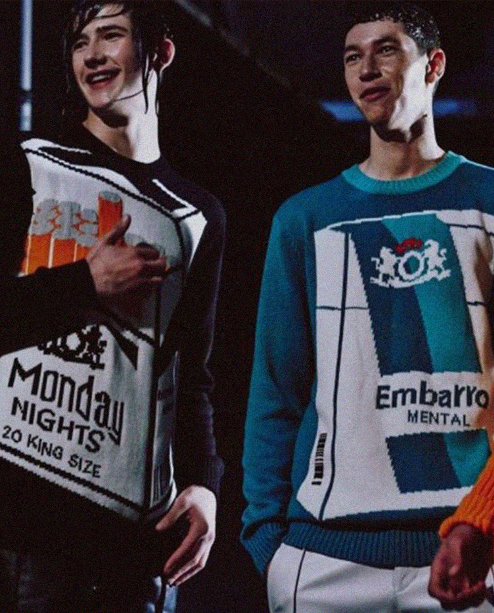
Though she’d been working in Art Direction for a while, a move from Barcelona to London proved to be the catalyst for Teti Martinez to start designing for music, via a job at record label Lobster Theramin. With influences that include Greek and pagan Goddesses, sci fi, and retro rave motifs, Teti’s output is super-eclectic – she even just put out a range of scarves based on her great-grandmother’s UF0 and astrology book collection.

What was your first music project/your route into what you do now?
When I moved to London in 2015 I first tried to continue working in Art Direction, which is what I was doing back in Barcelona, but without any luck. Ironically, something that I had never thought of, which was working in music and making a living from it, became my first job here, when I joined Lobster Theremin as their in-house designer. I worked twice a week with Jimmy (Asquith, the head of Lobster Theremin) at first, and then that evolved into a bigger thing while the label was growing. That opened the doors to many other projects and led to me meeting other clients in the music industry and has allowed me to work with many different artists, labels and promoters from around the globe. Working in music has allowed me to explore and develop a style that’s constantly evolving.
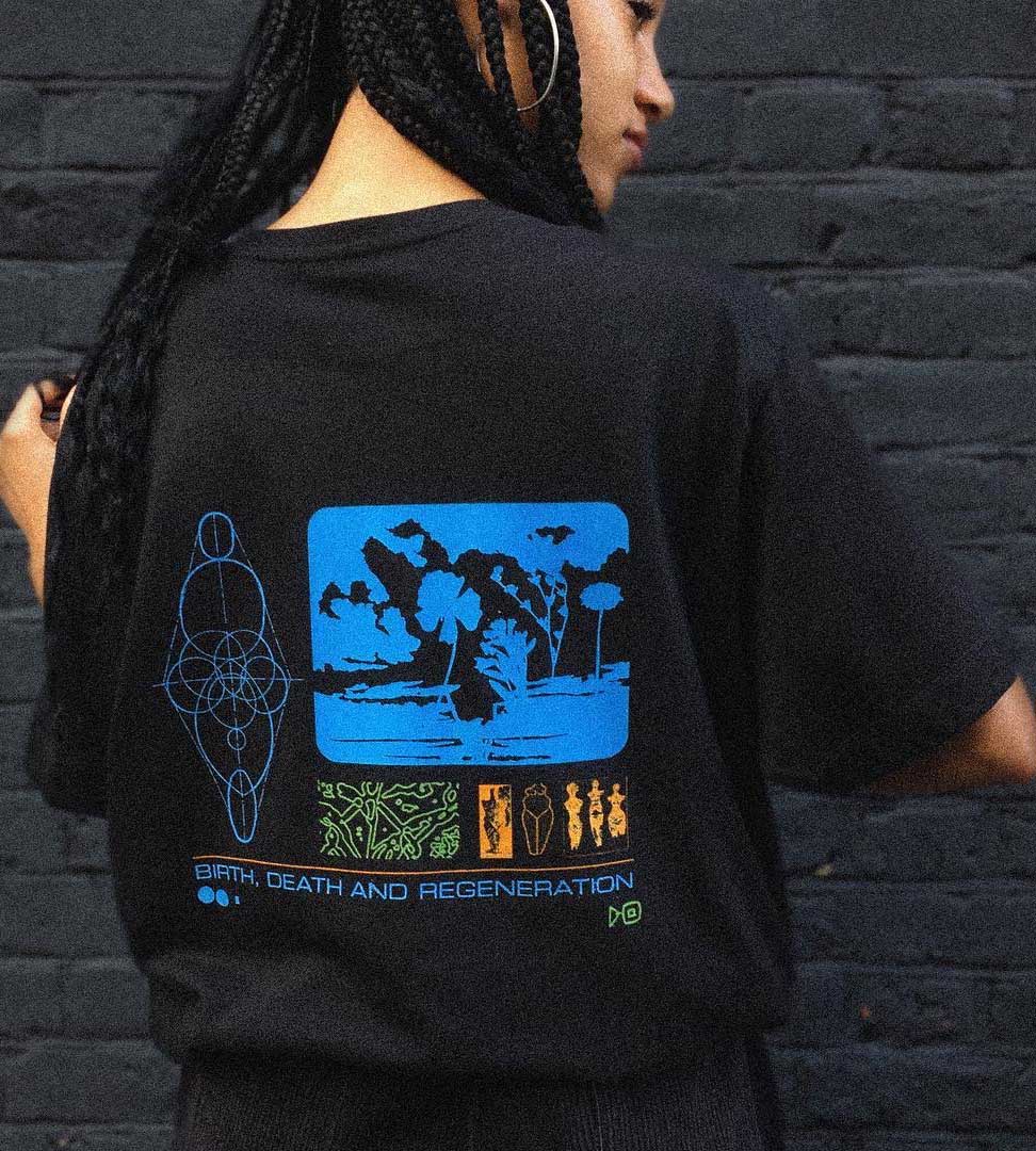
How does designing for physical formats like T-shirts and record sleeves/labels differ from digital?
I mostly work on posters and very few of them get printed. So it’s nice to be able to pick the materials and type of print, even making the physical elements become the protagonists by choosing the ways in which you mix them, and thinking about how they will feel in your hands. It’s always exciting to work on projects that will have a tangible, three-dimensional end result away from a bright computer screen.
Working in music has allowed me to explore and develop a style that’s constantly evolving
Ben Arfur
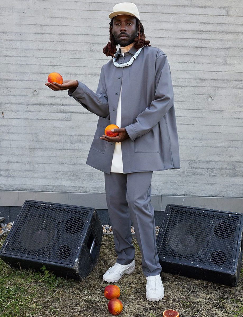
Welsh graphic designer Ben Arfur didn’t set out to be a graphic designer. The self-taught designer initially went to uni to do English, and it was only through setting up a club night with friends that he got his start in the design world. Extremely prolific, he now works across record sleeves, posters and tees too.
What was your first music project/your route into what you do now?
My first avenue in was probably Blue Honey; something we started back in Cardiff in 2012. This started off as a string of club nights, clothing shop and finally we opened a bar. It involved producing a huge body of work, but ultimately it was key in giving my work purpose and getting the right eyes on it.
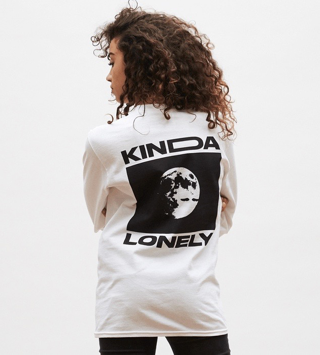
How does designing for physical formats like T-shirts and record sleeves/labels differ from digital?
There’s obviously limitations with physical. For instance when I’m working on a physical sleeve, I’ll look into ways with the artist of incorporating materials or unique elements into the production.
Read More: Check out our ‘How To’ series for more insights from our creative community.


