Can you tell our community a little about yourself to get started?
How would you describe the aesthetic of your artwork?
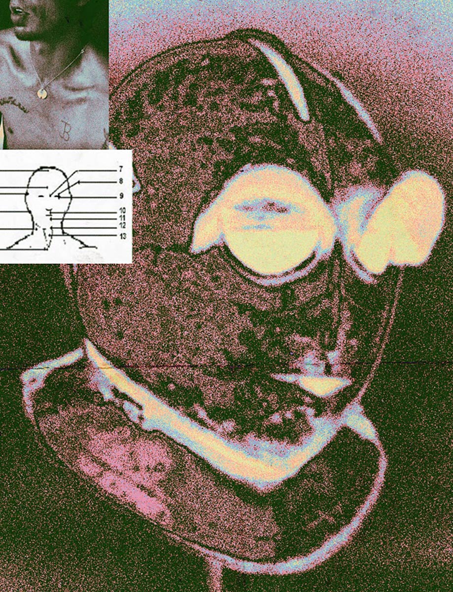
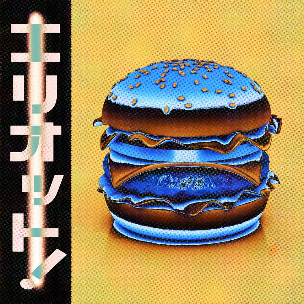
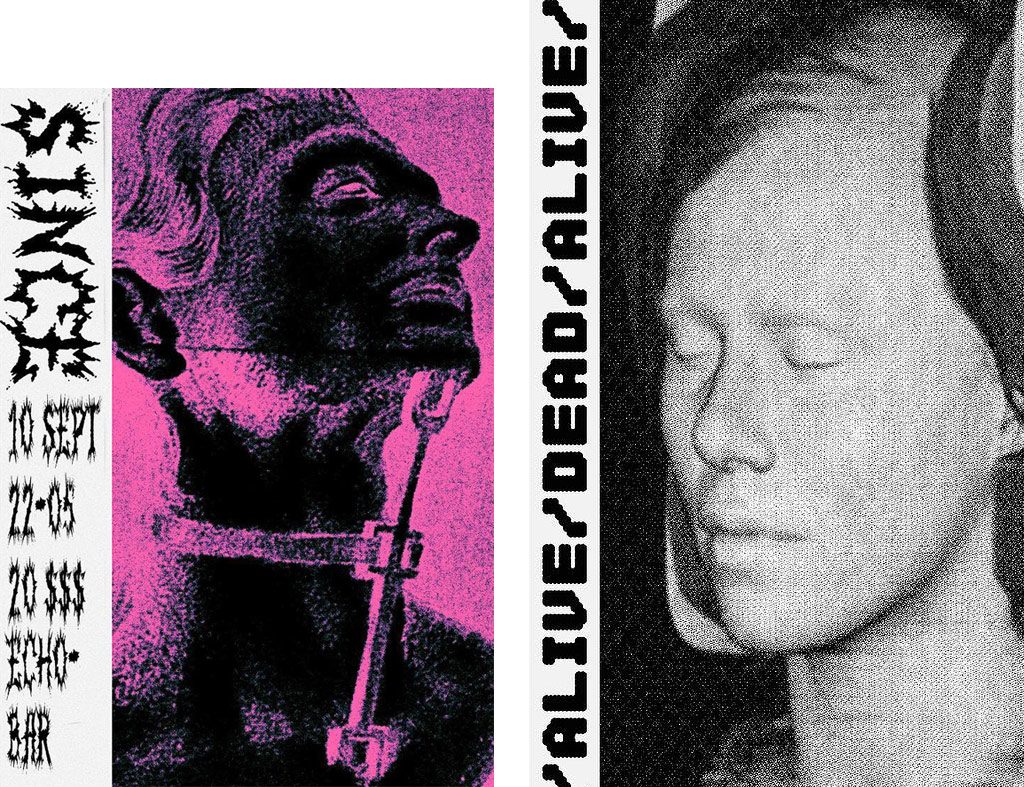
The aesthetic of my work has been described as anti-graphics, pixel graffiti, filthy scribblings, and work of a traumatised kindergartner (by my father). I personally call my style tormentalism.
How did you develop your style?
My style is heavily inspired by growing up in a post-communistic city, in the middle of dark grey buildings, bullet holes remaining in old houses after the war, heavy concrete structures and the overall greyscale that covers most of the gritty walls.
Fighting my own mediocrity is the hardest part I think
A lot of it comes from childhood memories of the hallway in my grandmothers apartment building, which had a strong odor of urine & meat stew, and when I was a child I remember being fascinated by the black numbers painted on each floor, and other typography used in similar structures (slavic people from poor areas might relate to this one). The building had a bulletin board right next to its entrance, filled with xerox flyers and DIY advertisement for religious groups/schools/sports clubs/book clubs that always had these really goofy illustrations, fonts & clip art, and I remember frequently taking them home and cutting out parts of them to make small collages, or just to collect them.
I’m also a huge fan of Czech and Polish poster designer from 60s-80s, Jakub Erol being the favourite one. They have such mysterious boldness and striking expressions to them that just tickle me in all the right ways.
What does a typical day look like for you?
My days differ greatly from one another, but I usually wake up around 11:00, take a 2 hour bath, go for a walk ‘n’ existential crisis-combo, sit in my couch and work until I receive a text from a thirsty friend longing for a beer, which is when I excuse my self from the work and go to one of the local pubs or parties.
When you’re in need of a hit of inspiration, where do you turn?
I rarely gather inspiration from design, or other designers, and mostly turn to literature, film and music. Some of the films that recently made a great impact on me are ‘Come and see’ by Elem Klimov, and ‘Enter the void’ by Gaspar Noé. When it comes to literature I’m really into Hunter S. Thompson right now.
What would be your dream project?
To be honest, I can’t even think of a dream project. I couldn’t ever imagine that I would be able to do this and somehow survive just by doing what I love. I’m just so grateful for the help and interest of the people that support me. Shit’s unreal, I still can’t understand that this is a real job.
What has been the hardest part of your journey? How did you overcome it?
Fighting my own mediocrity is the hardest part I think. Everyone struggles with mediocrity, and in my case I do like to be an outsider, and create independently to trends, which leads me to a journey without idols. I used to use song lyrics and quotes on my posters, but now I try to incorporate my own writing, which really is refreshing and I figured that if I wanted to create something new I shouldn’t inspire by what has already been created.
One tip for anyone looking to start their own creative journey?
First of all; go your own route. Bringing something new to the table is what makes art evolve. I do understand that at first we try to emulate our masters, but start by putting your own twists into the mix, even if they’re ugly or unpopular, by time you will develop your personal style and by doing what nobody else is doing you will stick out more for who you are.
Shop Kom’s new long sleeve T-shirt now. Available for a limited time only.


