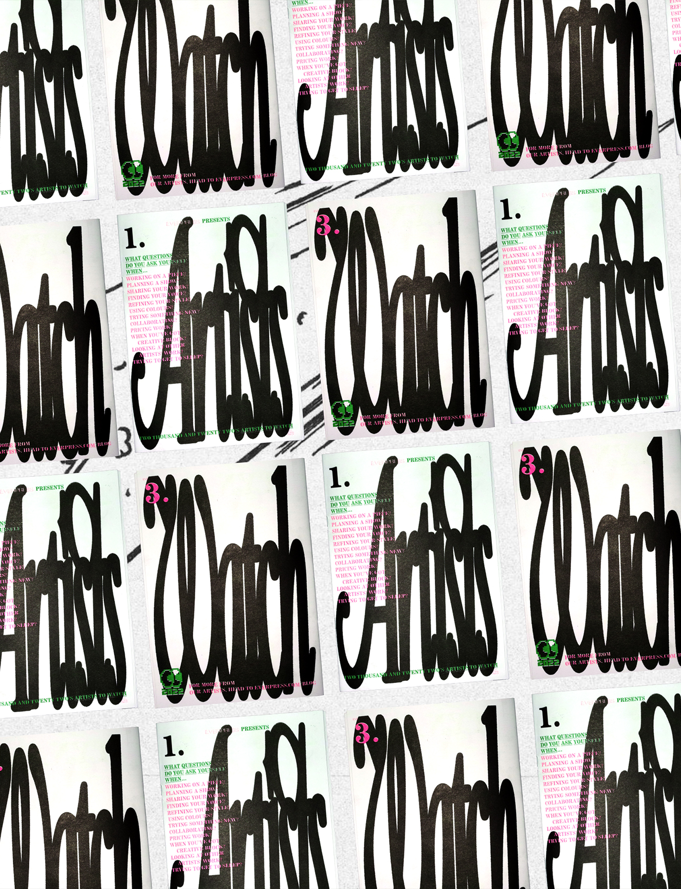
TYPOSTERS
Typosters, both the Instagram account and the website, has bloomed into a very influential resource. Can you talk a little about why you started the project? And when you first started out, what did you imagine for it?
Typoster’s initial goal back in 2018 was to become a digital archive of posters. Both of us, but especially Stelios, are very passionate about typography, so the main goal back then was to find and share interesting typographic posters and create an Instagram profile where all of them could be collected. The second main goal when Typosters was created, was to have it act as a platform where designers who are interested in typography can interact.
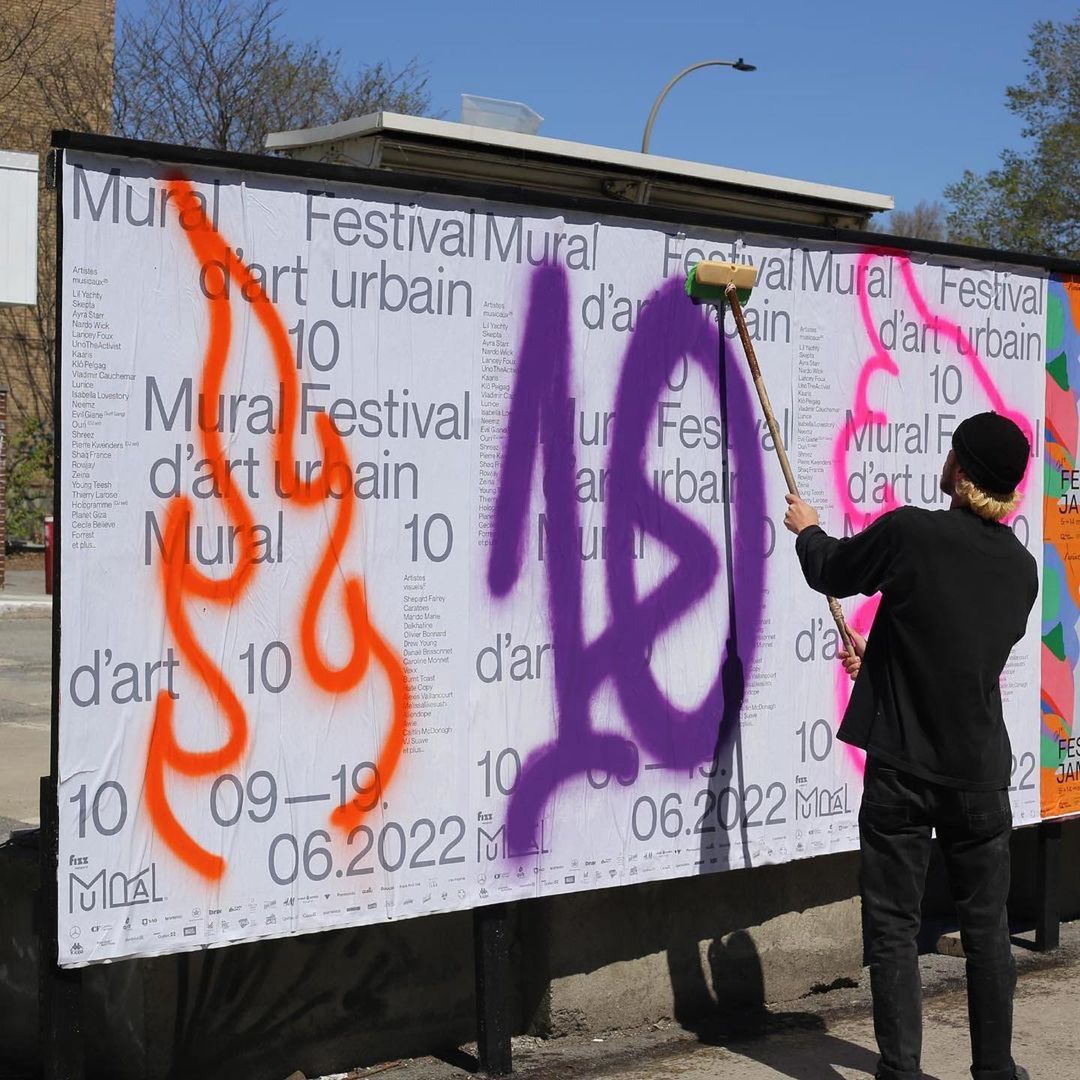
Right now what is important to us when it comes to Typosers is that it should always present quality design to its community. It is still essential that it acts as a platform where artists and designers can interact, but also come to in order to get inspiration.
Why do you think it’s important to create digital archives like this, of a medium (posters) that can often be ephemeral or transient?
After reading Anthony Burrill’s book Make it Now!, we realised how important it is to take inspiration from objects with a short life span. Since then we have also been interested in collecting and archiving such objects so that we can come back to them to get inspired. We have embraced that concept with Typosters by digitally archiving posters, which if not saved will be lost forever.
It is like creating a time capsule
Documenting and archiving is essential in order for us to remember and get inspired, but it also becomes a sort of library that everyone can explore and learn what was current at the ‘scene’ during our time. It is like creating a time capsule.
Part of the success of Typosters has been the scope of the work you feature. There are aesthetic themes that repeat across some of the pieces, but it’s never homogenous or samey as a whole. How do you approach curating the account? And relatedly, how do you find new designers and work to feature?
We try to hand pick and share posters that we think are interesting, unique or unexpected. We also try to pick posters that people are not so likely to stumble upon. That is also why it really does not matter for us how many followers and likes a designer has on Instagram. One thing that is important to us, though, is that we share posters that were designed for a real event or situation.
It can be quite boring showing the same aesthetics repeatedly and we try to represent graphic design in its totality; to cover the whole spectrum of techniques and styles, from completely hand drawn typographic layouts to 3D typographic renders. We mainly find new designers and studios through social media and articles. Other times, we track down designers who designed a particular poster we saw in the streets and liked it. We especially love discovering new designers during our trips abroad, it can be very exciting.
How much of that ethos did you bring to curating the lineup for this collection? And how did the final lineup emerge; did you have existing relationships with every artist?
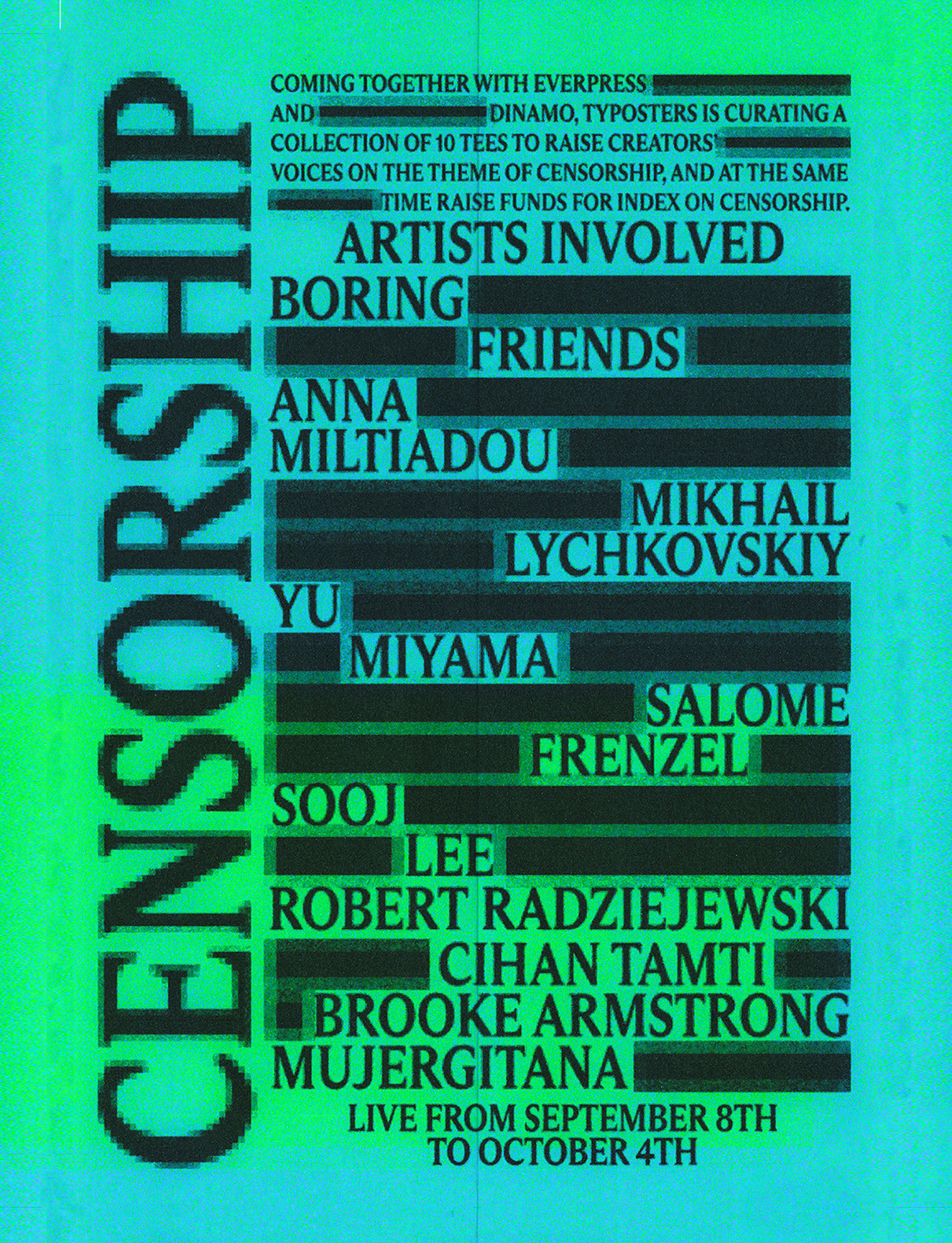
Again, diversity was very important to us so we wanted to have a diverse lineup for this collection, especially since the theme is Censorship. It was important to underline that no matter what each artist’s background is, we all condemn being censored.
We had existing relationships with some of the artists, but others, we have just admired for such a long time and we have waited for the perfect opportunity to collaborate with.
We try to represent graphic design in its totality
For you, what makes a typoster ‘good’ or ‘successful’? Are there any golden rules you abide by as designers yourselves?
We try not to abide by too many rules as we find they can often be very limiting. If we had to talk about one golden rule would be to stay creative and devoted to the project or task at hand. When a designer’s only focus is to deliver quality – they will deliver quality. It is also important to remember that a typoster needs to communicate its message effectively and quickly. We are big fans of some designers who can communicate complex messages through simple typography.
What do you think the relationship is between type, design and freedom of expression? How did you arrive at the overarching theme of ‘censorship’?
We believe that type and design are paramount when talking about freedom of expression. If someone wants to express their point of view or idea and let the world know about it – even for the simplest thing – they will get a piece of paper and write down their message. They might hold it up during a demonstration, or hang it up in their home. Either way, they used type.
It is almost a designer’s duty to support freedom of expression
It is almost a designer’s duty to support freedom of expression by using their knowledge and skills to accentuate a point of view or idea through type and design. That is why the theme ‘censorship’ was chosen; we need to remind people and designers how important it is, and how it is paramount that we all remember that it is a big issue we need to address.
You’re raising funds for Index On Censorship. For you, why is this work they do so important?
Index on Censorship focuses on artistic, digital and media freedom. Nowadays, when designers are typically very involved with social media, all three of these subjects are extremely important to them. Index campaigns against restriction to freedom of speech online, they support artists who challenge the current circumstances and speak out, they monitor illegal projects that restrict journalists’ work and they publish a magazine which features work from censored journalists. We find the work they do crucial and we couldn’t be more excited that we are raising funds for Index on Censorship.
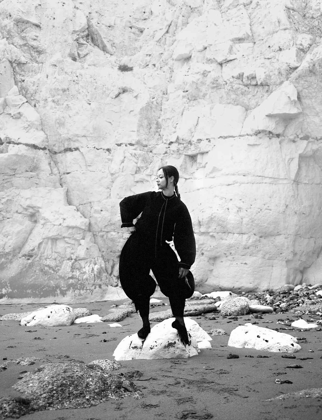
BROOKE ARMSTRONG
How do you balance your creative work alongside everything else it takes to run a successful business as an artist?
Routine and boundaries!! Getting yourself into a routine and practising healthy work boundaries is so important. Create a schedule for yourself and stick to it. I’ll usually save my mornings to be creative for myself: I’ll sip my coffee and create whatever I want in a pressure-free environment. It’s my favourite time of the day, it helps jumpstart my creative brain, and is also the time I can get any design urges out of my mind before I start my business work in the afternoon. Artists need time to create for themselves or they’ll wind up burnt out. Plus, running your own business can be a 24/7 job and it’s really easy to feel like you have to work around the clock. Setting those time frames for yourself is key to making sure you’re allowing your brain to rest and reset. Taking care of yourself comes before any job.
Artists need time to create for themselves
Your artist bio explains that you’re interested in creating “engaging and meaningful” designs. What does good design, that’s both engaging and meaningful, look like to you?
I think all good design or art should make you feel something. Maybe it’s calm because the colours are pleasing to look at, energetic because it’s got an inspiring message, melancholy because the composition is empty, content because it’s communicating something clearly. Or it’s something you’re able to relate heavily to and that in itself is engaging. The more senses we engage, the more strongly we are tied to a moment. A lot of my work revolves around my own moments and feelings, so those emotions, which others can relate to, are present. When you’re able to create work that the viewer sees or feels a part of themselves in, I believe that makes for meaningful, good design.
I’m interested in specifically the apparel aspect to your work, for you what’s the relationship between type, design and clothing?
Design and fashion/clothing have always gone hand and hand. Most of us use fashion to express ourselves, and I think my favourite part about merging the two is that you’re able to take that expression to the next level. It’s like wearing a statement poster on your body. Clothing designed by artists is also going to be unique and feel special when you’re wearing it because each element had so much thought go into it. (When I get to arrange compositions outside of the normal guidelines, that’s when the real magic starts to happen). Graphic designers have had a big impact on fashion, especially these last few years. It’s really unfortunate to see big corporations steal designs from small artists, my peers, and turn them into cheap products for quick profit.
All good design should make you feel something
Your design centres around online censorship, particularly your experiences of sharing your own body on social media. Why is freedom in digital spaces important for artists?
From a business standpoint, censoring artists and their work puts their livelihoods at risk. When social media marketing is considered a must for small businesses, it becomes a huge disadvantage if they’re threatened with removal from a platform. How else are artists supposed to promote their work if social media platforms are keeping them invisible?
Artist censorship equates hiding people and ideas from the world. For me, I believe deeply in using the nude body as a way to express yourself, it is our most vulnerable and innocent form, but platforms like Instagram only allow that kind of expression to a small group of people. And that usually includes big brands, men, and skinny white celebrities. Of course that doesn’t mean they’re getting away with showing full genitalia, but I have seen large accounts get away with essentially full nudes of models while Instagram is blocking small artists for the same thing. Art, no matter what your art is, should always be a free form of expression.
Relatedly, where is the line? Are there times when restrictions on what can be posted can be a good thing in digital spaces? And when does this cross over into artistic censorship?
Of course there is always going to be a line. Censorship isn’t necessarily a bad thing, it can be used for the protection of internet users. You could say it sets a common-sense limit. The tricky balance is protecting free speech while creating boundaries that stop dangerous, harmful content. Harmful content meaning things like: false news, hate speech targeting specific groups of people, illegal activities, murder, child pornography, sex and human trafficking, instructions on how to do illegal things like make a bomb or steal someones identity. Since art and design is an expression of the artist’s view of the world, I think these things can (and should) be talked about in the right way, also as a way to raise awareness to the issue. The graphic designer Stefan Sagmeister said, “Design is a language, so you can use it for complaining, entertaining, educating, agitating, organising, money raising, mourning, denouncing, selling and promoting.” When the Internet is trying to hide that, that’s when artist censorship is harmful. At the end of the day, even if Internet censorship is directly monitored and ethically upheld, someone has to decide what is acceptable to see online and what is not, that includes whatever biases they may have.
Censoring artists puts their livelihoods at risk
When do you feel most creatively satisfied?
This answer is actually pretty simple. Previously it would’ve been something like, “When I wrap up a client project and they’re very pleased.” Of course I still feel that way, but now, I feel most creatively satisfied when I get to design whatever I want with the intention of making it purely because I wanted to, for myself. Circling back to artists’ need to create for themselves as a way to recharge their creative batteries. For me, this year has been all about reclaiming my skills because it brings me joy to create, not because I have to meet a deadline to pay my bills.
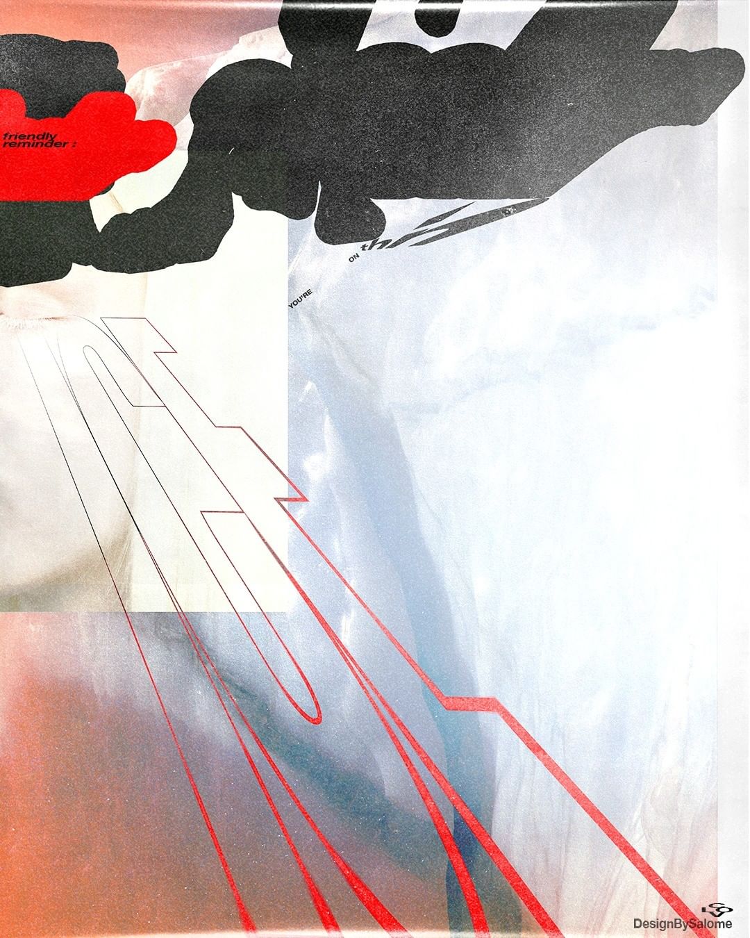
SALOME FRENZEL
Have you always been interested in design?
Yes, definitely. Above all, fashion design was something I was passionate about even as a small child. On top of that, I used to paint, craft and design a lot. Later, I spontaneously decided to go into graphic design. The idea of doing something with fashion later is still in my head.
I want to address as many people as possible with my art
You like to leave room for interpretation in your work. Why is it so important that an audience has to make their own mind up?
I want to address as many people as possible with my art, so that many feel understood and perhaps also recognize themselves in my work. This creates a sense of togetherness and one feels understood. Just at the beginning of my work on Instagram, I limited myself exclusively to “Friendly Reminder”, which of course should appeal to the masses, to encourage and motivate many people. In addition, I personally like it when people are stimulated to think through art. I think that I often bring this about with my posters.
Had you adapted any of your work for clothing before? How does it differ from other kinds of design?
This was the first time I’ve adapted one of my artworks or posters onto clothing. It was a challenge for me, I realised that the rigour of the rectangular format I usually use gives me support and order in my sometimes very detailed and extensive designs, as does the smoothness of the screen or paper. Fabric has its own feel and is a work of art in itself. I found it hard to give space to the clothing, to my design and most importantly: to connect this with the message.
How has ‘censorship’, whether in digital spaces or physical, affected you as a designer?
Looking at my digital designs, I never had problems with words or phrases that could have censorship placed on them. However, I often had problems with the depiction of female bodies. It was not uncommon for a design to be removed or to be shown to fewer people because it was deemed ‘offensive’. This always makes me angry and sad. I encounter the sexualization of female bodies all the time. Catcalling, harassing messages, etc. So I, as a designer, have to say that I am definitely affected by this and it always encourages me to spread messages, whether with words or photos, that give courage to stand up for yourself and keep going.
Type, design, and expression belong together
What is the relationship, for you, between type, design and freedom of expression?
Designs always convey a message. Whether they are created for commercial purposes or non-commercial, they give us the opportunity to communicate and express opinions. Sometimes we design with the purpose of spreading a message and sometimes we design and spread it passively. Fonts and symbols are means to actively spread a message. Passively, colours and shapes can spread messages. So for me, you can’t separate type and design. And whether we use free expression in parts of the world to speak, or we speak to gain free expression: Type, design, and expression belong together.
Read More: Who Gets To Be A Creative?